Обсуждение: Re: [pgadmin-hackers] [Design Update] Visual design of query editor and results table
Re: [pgadmin-hackers] [Design Update] Visual design of query editor and results table
От
Shirley Wang
Дата:
Thanks, all!
On Wed, Apr 5, 2017 at 4:55 PM, Anthony DeBarros <adebarros@gmail.com> wrote:I like the changes overall. Feels polished.For mockup purposes, remember that pgAdmin 4 behavior right-justifies integers, numerics, etc., for readability.
Anthony, I left-justified integers in the table for three reasons:
1. it aligns better with the table headers
2. it provides more consistent spacing between results making it easier to read
3. right-justified numbers come from precedents like excel or other spreadsheet type tools and muddles the distinction between editable and un-editable tables (at least data output in from query results is un-editable, I know right clicking on a table in the browser to "view ... data/rows" outputs an editable table)
Thoughts?
Вложения
On Thu, Apr 6, 2017 at 3:27 PM, Shirley Wang <swang@pivotal.io> wrote:
> Thanks, all!
>
>>
>> On Wed, Apr 5, 2017 at 4:55 PM, Anthony DeBarros <adebarros@gmail.com>
>> wrote:
>>>
>>> I like the changes overall. Feels polished.
>>>
>>> For mockup purposes, remember that pgAdmin 4 behavior right-justifies
>>> integers, numerics, etc., for readability.
>>>
>
> Anthony, I left-justified integers in the table for three reasons:
> 1. it aligns better with the table headers
> 2. it provides more consistent spacing between results making it easier to
> read
> 3. right-justified numbers come from precedents like excel or other
> spreadsheet type tools and muddles the distinction between editable and
> un-editable tables (at least data output in from query results is
> un-editable, I know right clicking on a table in the browser to "view ...
> data/rows" outputs an editable table)

When we first released pgAdmin 4 we forgot to right-justify numbers.
Users complained. Lots. They need to stay right justified.

--
Dave Page
Blog: http://pgsnake.blogspot.com
Twitter: @pgsnake

EnterpriseDB UK: http://www.enterprisedb.com
The Enterprise PostgreSQL Company
Re: [pgadmin-hackers] [Design Update] Visual design of query editorand results table
От
Robert Eckhardt
Дата:
> 3. right-justified numbers come from precedents like excel or other
> spreadsheet type tools and muddles the distinction between editable and
> un-editable tables (at least data output in from query results is
> un-editable, I know right clicking on a table in the browser to "view ...
> data/rows" outputs an editable table)
When we first released pgAdmin 4 we forgot to right-justify numbers.
Users complained. Lots. They need to stay right justified.
Right justifying makes it substantially easier to understand magnitude and makes it easier to get decimal alignment.
-- Rob
--
Dave Page
Blog: http://pgsnake.blogspot.com
Twitter: @pgsnake
EnterpriseDB UK: http://www.enterprisedb.com
The Enterprise PostgreSQL Company
--
Sent via pgadmin-hackers mailing list (pgadmin-hackers@postgresql.org)
To make changes to your subscription:
http://www.postgresql.org/mailpref/pgadmin-hackers
Re: [pgadmin-hackers] [Design Update] Visual design of query editorand results table
От
Anthony DeBarros
Дата:
Agreed on all the responses thus far. The ability to distinguish values ranging from thousands to tens of thousands to millions, etc., is substantially harder if numbers are left-justified.
On Thu, Apr 6, 2017 at 10:41 AM, Robert Eckhardt <reckhardt@pivotal.io> wrote:
> 3. right-justified numbers come from precedents like excel or other
> spreadsheet type tools and muddles the distinction between editable and
> un-editable tables (at least data output in from query results is
> un-editable, I know right clicking on a table in the browser to "view ...
> data/rows" outputs an editable table)
When we first released pgAdmin 4 we forgot to right-justify numbers.
Users complained. Lots. They need to stay right justified.Right justifying makes it substantially easier to understand magnitude and makes it easier to get decimal alignment.-- Rob
--
Dave Page
Blog: http://pgsnake.blogspot.com
Twitter: @pgsnake
EnterpriseDB UK: http://www.enterprisedb.com
The Enterprise PostgreSQL Company
--
Sent via pgadmin-hackers mailing list (pgadmin-hackers@postgresql.org)
To make changes to your subscription:
http://www.postgresql.org/mailpref/pgadmin-hackers
Re: [pgadmin-hackers] [Design Update] Visual design of query editorand results table
От
Shirley Wang
Дата:
Ok! Right justified it is
On Thu, Apr 6, 2017 at 11:22 AM Anthony DeBarros <adebarros@gmail.com> wrote:
Agreed on all the responses thus far. The ability to distinguish values ranging from thousands to tens of thousands to millions, etc., is substantially harder if numbers are left-justified.On Thu, Apr 6, 2017 at 10:41 AM, Robert Eckhardt <reckhardt@pivotal.io> wrote:> 3. right-justified numbers come from precedents like excel or other
> spreadsheet type tools and muddles the distinction between editable and
> un-editable tables (at least data output in from query results is
> un-editable, I know right clicking on a table in the browser to "view ...
> data/rows" outputs an editable table)
When we first released pgAdmin 4 we forgot to right-justify numbers.
Users complained. Lots. They need to stay right justified.Right justifying makes it substantially easier to understand magnitude and makes it easier to get decimal alignment.-- Rob
--
Dave Page
Blog: http://pgsnake.blogspot.com
Twitter: @pgsnake
EnterpriseDB UK: http://www.enterprisedb.com
The Enterprise PostgreSQL Company
--
Sent via pgadmin-hackers mailing list (pgadmin-hackers@postgresql.org)
To make changes to your subscription:
http://www.postgresql.org/mailpref/pgadmin-hackers
Re: [pgadmin-hackers] [Design Update] Visual design of query editor and results table
От
Shirley Wang
Дата:
Hello!
1. changing unselected columns and row colors to grey
2. changing selected columns and rows to blue
3. differentiating header text so that field name is bold and datatype is in brackets
4. text is white when columns are selected
5. removing checkboxes in each cell
6. adding a triangle indicator for select all (top left corner)
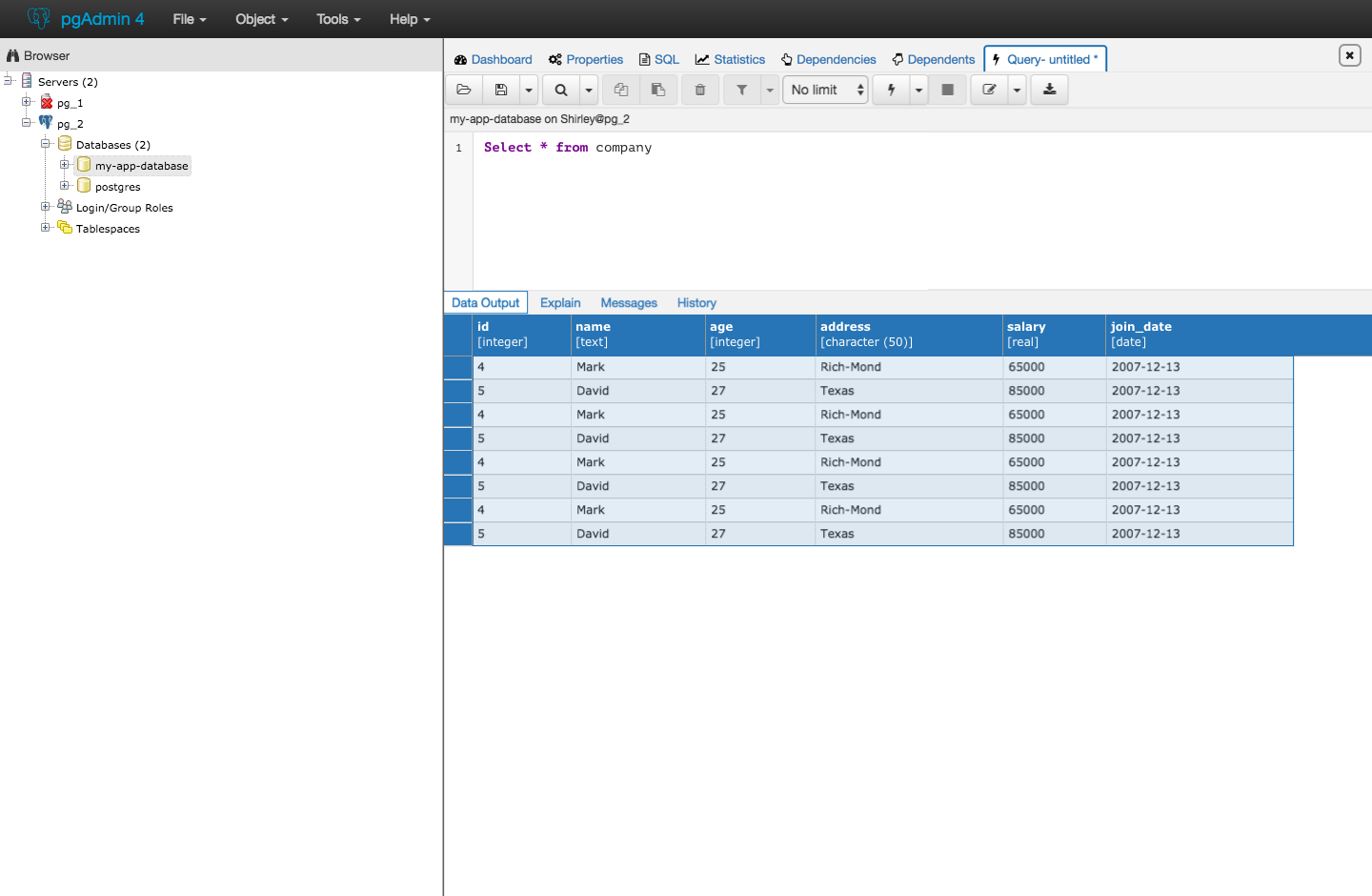
Clicking a single cell inside the table will unselect everything else and only select that cell.
Here is an updated version of the table:
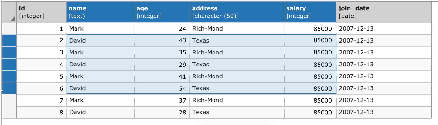
Please review these changes and provide feedback. We would like to implement them this week.
Thanks!
On Thu, Apr 6, 2017 at 11:27 AM Shirley Wang <swang@pivotal.io> wrote:
Ok! Right justified it isOn Thu, Apr 6, 2017 at 11:22 AM Anthony DeBarros <adebarros@gmail.com> wrote:Agreed on all the responses thus far. The ability to distinguish values ranging from thousands to tens of thousands to millions, etc., is substantially harder if numbers are left-justified.On Thu, Apr 6, 2017 at 10:41 AM, Robert Eckhardt <reckhardt@pivotal.io> wrote:> 3. right-justified numbers come from precedents like excel or other
> spreadsheet type tools and muddles the distinction between editable and
> un-editable tables (at least data output in from query results is
> un-editable, I know right clicking on a table in the browser to "view ...
> data/rows" outputs an editable table)
When we first released pgAdmin 4 we forgot to right-justify numbers.
Users complained. Lots. They need to stay right justified.Right justifying makes it substantially easier to understand magnitude and makes it easier to get decimal alignment.-- Rob
--
Dave Page
Blog: http://pgsnake.blogspot.com
Twitter: @pgsnake
EnterpriseDB UK: http://www.enterprisedb.com
The Enterprise PostgreSQL Company
--
Sent via pgadmin-hackers mailing list (pgadmin-hackers@postgresql.org)
To make changes to your subscription:
http://www.postgresql.org/mailpref/pgadmin-hackers
Вложения
Hi
--
On Wed, Apr 12, 2017 at 4:20 PM, Shirley Wang <swang@pivotal.io> wrote:
Hello!Our team is starting to work on changes to the results table, including:1. changing unselected columns and row colors to grey
I'd like to see the entire window to see if that seems to make things too flat, but no objection to a colour change in principal.
2. changing selected columns and rows to blue
OK.
3. differentiating header text so that field name is bold and datatype is in brackets
Not sure about the brackets - for example, it might look weird with array types, e.g.
[character varying(50)[]]
Given that the column name is in bold, and the type isn't, perhaps the brackets should be omitted?
4. text is white when columns are selected
OK.
5. removing checkboxes in each cell
\o/
6. adding a triangle indicator for select all (top left corner)
I like it.
Clicking a single cell inside the table will unselect everything else and only select that cell.Here is an updated version of the table:Please review these changes and provide feedback. We would like to implement them this week.Thanks!On Thu, Apr 6, 2017 at 11:27 AM Shirley Wang <swang@pivotal.io> wrote:Ok! Right justified it isOn Thu, Apr 6, 2017 at 11:22 AM Anthony DeBarros <adebarros@gmail.com> wrote:Agreed on all the responses thus far. The ability to distinguish values ranging from thousands to tens of thousands to millions, etc., is substantially harder if numbers are left-justified.On Thu, Apr 6, 2017 at 10:41 AM, Robert Eckhardt <reckhardt@pivotal.io> wrote:> 3. right-justified numbers come from precedents like excel or other
> spreadsheet type tools and muddles the distinction between editable and
> un-editable tables (at least data output in from query results is
> un-editable, I know right clicking on a table in the browser to "view ...
> data/rows" outputs an editable table)
When we first released pgAdmin 4 we forgot to right-justify numbers.
Users complained. Lots. They need to stay right justified.Right justifying makes it substantially easier to understand magnitude and makes it easier to get decimal alignment.-- Rob
--
Dave Page
Blog: http://pgsnake.blogspot.com
Twitter: @pgsnake
EnterpriseDB UK: http://www.enterprisedb.com
The Enterprise PostgreSQL Company
--
Sent via pgadmin-hackers mailing list (pgadmin-hackers@postgresql.org)
To make changes to your subscription:
http://www.postgresql.org/mailpref/pgadmin-hackers

Dave Page
Blog: http://pgsnake.blogspot.com
Twitter: @pgsnake
EnterpriseDB UK: http://www.enterprisedb.com
The Enterprise PostgreSQL Company
Blog: http://pgsnake.blogspot.com
Twitter: @pgsnake
EnterpriseDB UK: http://www.enterprisedb.com
The Enterprise PostgreSQL Company
Вложения
Re: [pgadmin-hackers] [Design Update] Visual design of query editor and results table
От
Shirley Wang
Дата:
On Wed, Apr 12, 2017 at 11:26 AM Dave Page <dpage@pgadmin.org> wrote:
HiOn Wed, Apr 12, 2017 at 4:20 PM, Shirley Wang <swang@pivotal.io> wrote:Hello!Our team is starting to work on changes to the results table, including:1. changing unselected columns and row colors to greyI'd like to see the entire window to see if that seems to make things too flat, but no objection to a colour change in principal.
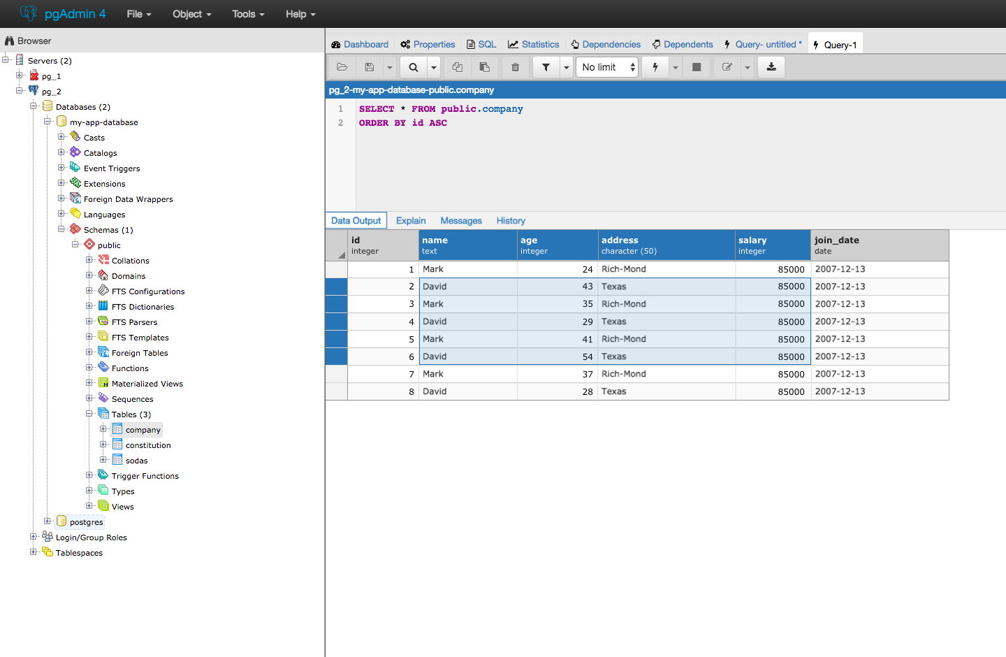
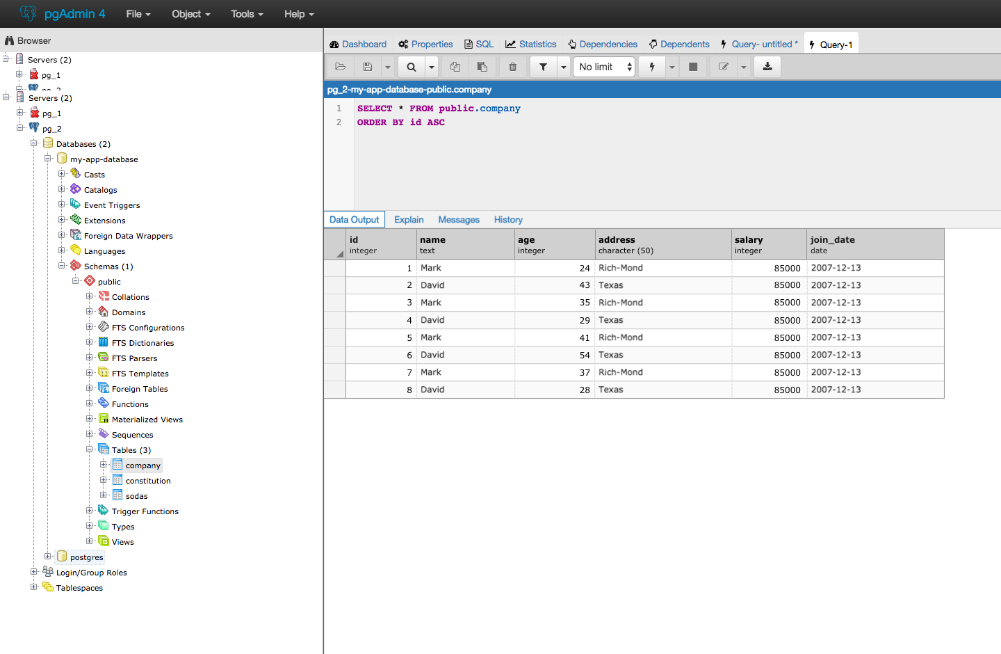
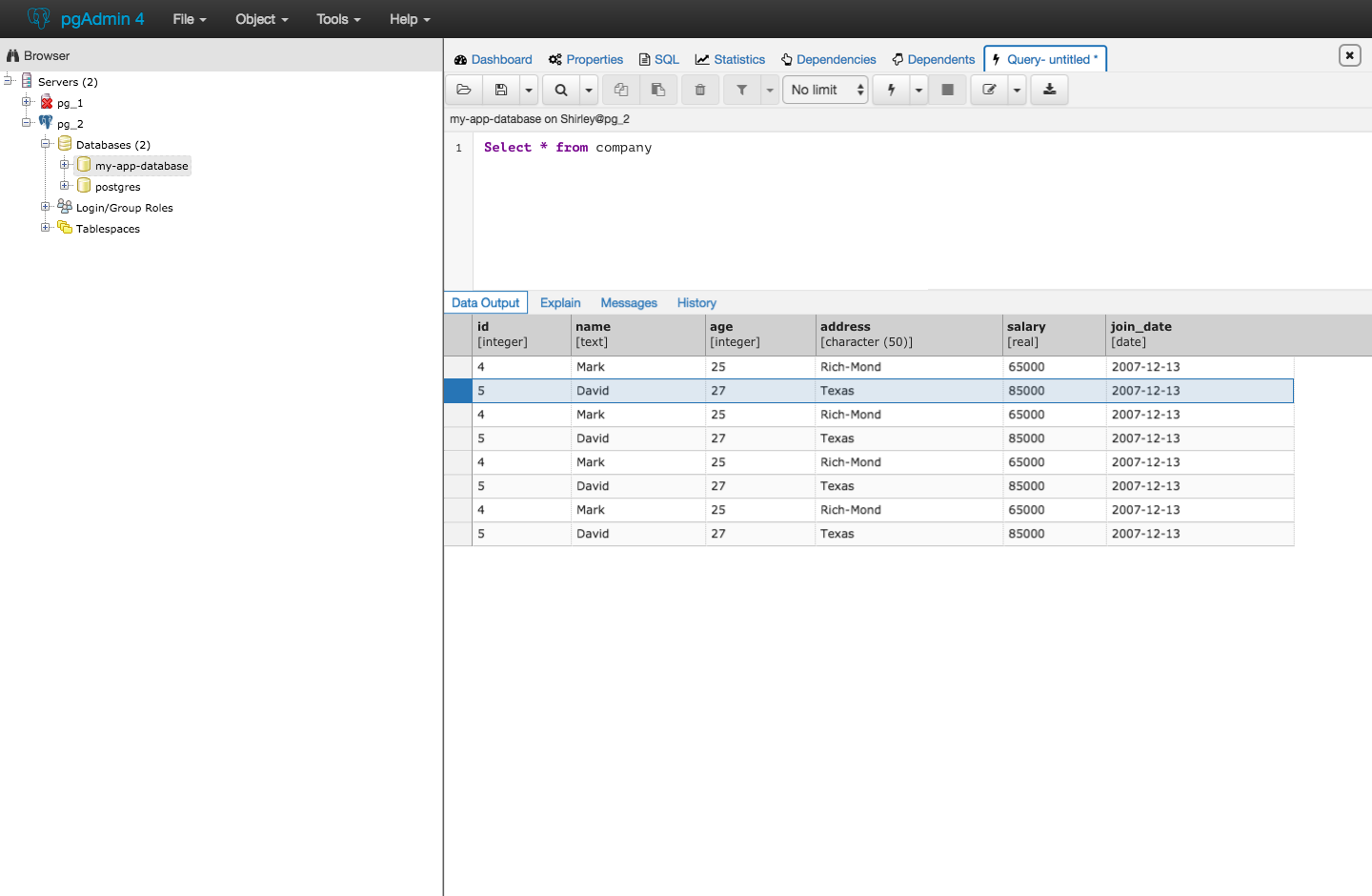
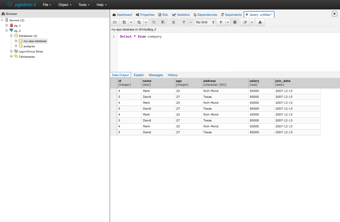
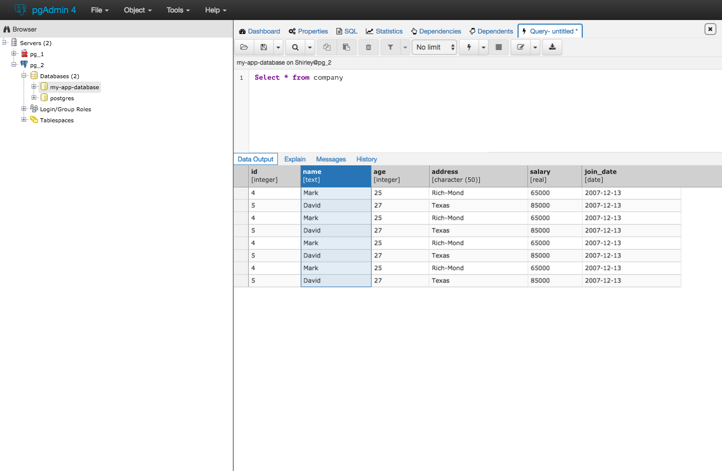
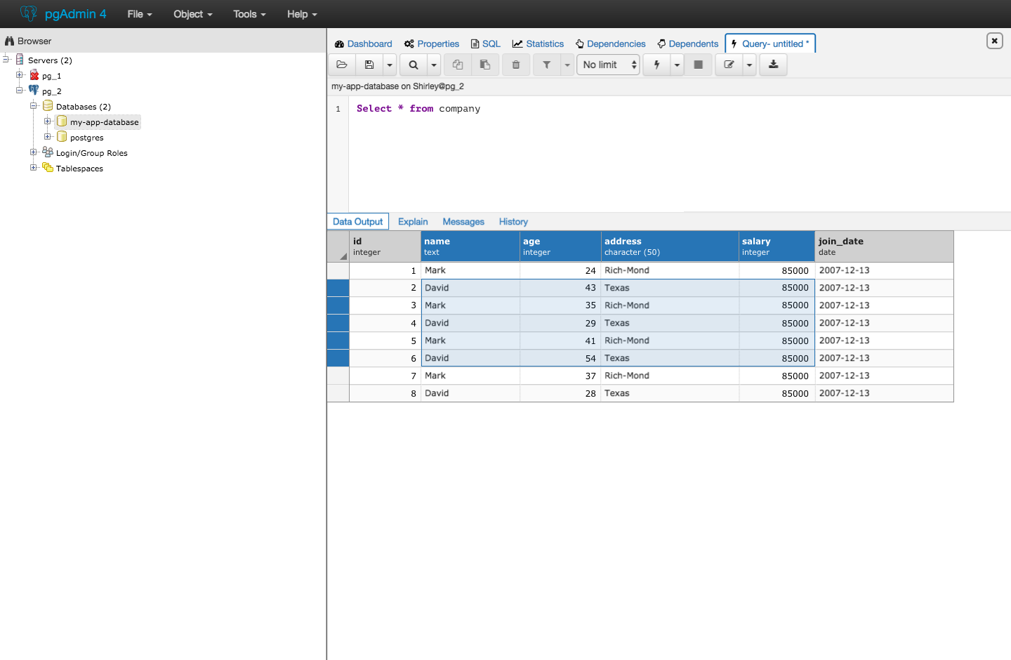
We're still working on styling the top navigation and also the bar with data output, explain, messages, and history, but here's what it looks like now with the current navigation styling. Because styles for the results table isn't impacting other modules or dialogs (exception being 'view data' options), we can come to a conclusion about styling for the table first, and take the results table into consideration when it comes to styling other parts of the editor.
I think that the table styling patch can be merged independently from top navigation styles (this way we're not held up by design and we can release and gather feedback on the results table). Here's what it would look like with the current navigation in pgAdmin4.
open query tool and see results

select columns and rows

Right click on tables in browser > view all data

Right click on tables in browser > view all data, select columns and rows

3. differentiating header text so that field name is bold and datatype is in bracketsNot sure about the brackets - for example, it might look weird with array types, e.g.[character varying(50)[]]Given that the column name is in bold, and the type isn't, perhaps the brackets should be omitted?
Oh good point. It seems like there are a few datatypes that require brackets. I think having font size for datatypes be slightly smaller than field name also works in establishing some visual hierarchy within the text.
Just a note about the screens with highlighting - the selection implies that using the shift (or command or control) key to select a group of cells will work. This keyboard shortcut does not exist now, but is future work. The screens are done that way to show what highlighted columns and rows would look like.
Вложения
On Wed, Apr 12, 2017 at 9:02 PM, Shirley Wang <swang@pivotal.io> wrote:
On Wed, Apr 12, 2017 at 11:26 AM Dave Page <dpage@pgadmin.org> wrote:HiOn Wed, Apr 12, 2017 at 4:20 PM, Shirley Wang <swang@pivotal.io> wrote:Hello!Our team is starting to work on changes to the results table, including:1. changing unselected columns and row colors to greyI'd like to see the entire window to see if that seems to make things too flat, but no objection to a colour change in principal.We're still working on styling the top navigation and also the bar with data output, explain, messages, and history, but here's what it looks like now with the current navigation styling. Because styles for the results table isn't impacting other modules or dialogs (exception being 'view data' options), we can come to a conclusion about styling for the table first, and take the results table into consideration when it comes to styling other parts of the editor.I think that the table styling patch can be merged independently from top navigation styles (this way we're not held up by design and we can release and gather feedback on the results table).
Sure.
Here's what it would look like with the current navigation in pgAdmin4.
Is that a new shade of gray? How many do we have now? It looks to me like it's starting to get messy, with too many different variations of gray plus the light blues used for the codemirror gutter and alternate rows in the grid.
Before we make this change, I think we should come up with the palette we discussed on Tuesday, and make sure we're all on the same page about what colours should be used for what in the main UI (I'm assuming we won't include icons and syntax colouring in this).
E.g.
- A light and dark gray for UI elements such as button bars and grid headers.
- A light blue for highlighting data items, e.g. the codemirror gutter and alternate grid lines.
- A darker blue for highlighted text and emphasised UI elements, e.g. selections, dialogue headers
- Standard colours for OK/Cancel/Save buttons etc, which can also (potentially) be reused for graph series.
What do you think?
open query tool and see resultsselect columns and rowsRight click on tables in browser > view all dataRight click on tables in browser > view all data, select columns and rows3. differentiating header text so that field name is bold and datatype is in bracketsNot sure about the brackets - for example, it might look weird with array types, e.g.[character varying(50)[]]Given that the column name is in bold, and the type isn't, perhaps the brackets should be omitted?Oh good point. It seems like there are a few datatypes that require brackets. I think having font size for datatypes be slightly smaller than field name also works in establishing some visual hierarchy within the text.Just a note about the screens with highlighting - the selection implies that using the shift (or command or control) key to select a group of cells will work. This keyboard shortcut does not exist now, but is future work. The screens are done that way to show what highlighted columns and rows would look like.


Dave Page
Blog: http://pgsnake.blogspot.com
Twitter: @pgsnake
EnterpriseDB UK: http://www.enterprisedb.com
The Enterprise PostgreSQL Company
Blog: http://pgsnake.blogspot.com
Twitter: @pgsnake
EnterpriseDB UK: http://www.enterprisedb.com
The Enterprise PostgreSQL Company
Вложения
Re: [pgadmin-hackers] [Design Update] Visual design of query editor and results table
От
Shirley Wang
Дата:
On Thu, Apr 13, 2017 at 4:19 AM Dave Page <dpage@pgadmin.org> wrote:
On Wed, Apr 12, 2017 at 9:02 PM, Shirley Wang <swang@pivotal.io> wrote:On Wed, Apr 12, 2017 at 11:26 AM Dave Page <dpage@pgadmin.org> wrote:HiOn Wed, Apr 12, 2017 at 4:20 PM, Shirley Wang <swang@pivotal.io> wrote:Hello!Our team is starting to work on changes to the results table, including:1. changing unselected columns and row colors to greyI'd like to see the entire window to see if that seems to make things too flat, but no objection to a colour change in principal.We're still working on styling the top navigation and also the bar with data output, explain, messages, and history, but here's what it looks like now with the current navigation styling. Because styles for the results table isn't impacting other modules or dialogs (exception being 'view data' options), we can come to a conclusion about styling for the table first, and take the results table into consideration when it comes to styling other parts of the editor.I think that the table styling patch can be merged independently from top navigation styles (this way we're not held up by design and we can release and gather feedback on the results table).Sure.Here's what it would look like with the current navigation in pgAdmin4.Is that a new shade of gray? How many do we have now? It looks to me like it's starting to get messy, with too many different variations of gray plus the light blues used for the codemirror gutter and alternate rows in the grid.
Yes, it is a darker shade of gray. Are you concerned with the number of variations on gray, or that the grays are not used appropriately?
Before we make this change, I think we should come up with the palette we discussed on Tuesday, and make sure we're all on the same page about what colours should be used for what in the main UI (I'm assuming we won't include icons and syntax colouring in this).E.g.- A light and dark gray for UI elements such as button bars and grid headers.- A light blue for highlighting data items, e.g. the codemirror gutter and alternate grid lines.- A darker blue for highlighted text and emphasised UI elements, e.g. selections, dialogue headers- Standard colours for OK/Cancel/Save buttons etc, which can also (potentially) be reused for graph series.What do you think?
I think this is a good idea, and can be done in a separate track from the table styling. I feel that the cost of changing gray in the table later on is less than waiting on implementing until we determine the color palette (since this might take some time and it'd be good to get some feedback). For now, we can use the same shade of dark gray as the one in the toolbar menu. I'm going to prioritize creating the style guide above working on additional features after the table.
open query tool and see resultsselect columns and rowsRight click on tables in browser > view all dataRight click on tables in browser > view all data, select columns and rows3. differentiating header text so that field name is bold and datatype is in bracketsNot sure about the brackets - for example, it might look weird with array types, e.g.[character varying(50)[]]Given that the column name is in bold, and the type isn't, perhaps the brackets should be omitted?Oh good point. It seems like there are a few datatypes that require brackets. I think having font size for datatypes be slightly smaller than field name also works in establishing some visual hierarchy within the text.Just a note about the screens with highlighting - the selection implies that using the shift (or command or control) key to select a group of cells will work. This keyboard shortcut does not exist now, but is future work. The screens are done that way to show what highlighted columns and rows would look like.--Dave Page
Blog: http://pgsnake.blogspot.com
Twitter: @pgsnake
EnterpriseDB UK: http://www.enterprisedb.com
The Enterprise PostgreSQL Company


Вложения
On Thu, Apr 13, 2017 at 4:07 PM, Shirley Wang <swang@pivotal.io> wrote:
On Thu, Apr 13, 2017 at 4:19 AM Dave Page <dpage@pgadmin.org> wrote:On Wed, Apr 12, 2017 at 9:02 PM, Shirley Wang <swang@pivotal.io> wrote:On Wed, Apr 12, 2017 at 11:26 AM Dave Page <dpage@pgadmin.org> wrote:HiOn Wed, Apr 12, 2017 at 4:20 PM, Shirley Wang <swang@pivotal.io> wrote:Hello!Our team is starting to work on changes to the results table, including:1. changing unselected columns and row colors to greyI'd like to see the entire window to see if that seems to make things too flat, but no objection to a colour change in principal.We're still working on styling the top navigation and also the bar with data output, explain, messages, and history, but here's what it looks like now with the current navigation styling. Because styles for the results table isn't impacting other modules or dialogs (exception being 'view data' options), we can come to a conclusion about styling for the table first, and take the results table into consideration when it comes to styling other parts of the editor.I think that the table styling patch can be merged independently from top navigation styles (this way we're not held up by design and we can release and gather feedback on the results table).Sure.Here's what it would look like with the current navigation in pgAdmin4.Is that a new shade of gray? How many do we have now? It looks to me like it's starting to get messy, with too many different variations of gray plus the light blues used for the codemirror gutter and alternate rows in the grid.Yes, it is a darker shade of gray. Are you concerned with the number of variations on gray, or that the grays are not used appropriately?
Both really.
Before we make this change, I think we should come up with the palette we discussed on Tuesday, and make sure we're all on the same page about what colours should be used for what in the main UI (I'm assuming we won't include icons and syntax colouring in this).E.g.- A light and dark gray for UI elements such as button bars and grid headers.- A light blue for highlighting data items, e.g. the codemirror gutter and alternate grid lines.- A darker blue for highlighted text and emphasised UI elements, e.g. selections, dialogue headers- Standard colours for OK/Cancel/Save buttons etc, which can also (potentially) be reused for graph series.What do you think?I think this is a good idea, and can be done in a separate track from the table styling. I feel that the cost of changing gray in the table later on is less than waiting on implementing until we determine the color palette (since this might take some time and it'd be good to get some feedback). For now, we can use the same shade of dark gray as the one in the toolbar menu. I'm going to prioritize creating the style guide above working on additional features after the table.open query tool and see resultsselect columns and rowsRight click on tables in browser > view all dataRight click on tables in browser > view all data, select columns and rows3. differentiating header text so that field name is bold and datatype is in bracketsNot sure about the brackets - for example, it might look weird with array types, e.g.[character varying(50)[]]Given that the column name is in bold, and the type isn't, perhaps the brackets should be omitted?Oh good point. It seems like there are a few datatypes that require brackets. I think having font size for datatypes be slightly smaller than field name also works in establishing some visual hierarchy within the text.Just a note about the screens with highlighting - the selection implies that using the shift (or command or control) key to select a group of cells will work. This keyboard shortcut does not exist now, but is future work. The screens are done that way to show what highlighted columns and rows would look like.--Dave Page
Blog: http://pgsnake.blogspot.com
Twitter: @pgsnake
EnterpriseDB UK: http://www.enterprisedb.com
The Enterprise PostgreSQL Company


Dave Page
Blog: http://pgsnake.blogspot.com
Twitter: @pgsnake
EnterpriseDB UK: http://www.enterprisedb.com
The Enterprise PostgreSQL Company
Blog: http://pgsnake.blogspot.com
Twitter: @pgsnake
EnterpriseDB UK: http://www.enterprisedb.com
The Enterprise PostgreSQL Company
Вложения
Re: [pgadmin-hackers] [Design Update] Visual design of query editorand results table
От
Robert Eckhardt
Дата:
Is that a new shade of gray? How many do we have now? It looks to me like it's starting to get messy, with too many different variations of gray plus the light blues used for the codemirror gutter and alternate rows in the grid.Yes, it is a darker shade of gray. Are you concerned with the number of variations on gray, or that the grays are not used appropriately?Both really.
The shade of gray, I think, doesn't really matter that much and remaining consistent within the app is fine as long as there is sufficient contrast.
The use of gray is intentional. The idea being that the eye should be drawn only to the area the user is actively working on. In the picture the area of focus is the query text editor and the blue bar above it actually draws the eye there. After the user decides they need to inspect the results adding blue there makes those results pop.
Let me state what I think your concerns are:
- The application is becoming too monochromatic and washed out
- the application is becoming too 'flat'
I think we agree that both of these things could be problematic, my guess is where we don't agree is on the line.
Here are the assumptions we are designing to:
- users are going to be on the application for multiple hours per day
- a softer aesthetic makes it easier on the eyes for long term use.
- color is important to make the product appealing
- use of color should be intentional and done to change the users focus.
To my knowledge we haven't don't anything to make the application more or less flat.
-- Rob
On Thu, Apr 13, 2017 at 4:43 PM, Robert Eckhardt <reckhardt@pivotal.io> wrote:
>>>> Is that a new shade of gray? How many do we have now? It looks to me
>>>> like it's starting to get messy, with too many different variations of gray
>>>> plus the light blues used for the codemirror gutter and alternate rows in
>>>> the grid.
>>>
>>>
>>> Yes, it is a darker shade of gray. Are you concerned with the number of
>>> variations on gray, or that the grays are not used appropriately?
>>
>>
>> Both really.
>
>
> The shade of gray, I think, doesn't really matter that much and remaining
> consistent within the app is fine as long as there is sufficient contrast.

I disagree. There should be a defined set of colours, otherwise the
application will look haphazard and random. The use of different
contrasts can help focus the user on the appropriate part (or parts,
which are also often important) of the screen.

> The use of gray is intentional. The idea being that the eye should be drawn
> only to the area the user is actively working on.  In the picture the area
> of focus is the query text editor and the blue bar above it actually draws
> the eye there. After the user decides they need to inspect the results
> adding blue there makes those results pop.

Exactly.

> Let me state what I think your concerns are:
>
> The application is becoming too monochromatic and washed out
> the application is becoming too 'flat'

Right - and for an example, just Google for the fallout after
Microsoft flattened the look of visual studio. Many people were vocal
that they didn't like it and felt it made it harder to use.

> I think we agree that both of these things could be problematic, my guess is
> where we don't agree is on the line.
>
> Here are the assumptions we are designing to:
>
> users are going to be on the application for multiple hours per day
> a softer aesthetic makes it easier on the eyes for long term use.
> color is important to make the product appealing
> use of color should be intentional and done to change the users focus.

Right - but we also need to keep in mind that there are usually
multiple areas of the screen that the user needs to be able to focus
on quickly - for example, the text editor may be the primary area, and
button bar the secondary. They need to be clearly delineated so that
users can quickly discern each area, and focus on either as needed.

However, we should also not ignore other important visual indicators.
For users with multiple query tools running at once (perhaps in
different databases or on different servers), the info bar that shows
which server you are on is critically important to help prevent
running queries on the wrong database and potentially destroying data.

> To my knowledge we haven't don't anything to make the application more or
> less flat.

Yes - the last point above for example; the info bar has been made
gray so it a) flattens the look and b) stops it standing out. I would
argue that absolutely needs to be a prominent colour; maybe not the
blue it currently is, but certainly something that makes it clearly
visible. Pastel colours are easy on the eye, so maybe the soft blue we
use, or a soft yellow would work.

--
Dave Page
Blog: http://pgsnake.blogspot.com
Twitter: @pgsnake

EnterpriseDB UK: http://www.enterprisedb.com
The Enterprise PostgreSQL Company
Re: [pgadmin-hackers] [Design Update] Visual design of query editor and results table
От
Robert Eckhardt
Дата:
> The shade of gray, I think, doesn't really matter that much and remaining
> consistent within the app is fine as long as there is sufficient contrast.
I disagree. There should be a defined set of colours, otherwise the
application will look haphazard and random. The use of different
contrasts can help focus the user on the appropriate part (or parts,
which are also often important) of the screen.
I was not precise in my language. When I said it doesn't matter I meant to me. I agree we should choose something from the palette that exists.
Yes - the last point above for example; the info bar has been made
gray so it a) flattens the look and b) stops it standing out. I would
argue that absolutely needs to be a prominent colour; maybe not the
blue it currently is, but certainly something that makes it clearly
visible. Pastel colours are easy on the eye, so maybe the soft blue we
use, or a soft yellow would work.
If the info bar is the bar that contains the name of the database you are connected to then we agree. This is something that is important to draw the eye and some of the user research we are about to start is along the lines of making this more visible.
I think we attempted to wrap too much stuff in one commit earlier.
Currently, from a design perspective we are looking at:
- Removing the checkboxes and making the entire header work to highlight
- making the header for the query results dark grey (using a gray that exists in the application pallet)
- Make the selected cell blue and text white so that what is selected pops and is clear.
- differentiating header text so that field name is bold and datatype smaller text and not bold
- adding a triangle indicator for select all (top left corner)
Note the disputed gray has not been changed in this picture but will be.

--
Dave Page
Blog: http://pgsnake.blogspot.com
Twitter: @pgsnake
EnterpriseDB UK: http://www.enterprisedb.com
The Enterprise PostgreSQL Company
Вложения
Re: [pgadmin-hackers] [Design Update] Visual design of query editor and results table
От
Shirley Wang
Дата:
Hello!

Just wanted to bump this back up again. We're about to submit a patch with these changes:
- Functionally making the result grid at functional parity with pgAdmin3
- Drag and select a subset of the cells
- select columns as well as rows
- use shift+arrow and shift+cmd+arrow keys to change the selected area
- add cmd+c copy, cmd+a select all
We'd like to include the column headers in what is copied but aren't sure of if/when the column headers would be unwanted by users
From a design perspective
- Removing the checkboxes and making the entire header work to highlight
- making the header for the query results dark grey (using the gray that is used for the toolbar menu)
- Make the selected cell blue and text white so that what is selected pops and is clear.
- differentiating header text so that field name is bold and datatype smaller text and not bold
Which will end up looking like this:
Rob & Shirley