Re: [pgadmin-hackers] [Design Update] Visual design of query editor and results table
| От | Robert Eckhardt |
|---|---|
| Тема | Re: [pgadmin-hackers] [Design Update] Visual design of query editor and results table |
| Дата | |
| Msg-id | CAAtBm9XV2H7A63kxGqvQJVWqox1G3+8ROqr9oZTHAZa_wb7JrA@mail.gmail.com обсуждение исходный текст |
| Ответ на | Re: [pgadmin-hackers] [Design Update] Visual design of query editorand results table (Dave Page <dpage@pgadmin.org>) |
| Ответы |
Re: [pgadmin-hackers] [Design Update] Visual design of query editor and results table
|
| Список | pgadmin-hackers |
> The shade of gray, I think, doesn't really matter that much and remaining
> consistent within the app is fine as long as there is sufficient contrast.
I disagree. There should be a defined set of colours, otherwise the
application will look haphazard and random. The use of different
contrasts can help focus the user on the appropriate part (or parts,
which are also often important) of the screen.
I was not precise in my language. When I said it doesn't matter I meant to me. I agree we should choose something from the palette that exists.
Yes - the last point above for example; the info bar has been made
gray so it a) flattens the look and b) stops it standing out. I would
argue that absolutely needs to be a prominent colour; maybe not the
blue it currently is, but certainly something that makes it clearly
visible. Pastel colours are easy on the eye, so maybe the soft blue we
use, or a soft yellow would work.
If the info bar is the bar that contains the name of the database you are connected to then we agree. This is something that is important to draw the eye and some of the user research we are about to start is along the lines of making this more visible.
I think we attempted to wrap too much stuff in one commit earlier.
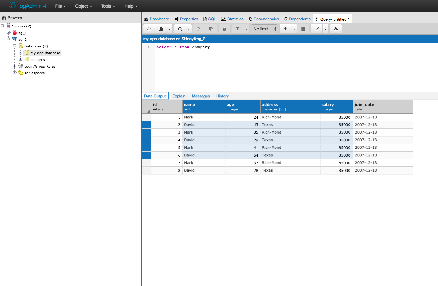
Currently, from a design perspective we are looking at:
- Removing the checkboxes and making the entire header work to highlight
- making the header for the query results dark grey (using a gray that exists in the application pallet)
- Make the selected cell blue and text white so that what is selected pops and is clear.
- differentiating header text so that field name is bold and datatype smaller text and not bold
- adding a triangle indicator for select all (top left corner)
Note the disputed gray has not been changed in this picture but will be.

--
Dave Page
Blog: http://pgsnake.blogspot.com
Twitter: @pgsnake
EnterpriseDB UK: http://www.enterprisedb.com
The Enterprise PostgreSQL Company
Вложения
В списке pgadmin-hackers по дате отправления:
