Обсуждение: pgAdmin4 - Tree view icons for final reveiw
Вложения
Hello Team,Here are the revised and final icons for tree view control.I have attached in .svg file format as well so that you can do zoom in view at any level.Please share your feedback on the same.Thanks and regards,Chethana KumarPrincipal UI/UX DesignerEnterpriseDB CorporationThe Postgres Database CompanyP: +91 86981 57146
Вложения
Hello Team,I have applied labels for each icon for identification purpose. So please consider this copy for your feedback.Note: The "icon_demo.png" is attached to show case the view on webpage.Regards,Chethana kumarOn Mon, Aug 21, 2017 at 3:57 PM, Chethana Kumar <chethana.kumar@enterprisedb.com> wrote:Hello Team,Here are the revised and final icons for tree view control.I have attached in .svg file format as well so that you can do zoom in view at any level.Please share your feedback on the same.Thanks and regards,Chethana KumarPrincipal UI/UX DesignerEnterpriseDB CorporationThe Postgres Database Company--Chethana KumarPrincipal UI/UX DesignerEnterpriseDB CorporationThe Postgres Database Company
Hi Chethana,I just thought of something with these icons. What happens with the ones that appear in dialog headers? In the blue bar?On Mon, Aug 21, 2017 at 8:31 AM Chethana Kumar <chethana.kumar@enterprisedb.com> wrote: Hello Team,I have applied labels for each icon for identification purpose. So please consider this copy for your feedback.Note: The "icon_demo.png" is attached to show case the view on webpage.Regards,Chethana kumarOn Mon, Aug 21, 2017 at 3:57 PM, Chethana Kumar <chethana.kumar@enterprisedb.com> wrote: Hello Team,Here are the revised and final icons for tree view control.I have attached in .svg file format as well so that you can do zoom in view at any level.Please share your feedback on the same.Thanks and regards,Chethana KumarPrincipal UI/UX DesignerEnterpriseDB CorporationThe Postgres Database Company--Chethana KumarPrincipal UI/UX DesignerEnterpriseDB CorporationThe Postgres Database Company
Yes Shirley, I have already thought through on it.Basically, we need to have one more set of icons in white color mode so that we can use it on dialog headers as well.As the blue theme icons won't fit there.Please share your thoughts.Regards,Chethana kumarOn Tue, Aug 22, 2017 at 4:32 AM, Shirley Wang <swang@pivotal.io> wrote:Hi Chethana,I just thought of something with these icons. What happens with the ones that appear in dialog headers? In the blue bar?On Mon, Aug 21, 2017 at 8:31 AM Chethana Kumar <chethana.kumar@enterprisedb.com> wrote: Hello Team,I have applied labels for each icon for identification purpose. So please consider this copy for your feedback.Note: The "icon_demo.png" is attached to show case the view on webpage.Regards,Chethana kumarOn Mon, Aug 21, 2017 at 3:57 PM, Chethana Kumar <chethana.kumar@enterprisedb.com> wrote: Hello Team,Here are the revised and final icons for tree view control.I have attached in .svg file format as well so that you can do zoom in view at any level.Please share your feedback on the same.Thanks and regards,Chethana KumarPrincipal UI/UX DesignerEnterpriseDB CorporationThe Postgres Database Company--Chethana KumarPrincipal UI/UX DesignerEnterpriseDB CorporationThe Postgres Database Company--Chethana KumarPrincipal UI/UX DesignerEnterpriseDB CorporationThe Postgres Database CompanyP: +91 86981 57146
Вложения
Hi Chethana,- The icons for Server node is missing, we will need given set of icons for server.1) Basic Server icon (Disconnect state)2) PG (Connected state)3) EPAS (Connected state)4) GreenPlum (Connected state)[Attaching current icons for PG & EPAS, I'm not sure about GreenPlum server icon.]- I'm not sure where we will use serverbad icon from 'tree_view_Icons.svg' file as it looks like server-group icon and not individual server.- Icon set for Schema & Catalog (both collection and individual) looks very similar to each other with minor colour difference, we have to look very carefully to identify them each.- Why do we require two different set of icons for Tables & Columns, I mean one for Schema and one for Catalog?- Icons for Partition node is same for collection and individual.- Icons for Event trigger node and Trigger node are very different from each other despite both are triggers.I know this is out of context but in my own opinion these icons have resemblance with Flat design where as rest of our application is in 2d design, for example buttons, dialogs etc.--On Tue, Aug 22, 2017 at 9:37 AM, Chethana Kumar <chethana.kumar@enterprisedb.com> wrote: Yes Shirley, I have already thought through on it.Basically, we need to have one more set of icons in white color mode so that we can use it on dialog headers as well.As the blue theme icons won't fit there.Please share your thoughts.Regards,Chethana kumarOn Tue, Aug 22, 2017 at 4:32 AM, Shirley Wang <swang@pivotal.io> wrote:Hi Chethana,I just thought of something with these icons. What happens with the ones that appear in dialog headers? In the blue bar?On Mon, Aug 21, 2017 at 8:31 AM Chethana Kumar <chethana.kumar@enterprisedb.com> wrote: Hello Team,I have applied labels for each icon for identification purpose. So please consider this copy for your feedback.Note: The "icon_demo.png" is attached to show case the view on webpage.Regards,Chethana kumarOn Mon, Aug 21, 2017 at 3:57 PM, Chethana Kumar <chethana.kumar@enterprisedb.com> wrote: Hello Team,Here are the revised and final icons for tree view control.I have attached in .svg file format as well so that you can do zoom in view at any level.Please share your feedback on the same.Thanks and regards,Chethana KumarPrincipal UI/UX DesignerEnterpriseDB CorporationThe Postgres Database Company--Chethana KumarPrincipal UI/UX DesignerEnterpriseDB CorporationThe Postgres Database Company--Chethana KumarPrincipal UI/UX DesignerEnterpriseDB CorporationThe Postgres Database CompanyP: +91 86981 57146
Вложения
Hi Chethana,The icons dimensions seem to vary in attached SVG. I have attached screenshot.Ideally, the icon(s) must fit(take full width/height) in the dimensions either it is 16x16 or 14x14. because we will not adjust the pixels for each icon.Can you please tell what are the dimensions for an icon we are going to use?Thanks,SurinderOn Tue, Aug 22, 2017 at 11:17 AM, Murtuza Zabuawala <murtuza.zabuawala@enterprisedb.com> wrote: Hi Chethana,- The icons for Server node is missing, we will need given set of icons for server.1) Basic Server icon (Disconnect state)2) PG (Connected state)3) EPAS (Connected state)4) GreenPlum (Connected state)[Attaching current icons for PG & EPAS, I'm not sure about GreenPlum server icon.]- I'm not sure where we will use serverbad icon from 'tree_view_Icons.svg' file as it looks like server-group icon and not individual server.- Icon set for Schema & Catalog (both collection and individual) looks very similar to each other with minor colour difference, we have to look very carefully to identify them each.- Why do we require two different set of icons for Tables & Columns, I mean one for Schema and one for Catalog?- Icons for Partition node is same for collection and individual.- Icons for Event trigger node and Trigger node are very different from each other despite both are triggers.I know this is out of context but in my own opinion these icons have resemblance with Flat design where as rest of our application is in 2d design, for example buttons, dialogs etc.--On Tue, Aug 22, 2017 at 9:37 AM, Chethana Kumar <chethana.kumar@enterprisedb.com> wrote: Yes Shirley, I have already thought through on it.Basically, we need to have one more set of icons in white color mode so that we can use it on dialog headers as well.As the blue theme icons won't fit there.Please share your thoughts.Regards,Chethana kumarOn Tue, Aug 22, 2017 at 4:32 AM, Shirley Wang <swang@pivotal.io> wrote:Hi Chethana,I just thought of something with these icons. What happens with the ones that appear in dialog headers? In the blue bar?On Mon, Aug 21, 2017 at 8:31 AM Chethana Kumar <chethana.kumar@enterprisedb.com> wrote: Hello Team,I have applied labels for each icon for identification purpose. So please consider this copy for your feedback.Note: The "icon_demo.png" is attached to show case the view on webpage.Regards,Chethana kumarOn Mon, Aug 21, 2017 at 3:57 PM, Chethana Kumar <chethana.kumar@enterprisedb.com> wrote: Hello Team,Here are the revised and final icons for tree view control.I have attached in .svg file format as well so that you can do zoom in view at any level.Please share your feedback on the same.Thanks and regards,Chethana KumarPrincipal UI/UX DesignerEnterpriseDB CorporationThe Postgres Database Company--Chethana KumarPrincipal UI/UX DesignerEnterpriseDB CorporationThe Postgres Database Company--Chethana KumarPrincipal UI/UX DesignerEnterpriseDB CorporationThe Postgres Database CompanyP: +91 86981 57146
Hi Chethana,- The icons for Server node is missing, we will need given set of icons for server.1) Basic Server icon (Disconnect state)2) PG (Connected state)3) EPAS (Connected state)4) GreenPlum (Connected state)[Attaching current icons for PG & EPAS, I'm not sure about GreenPlum server icon.]- I'm not sure where we will use serverbad icon from 'tree_view_Icons.svg' file as it looks like server-group icon and not individual server.
- Icon set for Schema & Catalog (both collection and individual) looks very similar to each other with minor colour difference, we have to look very carefully to identify them each.
- Why do we require two different set of icons for Tables & Columns, I mean one for Schema and one for Catalog?
- Icons for Partition node is same for collection and individual.
- Icons for Event trigger node and Trigger node are very different from each other despite both are triggers.
I know this is out of context but in my own opinion these icons have resemblance with Flat design where as rest of our application is in 2d design, for example buttons, dialogs etc.
--On Tue, Aug 22, 2017 at 9:37 AM, Chethana Kumar <chethana.kumar@enterprisedb.com> wrote: Yes Shirley, I have already thought through on it.Basically, we need to have one more set of icons in white color mode so that we can use it on dialog headers as well.As the blue theme icons won't fit there.Please share your thoughts.Regards,Chethana kumarOn Tue, Aug 22, 2017 at 4:32 AM, Shirley Wang <swang@pivotal.io> wrote:Hi Chethana,I just thought of something with these icons. What happens with the ones that appear in dialog headers? In the blue bar?On Mon, Aug 21, 2017 at 8:31 AM Chethana Kumar <chethana.kumar@enterprisedb.com> wrote: Hello Team,I have applied labels for each icon for identification purpose. So please consider this copy for your feedback.Note: The "icon_demo.png" is attached to show case the view on webpage.Regards,Chethana kumarOn Mon, Aug 21, 2017 at 3:57 PM, Chethana Kumar <chethana.kumar@enterprisedb.com> wrote: Hello Team,Here are the revised and final icons for tree view control.I have attached in .svg file format as well so that you can do zoom in view at any level.Please share your feedback on the same.Thanks and regards,Chethana KumarPrincipal UI/UX DesignerEnterpriseDB CorporationThe Postgres Database Company--Chethana KumarPrincipal UI/UX DesignerEnterpriseDB CorporationThe Postgres Database Company--Chethana KumarPrincipal UI/UX DesignerEnterpriseDB CorporationThe Postgres Database CompanyP: +91 86981 57146
Вложения
Hi Murtuza,Please see my reply inline along with the updated .svg file for tree view icons.On Tue, Aug 22, 2017 at 11:17 AM, Murtuza Zabuawala <murtuza.zabuawala@enterprisedb.com> wrote: Hi Chethana,- The icons for Server node is missing, we will need given set of icons for server.1) Basic Server icon (Disconnect state)2) PG (Connected state)3) EPAS (Connected state)4) GreenPlum (Connected state)[Attaching current icons for PG & EPAS, I'm not sure about GreenPlum server icon.]- I'm not sure where we will use serverbad icon from 'tree_view_Icons.svg' file as it looks like server-group icon and not individual server.The icon is there in the pgAdmin's icon folder and it is needed for the application
- Icon set for Schema & Catalog (both collection and individual) looks very similar to each other with minor colour difference, we have to look very carefully to identify them each.Agree with this point and come up with some updations on it. This time I have made it pretty differentiable between Schema and Catalog.- Why do we require two different set of icons for Tables & Columns, I mean one for Schema and one for Catalog?Agreed, I have kept single icon for tables and columns.- Icons for Partition node is same for collection and individual.Working on it- Icons for Event trigger node and Trigger node are very different from each other despite both are triggers.Agreed, done the changes accordingly.
I know this is out of context but in my own opinion these icons have resemblance with Flat design where as rest of our application is in 2d design, for example buttons, dialogs etc.Yes, the icons look and feel are more towards flat and stylish now as it represents the current trend. You treat this as a first step towards making the whole application flat design from the current design. But this will happen in a long run, not on a quick basis.--On Tue, Aug 22, 2017 at 9:37 AM, Chethana Kumar <chethana.kumar@enterprisedb.com> wrote: Yes Shirley, I have already thought through on it.Basically, we need to have one more set of icons in white color mode so that we can use it on dialog headers as well.As the blue theme icons won't fit there.Please share your thoughts.Regards,Chethana kumarOn Tue, Aug 22, 2017 at 4:32 AM, Shirley Wang <swang@pivotal.io> wrote:Hi Chethana,I just thought of something with these icons. What happens with the ones that appear in dialog headers? In the blue bar?On Mon, Aug 21, 2017 at 8:31 AM Chethana Kumar <chethana.kumar@enterprisedb.com> wrote: Hello Team,I have applied labels for each icon for identification purpose. So please consider this copy for your feedback.Note: The "icon_demo.png" is attached to show case the view on webpage.Regards,Chethana kumarOn Mon, Aug 21, 2017 at 3:57 PM, Chethana Kumar <chethana.kumar@enterprisedb.com> wrote: Hello Team,Here are the revised and final icons for tree view control.I have attached in .svg file format as well so that you can do zoom in view at any level.Please share your feedback on the same.Thanks and regards,Chethana KumarPrincipal UI/UX DesignerEnterpriseDB CorporationThe Postgres Database Company--Chethana KumarPrincipal UI/UX DesignerEnterpriseDB CorporationThe Postgres Database Company--Chethana KumarPrincipal UI/UX DesignerEnterpriseDB CorporationThe Postgres Database CompanyP: +91 86981 57146--Chethana KumarPrincipal UI/UX DesignerEnterpriseDB CorporationThe Postgres Database CompanyP: +91 86981 57146
On August 23, 2017 at 4:03:42 AM, Murtuza Zabuawala (murtuza.zabuawala@enterprisedb.com) wrote:
Hi Murtuza,Please see my reply inline along with the updated .svg file for tree view icons.On Tue, Aug 22, 2017 at 11:17 AM, Murtuza Zabuawala <murtuza.zabuawala@enterprisedb.com> wrote: Hi Chethana,- The icons for Server node is missing, we will need given set of icons for server.1) Basic Server icon (Disconnect state)2) PG (Connected state)3) EPAS (Connected state)4) GreenPlum (Connected state)[Attaching current icons for PG & EPAS, I'm not sure about GreenPlum server icon.]- I'm not sure where we will use serverbad icon from 'tree_view_Icons.svg' file as it looks like server-group icon and not individual server.The icon is there in the pgAdmin's icon folder and it is needed for the application
- Icon set for Schema & Catalog (both collection and individual) looks very similar to each other with minor colour difference, we have to look very carefully to identify them each.Agree with this point and come up with some updations on it. This time I have made it pretty differentiable between Schema and Catalog.- Why do we require two different set of icons for Tables & Columns, I mean one for Schema and one for Catalog?Agreed, I have kept single icon for tables and columns.- Icons for Partition node is same for collection and individual.Working on it- Icons for Event trigger node and Trigger node are very different from each other despite both are triggers.Agreed, done the changes accordingly.
I know this is out of context but in my own opinion these icons have resemblance with Flat design where as rest of our application is in 2d design, for example buttons, dialogs etc.Yes, the icons look and feel are more towards flat and stylish now as it represents the current trend. You treat this as a first step towards making the whole application flat design from the current design. But this will happen in a long run, not on a quick basis.--Regards,On Tue, Aug 22, 2017 at 9:37 AM, Chethana Kumar <chethana.kumar@enterprisedb.com> wrote: Yes Shirley, I have already thought through on it.Basically, we need to have one more set of icons in white color mode so that we can use it on dialog headers as well.As the blue theme icons won't fit there.Please share your thoughts.Regards,Chethana kumarOn Tue, Aug 22, 2017 at 4:32 AM, Shirley Wang <swang@pivotal.io> wrote:Hi Chethana,I just thought of something with these icons. What happens with the ones that appear in dialog headers? In the blue bar?On Mon, Aug 21, 2017 at 8:31 AM Chethana Kumar <chethana.kumar@enterprisedb.com> wrote: Hello Team,I have applied labels for each icon for identification purpose. So please consider this copy for your feedback.Note: The "icon_demo.png" is attached to show case the view on webpage.Regards,Chethana kumarOn Mon, Aug 21, 2017 at 3:57 PM, Chethana Kumar <chethana.kumar@enterprisedb.com> wrote: Hello Team,Here are the revised and final icons for tree view control.I have attached in .svg file format as well so that you can do zoom in view at any level.Please share your feedback on the same.Thanks and regards,Chethana KumarPrincipal UI/UX DesignerEnterpriseDB Corporation--Chethana KumarPrincipal UI/UX DesignerEnterpriseDB Corporation--Chethana KumarPrincipal UI/UX DesignerEnterpriseDB Corporation--Chethana KumarPrincipal UI/UX DesignerEnterpriseDB Corporation
Dave and all,Out of curiosity (because I’m writing a book that includes pgAdmin screen grabs), do you expect these icons to make it into your September release?Thanks,AnthonyOn August 23, 2017 at 4:03:42 AM, Murtuza Zabuawala (murtuza.zabuawala@
enterprisedb.com) wrote: Hi Chethana,On Wed, Aug 23, 2017 at 12:51 PM, Chethana Kumar <chethana.kumar@enterprisedb.com> wrote: Hi Murtuza,Please see my reply inline along with the updated .svg file for tree view icons.On Tue, Aug 22, 2017 at 11:17 AM, Murtuza Zabuawala <murtuza.zabuawala@enterprisedb.com> wrote: Hi Chethana,- The icons for Server node is missing, we will need given set of icons for server.1) Basic Server icon (Disconnect state)2) PG (Connected state)3) EPAS (Connected state)4) GreenPlum (Connected state)[Attaching current icons for PG & EPAS, I'm not sure about GreenPlum server icon.]- I'm not sure where we will use serverbad icon from 'tree_view_Icons.svg' file as it looks like server-group icon and not individual server.The icon is there in the pgAdmin's icon folder and it is needed for the applicationYes, we need serverbad icon which indicates the server in disconnect state but what we have on svg is same icon as server-group icon, we need icon for individual server.Something like this below which will differentiate individual server icon from server-group icon,
- Icon set for Schema & Catalog (both collection and individual) looks very similar to each other with minor colour difference, we have to look very carefully to identify them each.Agree with this point and come up with some updations on it. This time I have made it pretty differentiable between Schema and Catalog.- Why do we require two different set of icons for Tables & Columns, I mean one for Schema and one for Catalog?Agreed, I have kept single icon for tables and columns.- Icons for Partition node is same for collection and individual.Working on it- Icons for Event trigger node and Trigger node are very different from each other despite both are triggers.Agreed, done the changes accordingly.This is still different.Current Event trigger icon:NewEvent triggerIcon:
Current Trigger icon:New Trigger Icon:If you see both icons are same.[Suggestion: Can we do similar to what we have done with View & Materialized view icons, we have added M in the icon for materialized view, Same way we can have Trigger icon and for Event trigger we can add E in the icon]I know this is out of context but in my own opinion these icons have resemblance with Flat design where as rest of our application is in 2d design, for example buttons, dialogs etc.Yes, the icons look and feel are more towards flat and stylish now as it represents the current trend. You treat this as a first step towards making the whole application flat design from the current design. But this will happen in a long run, not on a quick basis.--Regards,On Tue, Aug 22, 2017 at 9:37 AM, Chethana Kumar <chethana.kumar@enterprisedb.com> wrote: Yes Shirley, I have already thought through on it.Basically, we need to have one more set of icons in white color mode so that we can use it on dialog headers as well.As the blue theme icons won't fit there.Please share your thoughts.Regards,Chethana kumarOn Tue, Aug 22, 2017 at 4:32 AM, Shirley Wang <swang@pivotal.io> wrote:Hi Chethana,I just thought of something with these icons. What happens with the ones that appear in dialog headers? In the blue bar?On Mon, Aug 21, 2017 at 8:31 AM Chethana Kumar <chethana.kumar@enterprisedb.com> wrote: Hello Team,I have applied labels for each icon for identification purpose. So please consider this copy for your feedback.Note: The "icon_demo.png" is attached to show case the view on webpage.Regards,Chethana kumarOn Mon, Aug 21, 2017 at 3:57 PM, Chethana Kumar <chethana.kumar@enterprisedb.com> wrote: Hello Team,Here are the revised and final icons for tree view control.I have attached in .svg file format as well so that you can do zoom in view at any level.Please share your feedback on the same.Thanks and regards,Chethana KumarPrincipal UI/UX DesignerEnterpriseDB Corporation--Chethana KumarPrincipal UI/UX DesignerEnterpriseDB Corporation--Chethana KumarPrincipal UI/UX DesignerEnterpriseDB Corporation--Chethana KumarPrincipal UI/UX DesignerEnterpriseDB Corporation
Blog: http://pgsnake.blogspot.com
Twitter: @pgsnake
EnterpriseDB UK: http://www.enterprisedb.com
The Enterprise PostgreSQL Company
HiYes, that's my expectation. Hopefully they'll go in in the next week or so.--On Fri, Aug 25, 2017 at 12:40 PM, Anthony DeBarros <adebarros@gmail.com> wrote:Dave and all,Out of curiosity (because I’m writing a book that includes pgAdmin screen grabs), do you expect these icons to make it into your September release?Thanks,AnthonyOn August 23, 2017 at 4:03:42 AM, Murtuza Zabuawala (murtuza.zabuawala@enterprised
b.com) wrote: Hi Chethana,On Wed, Aug 23, 2017 at 12:51 PM, Chethana Kumar <chethana.kumar@enterprisedb.com> wrote: Hi Murtuza,Please see my reply inline along with the updated .svg file for tree view icons.On Tue, Aug 22, 2017 at 11:17 AM, Murtuza Zabuawala <murtuza.zabuawala@enterprisedb.com> wrote: Hi Chethana,- The icons for Server node is missing, we will need given set of icons for server.1) Basic Server icon (Disconnect state)2) PG (Connected state)3) EPAS (Connected state)4) GreenPlum (Connected state)[Attaching current icons for PG & EPAS, I'm not sure about GreenPlum server icon.]- I'm not sure where we will use serverbad icon from 'tree_view_Icons.svg' file as it looks like server-group icon and not individual server.The icon is there in the pgAdmin's icon folder and it is needed for the applicationYes, we need serverbad icon which indicates the server in disconnect state but what we have on svg is same icon as server-group icon, we need icon for individual server.Something like this below which will differentiate individual server icon from server-group icon,
- Icon set for Schema & Catalog (both collection and individual) looks very similar to each other with minor colour difference, we have to look very carefully to identify them each.Agree with this point and come up with some updations on it. This time I have made it pretty differentiable between Schema and Catalog.- Why do we require two different set of icons for Tables & Columns, I mean one for Schema and one for Catalog?Agreed, I have kept single icon for tables and columns.- Icons for Partition node is same for collection and individual.Working on it- Icons for Event trigger node and Trigger node are very different from each other despite both are triggers.Agreed, done the changes accordingly.This is still different.Current Event trigger icon:NewEvent triggerIcon:
Current Trigger icon:New Trigger Icon:If you see both icons are same.[Suggestion: Can we do similar to what we have done with View & Materialized view icons, we have added M in the icon for materialized view, Same way we can have Trigger icon and for Event trigger we can add E in the icon]I know this is out of context but in my own opinion these icons have resemblance with Flat design where as rest of our application is in 2d design, for example buttons, dialogs etc.Yes, the icons look and feel are more towards flat and stylish now as it represents the current trend. You treat this as a first step towards making the whole application flat design from the current design. But this will happen in a long run, not on a quick basis.--Regards,On Tue, Aug 22, 2017 at 9:37 AM, Chethana Kumar <chethana.kumar@enterprisedb.com> wrote: Yes Shirley, I have already thought through on it.Basically, we need to have one more set of icons in white color mode so that we can use it on dialog headers as well.As the blue theme icons won't fit there.Please share your thoughts.Regards,Chethana kumarOn Tue, Aug 22, 2017 at 4:32 AM, Shirley Wang <swang@pivotal.io> wrote:Hi Chethana,I just thought of something with these icons. What happens with the ones that appear in dialog headers? In the blue bar?On Mon, Aug 21, 2017 at 8:31 AM Chethana Kumar <chethana.kumar@enterprisedb.com> wrote: Hello Team,I have applied labels for each icon for identification purpose. So please consider this copy for your feedback.Note: The "icon_demo.png" is attached to show case the view on webpage.Regards,Chethana kumarOn Mon, Aug 21, 2017 at 3:57 PM, Chethana Kumar <chethana.kumar@enterprisedb.com> wrote: Hello Team,Here are the revised and final icons for tree view control.I have attached in .svg file format as well so that you can do zoom in view at any level.Please share your feedback on the same.Thanks and regards,Chethana KumarPrincipal UI/UX DesignerEnterpriseDB Corporation--Chethana KumarPrincipal UI/UX DesignerEnterpriseDB Corporation--Chethana KumarPrincipal UI/UX DesignerEnterpriseDB Corporation--Chethana KumarPrincipal UI/UX DesignerEnterpriseDB CorporationDave Page
Blog: http://pgsnake.blogspot.com
Twitter: @pgsnake
EnterpriseDB UK: http://www.enterprisedb.com
The Enterprise PostgreSQL Company


Вложения
Hi Dave,As far as I know, we replaced png icons with svg icons because - it should work with all types of resolutions. The svg icon should not blur.Here in my Linux system, I am using 1440*900(16:10) resolution and most of the svg icons are blurred. Please find attach screenshot.Thoughts ?Thanks,Neel PatelOn Fri, Aug 25, 2017 at 5:14 PM, Dave Page <dpage@pgadmin.org> wrote:HiYes, that's my expectation. Hopefully they'll go in in the next week or so.--On Fri, Aug 25, 2017 at 12:40 PM, Anthony DeBarros <adebarros@gmail.com> wrote:Dave and all,Out of curiosity (because I’m writing a book that includes pgAdmin screen grabs), do you expect these icons to make it into your September release?Thanks,AnthonyOn August 23, 2017 at 4:03:42 AM, Murtuza Zabuawala (murtuza.zabuawala@enterprised
b.com) wrote: Hi Chethana,On Wed, Aug 23, 2017 at 12:51 PM, Chethana Kumar <chethana.kumar@enterprisedb.com> wrote: Hi Murtuza,Please see my reply inline along with the updated .svg file for tree view icons.On Tue, Aug 22, 2017 at 11:17 AM, Murtuza Zabuawala <murtuza.zabuawala@enterprisedb.com> wrote: Hi Chethana,- The icons for Server node is missing, we will need given set of icons for server.1) Basic Server icon (Disconnect state)2) PG (Connected state)3) EPAS (Connected state)4) GreenPlum (Connected state)[Attaching current icons for PG & EPAS, I'm not sure about GreenPlum server icon.]- I'm not sure where we will use serverbad icon from 'tree_view_Icons.svg' file as it looks like server-group icon and not individual server.The icon is there in the pgAdmin's icon folder and it is needed for the applicationYes, we need serverbad icon which indicates the server in disconnect state but what we have on svg is same icon as server-group icon, we need icon for individual server.Something like this below which will differentiate individual server icon from server-group icon,
- Icon set for Schema & Catalog (both collection and individual) looks very similar to each other with minor colour difference, we have to look very carefully to identify them each.Agree with this point and come up with some updations on it. This time I have made it pretty differentiable between Schema and Catalog.- Why do we require two different set of icons for Tables & Columns, I mean one for Schema and one for Catalog?Agreed, I have kept single icon for tables and columns.- Icons for Partition node is same for collection and individual.Working on it- Icons for Event trigger node and Trigger node are very different from each other despite both are triggers.Agreed, done the changes accordingly.This is still different.Current Event trigger icon:NewEvent triggerIcon:
Current Trigger icon:New Trigger Icon:If you see both icons are same.[Suggestion: Can we do similar to what we have done with View & Materialized view icons, we have added M in the icon for materialized view, Same way we can have Trigger icon and for Event trigger we can add E in the icon]I know this is out of context but in my own opinion these icons have resemblance with Flat design where as rest of our application is in 2d design, for example buttons, dialogs etc.Yes, the icons look and feel are more towards flat and stylish now as it represents the current trend. You treat this as a first step towards making the whole application flat design from the current design. But this will happen in a long run, not on a quick basis.--Regards,On Tue, Aug 22, 2017 at 9:37 AM, Chethana Kumar <chethana.kumar@enterprisedb.com> wrote: Yes Shirley, I have already thought through on it.Basically, we need to have one more set of icons in white color mode so that we can use it on dialog headers as well.As the blue theme icons won't fit there.Please share your thoughts.Regards,Chethana kumarOn Tue, Aug 22, 2017 at 4:32 AM, Shirley Wang <swang@pivotal.io> wrote:Hi Chethana,I just thought of something with these icons. What happens with the ones that appear in dialog headers? In the blue bar?On Mon, Aug 21, 2017 at 8:31 AM Chethana Kumar <chethana.kumar@enterprisedb.com> wrote: Hello Team,I have applied labels for each icon for identification purpose. So please consider this copy for your feedback.Note: The "icon_demo.png" is attached to show case the view on webpage.Regards,Chethana kumarOn Mon, Aug 21, 2017 at 3:57 PM, Chethana Kumar <chethana.kumar@enterprisedb.com> wrote: Hello Team,Here are the revised and final icons for tree view control.I have attached in .svg file format as well so that you can do zoom in view at any level.Please share your feedback on the same.Thanks and regards,Chethana KumarPrincipal UI/UX DesignerEnterpriseDB Corporation--Chethana KumarPrincipal UI/UX DesignerEnterpriseDB Corporation--Chethana KumarPrincipal UI/UX DesignerEnterpriseDB Corporation--Chethana KumarPrincipal UI/UX DesignerEnterpriseDB CorporationDave Page
Blog: http://pgsnake.blogspot.com
Twitter: @pgsnake
EnterpriseDB UK: http://www.enterprisedb.com
The Enterprise PostgreSQL Company


Вложения
Hello,I also observed few issues,1) In my opinion, New icons looks dull in main header menu due to dark background, attaching screenshot for your reference.2) Spacing issue between icons and label are inconsistent, attaching screenshot for your reference.3) Icons with blue colour in them are not properly visible in context menu. For example "Trigger" icon is not visible when we hover over it because of same colour, attaching screenshot for your reference.4) Are we considering different icons for Event triggers & Triggers? (They were same in pgAdmin3)5) Icons for Casts modules are same, I mean collection icon and node icon, I think we need different icons to differentiate.6) The width of bad-server-icon is more when compare with other icons, that makes it looks like a text document icon.--Regards,On Mon, Sep 11, 2017 at 12:58 PM, Neel Patel <neel.patel@enterprisedb.com> wrote:Hi Dave,As far as I know, we replaced png icons with svg icons because - it should work with all types of resolutions. The svg icon should not blur.Here in my Linux system, I am using 1440*900(16:10) resolution and most of the svg icons are blurred. Please find attach screenshot.Thoughts ?Thanks,Neel PatelOn Fri, Aug 25, 2017 at 5:14 PM, Dave Page <dpage@pgadmin.org> wrote:HiYes, that's my expectation. Hopefully they'll go in in the next week or so.--On Fri, Aug 25, 2017 at 12:40 PM, Anthony DeBarros <adebarros@gmail.com> wrote:Dave and all,Out of curiosity (because I’m writing a book that includes pgAdmin screen grabs), do you expect these icons to make it into your September release?Thanks,AnthonyOn August 23, 2017 at 4:03:42 AM, Murtuza Zabuawala (murtuza.zabuawala@enterprised
b.com) wrote: Hi Chethana,On Wed, Aug 23, 2017 at 12:51 PM, Chethana Kumar <chethana.kumar@enterprisedb.com> wrote: Hi Murtuza,Please see my reply inline along with the updated .svg file for tree view icons.On Tue, Aug 22, 2017 at 11:17 AM, Murtuza Zabuawala <murtuza.zabuawala@enterprisedb.com> wrote: Hi Chethana,- The icons for Server node is missing, we will need given set of icons for server.1) Basic Server icon (Disconnect state)2) PG (Connected state)3) EPAS (Connected state)4) GreenPlum (Connected state)[Attaching current icons for PG & EPAS, I'm not sure about GreenPlum server icon.]- I'm not sure where we will use serverbad icon from 'tree_view_Icons.svg' file as it looks like server-group icon and not individual server.The icon is there in the pgAdmin's icon folder and it is needed for the applicationYes, we need serverbad icon which indicates the server in disconnect state but what we have on svg is same icon as server-group icon, we need icon for individual server.Something like this below which will differentiate individual server icon from server-group icon,- Icon set for Schema & Catalog (both collection and individual) looks very similar to each other with minor colour difference, we have to look very carefully to identify them each.Agree with this point and come up with some updations on it. This time I have made it pretty differentiable between Schema and Catalog.- Why do we require two different set of icons for Tables & Columns, I mean one for Schema and one for Catalog?Agreed, I have kept single icon for tables and columns.- Icons for Partition node is same for collection and individual.Working on it- Icons for Event trigger node and Trigger node are very different from each other despite both are triggers.Agreed, done the changes accordingly.This is still different.Current Event trigger icon:NewEvent triggerIcon:Current Trigger icon:New Trigger Icon:If you see both icons are same.[Suggestion: Can we do similar to what we have done with View & Materialized view icons, we have added M in the icon for materialized view, Same way we can have Trigger icon and for Event trigger we can add E in the icon]I know this is out of context but in my own opinion these icons have resemblance with Flat design where as rest of our application is in 2d design, for example buttons, dialogs etc.Yes, the icons look and feel are more towards flat and stylish now as it represents the current trend. You treat this as a first step towards making the whole application flat design from the current design. But this will happen in a long run, not on a quick basis.--Regards,On Tue, Aug 22, 2017 at 9:37 AM, Chethana Kumar <chethana.kumar@enterprisedb.com> wrote: Yes Shirley, I have already thought through on it.Basically, we need to have one more set of icons in white color mode so that we can use it on dialog headers as well.As the blue theme icons won't fit there.Please share your thoughts.Regards,Chethana kumarOn Tue, Aug 22, 2017 at 4:32 AM, Shirley Wang <swang@pivotal.io> wrote:Hi Chethana,I just thought of something with these icons. What happens with the ones that appear in dialog headers? In the blue bar?On Mon, Aug 21, 2017 at 8:31 AM Chethana Kumar <chethana.kumar@enterprisedb.com> wrote: Hello Team,I have applied labels for each icon for identification purpose. So please consider this copy for your feedback.Note: The "icon_demo.png" is attached to show case the view on webpage.Regards,Chethana kumarOn Mon, Aug 21, 2017 at 3:57 PM, Chethana Kumar <chethana.kumar@enterprisedb.com> wrote: Hello Team,Here are the revised and final icons for tree view control.I have attached in .svg file format as well so that you can do zoom in view at any level.Please share your feedback on the same.Thanks and regards,Chethana KumarPrincipal UI/UX DesignerEnterpriseDB Corporation--Chethana KumarPrincipal UI/UX DesignerEnterpriseDB Corporation--Chethana KumarPrincipal UI/UX DesignerEnterpriseDB Corporation--Chethana KumarPrincipal UI/UX DesignerEnterpriseDB CorporationDave Page
Blog: http://pgsnake.blogspot.com
Twitter: @pgsnake
EnterpriseDB UK: http://www.enterprisedb.com
The Enterprise PostgreSQL Company
Blog: http://pgsnake.blogspot.com
Twitter: @pgsnake
EnterpriseDB UK: http://www.enterprisedb.com
The Enterprise PostgreSQL Company
Agreed - these issues need to be resolved before we can proceed.Ashesh, please revert the patch for now.Chethana, please figure out what we need to change to resolve the various issues raised. Iirc, we'd already decided to remove icons from the menus right?On Mon, Sep 11, 2017 at 8:45 AM, Murtuza Zabuawala <murtuza.zabuawala@enterprisedb.com> wrote: Hello,I also observed few issues,1) In my opinion, New icons looks dull in main header menu due to dark background, attaching screenshot for your reference.2) Spacing issue between icons and label are inconsistent, attaching screenshot for your reference.3) Icons with blue colour in them are not properly visible in context menu. For example "Trigger" icon is not visible when we hover over it because of same colour, attaching screenshot for your reference.4) Are we considering different icons for Event triggers & Triggers? (They were same in pgAdmin3)5) Icons for Casts modules are same, I mean collection icon and node icon, I think we need different icons to differentiate.6) The width of bad-server-icon is more when compare with other icons, that makes it looks like a text document icon.--Regards,On Mon, Sep 11, 2017 at 12:58 PM, Neel Patel <neel.patel@enterprisedb.com> wrote:Hi Dave,As far as I know, we replaced png icons with svg icons because - it should work with all types of resolutions. The svg icon should not blur.Here in my Linux system, I am using 1440*900(16:10) resolution and most of the svg icons are blurred. Please find attach screenshot.Thoughts ?Thanks,Neel PatelOn Fri, Aug 25, 2017 at 5:14 PM, Dave Page <dpage@pgadmin.org> wrote:HiYes, that's my expectation. Hopefully they'll go in in the next week or so.--On Fri, Aug 25, 2017 at 12:40 PM, Anthony DeBarros <adebarros@gmail.com> wrote:Dave and all,Out of curiosity (because I’m writing a book that includes pgAdmin screen grabs), do you expect these icons to make it into your September release?Thanks,AnthonyOn August 23, 2017 at 4:03:42 AM, Murtuza Zabuawala (murtuza.zabuawala@enterprised
b.com) wrote: Hi Chethana,On Wed, Aug 23, 2017 at 12:51 PM, Chethana Kumar <chethana.kumar@enterprisedb.com> wrote: Hi Murtuza,Please see my reply inline along with the updated .svg file for tree view icons.On Tue, Aug 22, 2017 at 11:17 AM, Murtuza Zabuawala <murtuza.zabuawala@enterprisedb.com> wrote: Hi Chethana,- The icons for Server node is missing, we will need given set of icons for server.1) Basic Server icon (Disconnect state)2) PG (Connected state)3) EPAS (Connected state)4) GreenPlum (Connected state)[Attaching current icons for PG & EPAS, I'm not sure about GreenPlum server icon.]- I'm not sure where we will use serverbad icon from 'tree_view_Icons.svg' file as it looks like server-group icon and not individual server.The icon is there in the pgAdmin's icon folder and it is needed for the applicationYes, we need serverbad icon which indicates the server in disconnect state but what we have on svg is same icon as server-group icon, we need icon for individual server.Something like this below which will differentiate individual server icon from server-group icon,- Icon set for Schema & Catalog (both collection and individual) looks very similar to each other with minor colour difference, we have to look very carefully to identify them each.Agree with this point and come up with some updations on it. This time I have made it pretty differentiable between Schema and Catalog.- Why do we require two different set of icons for Tables & Columns, I mean one for Schema and one for Catalog?Agreed, I have kept single icon for tables and columns.- Icons for Partition node is same for collection and individual.Working on it- Icons for Event trigger node and Trigger node are very different from each other despite both are triggers.Agreed, done the changes accordingly.This is still different.Current Event trigger icon:NewEvent triggerIcon:Current Trigger icon:New Trigger Icon:If you see both icons are same.[Suggestion: Can we do similar to what we have done with View & Materialized view icons, we have added M in the icon for materialized view, Same way we can have Trigger icon and for Event trigger we can add E in the icon]I know this is out of context but in my own opinion these icons have resemblance with Flat design where as rest of our application is in 2d design, for example buttons, dialogs etc.Yes, the icons look and feel are more towards flat and stylish now as it represents the current trend. You treat this as a first step towards making the whole application flat design from the current design. But this will happen in a long run, not on a quick basis.--Regards,On Tue, Aug 22, 2017 at 9:37 AM, Chethana Kumar <chethana.kumar@enterprisedb.com> wrote: Yes Shirley, I have already thought through on it.Basically, we need to have one more set of icons in white color mode so that we can use it on dialog headers as well.As the blue theme icons won't fit there.Please share your thoughts.Regards,Chethana kumarOn Tue, Aug 22, 2017 at 4:32 AM, Shirley Wang <swang@pivotal.io> wrote:Hi Chethana,I just thought of something with these icons. What happens with the ones that appear in dialog headers? In the blue bar?On Mon, Aug 21, 2017 at 8:31 AM Chethana Kumar <chethana.kumar@enterprisedb.com> wrote: Hello Team,I have applied labels for each icon for identification purpose. So please consider this copy for your feedback.Note: The "icon_demo.png" is attached to show case the view on webpage.Regards,Chethana kumarOn Mon, Aug 21, 2017 at 3:57 PM, Chethana Kumar <chethana.kumar@enterprisedb.com> wrote: Hello Team,Here are the revised and final icons for tree view control.I have attached in .svg file format as well so that you can do zoom in view at any level.Please share your feedback on the same.Thanks and regards,Chethana KumarPrincipal UI/UX DesignerEnterpriseDB Corporation--Chethana KumarPrincipal UI/UX DesignerEnterpriseDB Corporation--Chethana KumarPrincipal UI/UX DesignerEnterpriseDB Corporation--Chethana KumarPrincipal UI/UX DesignerEnterpriseDB CorporationDave Page
Blog: http://pgsnake.blogspot.com
Twitter: @pgsnake
EnterpriseDB UK: http://www.enterprisedb.com
The Enterprise PostgreSQL Company--Dave Page
Blog: http://pgsnake.blogspot.com
Twitter: @pgsnake
EnterpriseDB UK: http://www.enterprisedb.com
The Enterprise PostgreSQL Company
Blog: http://pgsnake.blogspot.com
Twitter: @pgsnake
EnterpriseDB UK: http://www.enterprisedb.com
The Enterprise PostgreSQL Company
Hmm, scrub the revert - it looks like you just fixed a bunch of the issues.
The main thing I think that remains as an issue is the colouring on the headers and menus - the former of which needs fixing somehow, the latter we were going to remove to de-clutter the UI anyway.
On Mon, Sep 11, 2017 at 8:50 AM, Dave Page <dpage@pgadmin.org> wrote:Agreed - these issues need to be resolved before we can proceed.Ashesh, please revert the patch for now.Chethana, please figure out what we need to change to resolve the various issues raised. Iirc, we'd already decided to remove icons from the menus right?On Mon, Sep 11, 2017 at 8:45 AM, Murtuza Zabuawala <murtuza.zabuawala@enterprisedb.com> wrote: Hello,I also observed few issues,1) In my opinion, New icons looks dull in main header menu due to dark background, attaching screenshot for your reference.2) Spacing issue between icons and label are inconsistent, attaching screenshot for your reference.3) Icons with blue colour in them are not properly visible in context menu. For example "Trigger" icon is not visible when we hover over it because of same colour, attaching screenshot for your reference.4) Are we considering different icons for Event triggers & Triggers? (They were same in pgAdmin3)5) Icons for Casts modules are same, I mean collection icon and node icon, I think we need different icons to differentiate.6) The width of bad-server-icon is more when compare with other icons, that makes it looks like a text document icon.--Regards,On Mon, Sep 11, 2017 at 12:58 PM, Neel Patel <neel.patel@enterprisedb.com> wrote:Hi Dave,As far as I know, we replaced png icons with svg icons because - it should work with all types of resolutions. The svg icon should not blur.Here in my Linux system, I am using 1440*900(16:10) resolution and most of the svg icons are blurred. Please find attach screenshot.Thoughts ?Thanks,Neel PatelOn Fri, Aug 25, 2017 at 5:14 PM, Dave Page <dpage@pgadmin.org> wrote:HiYes, that's my expectation. Hopefully they'll go in in the next week or so.--On Fri, Aug 25, 2017 at 12:40 PM, Anthony DeBarros <adebarros@gmail.com> wrote:Dave and all,Out of curiosity (because I’m writing a book that includes pgAdmin screen grabs), do you expect these icons to make it into your September release?Thanks,AnthonyOn August 23, 2017 at 4:03:42 AM, Murtuza Zabuawala (murtuza.zabuawala@enterprised
b.com) wrote: Hi Chethana,On Wed, Aug 23, 2017 at 12:51 PM, Chethana Kumar <chethana.kumar@enterprisedb.com> wrote: Hi Murtuza,Please see my reply inline along with the updated .svg file for tree view icons.On Tue, Aug 22, 2017 at 11:17 AM, Murtuza Zabuawala <murtuza.zabuawala@enterprisedb.com> wrote: Hi Chethana,- The icons for Server node is missing, we will need given set of icons for server.1) Basic Server icon (Disconnect state)2) PG (Connected state)3) EPAS (Connected state)4) GreenPlum (Connected state)[Attaching current icons for PG & EPAS, I'm not sure about GreenPlum server icon.]- I'm not sure where we will use serverbad icon from 'tree_view_Icons.svg' file as it looks like server-group icon and not individual server.The icon is there in the pgAdmin's icon folder and it is needed for the applicationYes, we need serverbad icon which indicates the server in disconnect state but what we have on svg is same icon as server-group icon, we need icon for individual server.Something like this below which will differentiate individual server icon from server-group icon,- Icon set for Schema & Catalog (both collection and individual) looks very similar to each other with minor colour difference, we have to look very carefully to identify them each.Agree with this point and come up with some updations on it. This time I have made it pretty differentiable between Schema and Catalog.- Why do we require two different set of icons for Tables & Columns, I mean one for Schema and one for Catalog?Agreed, I have kept single icon for tables and columns.- Icons for Partition node is same for collection and individual.Working on it- Icons for Event trigger node and Trigger node are very different from each other despite both are triggers.Agreed, done the changes accordingly.This is still different.Current Event trigger icon:NewEvent triggerIcon:Current Trigger icon:New Trigger Icon:If you see both icons are same.[Suggestion: Can we do similar to what we have done with View & Materialized view icons, we have added M in the icon for materialized view, Same way we can have Trigger icon and for Event trigger we can add E in the icon]I know this is out of context but in my own opinion these icons have resemblance with Flat design where as rest of our application is in 2d design, for example buttons, dialogs etc.Yes, the icons look and feel are more towards flat and stylish now as it represents the current trend. You treat this as a first step towards making the whole application flat design from the current design. But this will happen in a long run, not on a quick basis.--Regards,On Tue, Aug 22, 2017 at 9:37 AM, Chethana Kumar <chethana.kumar@enterprisedb.com> wrote: Yes Shirley, I have already thought through on it.Basically, we need to have one more set of icons in white color mode so that we can use it on dialog headers as well.As the blue theme icons won't fit there.Please share your thoughts.Regards,Chethana kumarOn Tue, Aug 22, 2017 at 4:32 AM, Shirley Wang <swang@pivotal.io> wrote:Hi Chethana,I just thought of something with these icons. What happens with the ones that appear in dialog headers? In the blue bar?On Mon, Aug 21, 2017 at 8:31 AM Chethana Kumar <chethana.kumar@enterprisedb.com> wrote: Hello Team,I have applied labels for each icon for identification purpose. So please consider this copy for your feedback.Note: The "icon_demo.png" is attached to show case the view on webpage.Regards,Chethana kumarOn Mon, Aug 21, 2017 at 3:57 PM, Chethana Kumar <chethana.kumar@enterprisedb.com> wrote: Hello Team,Here are the revised and final icons for tree view control.I have attached in .svg file format as well so that you can do zoom in view at any level.Please share your feedback on the same.Thanks and regards,Chethana KumarPrincipal UI/UX DesignerEnterpriseDB Corporation--Chethana KumarPrincipal UI/UX DesignerEnterpriseDB Corporation--Chethana KumarPrincipal UI/UX DesignerEnterpriseDB Corporation--Chethana KumarPrincipal UI/UX DesignerEnterpriseDB CorporationDave Page
Blog: http://pgsnake.blogspot.com
Twitter: @pgsnake
EnterpriseDB UK: http://www.enterprisedb.com
The Enterprise PostgreSQL Company--Dave Page
Blog: http://pgsnake.blogspot.com
Twitter: @pgsnake
EnterpriseDB UK: http://www.enterprisedb.com
The Enterprise PostgreSQL Company--Dave Page
Blog: http://pgsnake.blogspot.com
Twitter: @pgsnake
EnterpriseDB UK: http://www.enterprisedb.com
The Enterprise PostgreSQL Company
On Mon, Sep 11, 2017 at 1:25 PM, Dave Page <dpage@pgadmin.org> wrote:Hmm, scrub the revert - it looks like you just fixed a bunch of the issues.K.The main thing I think that remains as an issue is the colouring on the headers and menus - the former of which needs fixing somehow, the latter we were going to remove to de-clutter the UI anyway.I can remove the icons from the context menus, and menus in 10 mins (if you want).
-- Thanks, AsheshOn Mon, Sep 11, 2017 at 8:50 AM, Dave Page <dpage@pgadmin.org> wrote:Agreed - these issues need to be resolved before we can proceed.Ashesh, please revert the patch for now.Chethana, please figure out what we need to change to resolve the various issues raised. Iirc, we'd already decided to remove icons from the menus right?On Mon, Sep 11, 2017 at 8:45 AM, Murtuza Zabuawala <murtuza.zabuawala@enterprisedb.com> wrote: Hello,I also observed few issues,1) In my opinion, New icons looks dull in main header menu due to dark background, attaching screenshot for your reference.2) Spacing issue between icons and label are inconsistent, attaching screenshot for your reference.3) Icons with blue colour in them are not properly visible in context menu. For example "Trigger" icon is not visible when we hover over it because of same colour, attaching screenshot for your reference.4) Are we considering different icons for Event triggers & Triggers? (They were same in pgAdmin3)5) Icons for Casts modules are same, I mean collection icon and node icon, I think we need different icons to differentiate.6) The width of bad-server-icon is more when compare with other icons, that makes it looks like a text document icon.--Regards,On Mon, Sep 11, 2017 at 12:58 PM, Neel Patel <neel.patel@enterprisedb.com> wrote:Hi Dave,As far as I know, we replaced png icons with svg icons because - it should work with all types of resolutions. The svg icon should not blur.Here in my Linux system, I am using 1440*900(16:10) resolution and most of the svg icons are blurred. Please find attach screenshot.Thoughts ?Thanks,Neel PatelOn Fri, Aug 25, 2017 at 5:14 PM, Dave Page <dpage@pgadmin.org> wrote:HiYes, that's my expectation. Hopefully they'll go in in the next week or so.--On Fri, Aug 25, 2017 at 12:40 PM, Anthony DeBarros <adebarros@gmail.com> wrote:Dave and all,Out of curiosity (because I’m writing a book that includes pgAdmin screen grabs), do you expect these icons to make it into your September release?Thanks,AnthonyOn August 23, 2017 at 4:03:42 AM, Murtuza Zabuawala (murtuza.zabuawala@enterprised
b.com) wrote: Hi Chethana,On Wed, Aug 23, 2017 at 12:51 PM, Chethana Kumar <chethana.kumar@enterprisedb.com> wrote: Hi Murtuza,Please see my reply inline along with the updated .svg file for tree view icons.On Tue, Aug 22, 2017 at 11:17 AM, Murtuza Zabuawala <murtuza.zabuawala@enterprisedb.com> wrote: Hi Chethana,- The icons for Server node is missing, we will need given set of icons for server.1) Basic Server icon (Disconnect state)2) PG (Connected state)3) EPAS (Connected state)4) GreenPlum (Connected state)[Attaching current icons for PG & EPAS, I'm not sure about GreenPlum server icon.]- I'm not sure where we will use serverbad icon from 'tree_view_Icons.svg' file as it looks like server-group icon and not individual server.The icon is there in the pgAdmin's icon folder and it is needed for the applicationYes, we need serverbad icon which indicates the server in disconnect state but what we have on svg is same icon as server-group icon, we need icon for individual server.Something like this below which will differentiate individual server icon from server-group icon,- Icon set for Schema & Catalog (both collection and individual) looks very similar to each other with minor colour difference, we have to look very carefully to identify them each.Agree with this point and come up with some updations on it. This time I have made it pretty differentiable between Schema and Catalog.- Why do we require two different set of icons for Tables & Columns, I mean one for Schema and one for Catalog?Agreed, I have kept single icon for tables and columns.- Icons for Partition node is same for collection and individual.Working on it- Icons for Event trigger node and Trigger node are very different from each other despite both are triggers.Agreed, done the changes accordingly.This is still different.Current Event trigger icon:NewEvent triggerIcon:Current Trigger icon:New Trigger Icon:If you see both icons are same.[Suggestion: Can we do similar to what we have done with View & Materialized view icons, we have added M in the icon for materialized view, Same way we can have Trigger icon and for Event trigger we can add E in the icon]I know this is out of context but in my own opinion these icons have resemblance with Flat design where as rest of our application is in 2d design, for example buttons, dialogs etc.Yes, the icons look and feel are more towards flat and stylish now as it represents the current trend. You treat this as a first step towards making the whole application flat design from the current design. But this will happen in a long run, not on a quick basis.--Regards,On Tue, Aug 22, 2017 at 9:37 AM, Chethana Kumar <chethana.kumar@enterprisedb.com> wrote: Yes Shirley, I have already thought through on it.Basically, we need to have one more set of icons in white color mode so that we can use it on dialog headers as well.As the blue theme icons won't fit there.Please share your thoughts.Regards,Chethana kumarOn Tue, Aug 22, 2017 at 4:32 AM, Shirley Wang <swang@pivotal.io> wrote:Hi Chethana,I just thought of something with these icons. What happens with the ones that appear in dialog headers? In the blue bar?On Mon, Aug 21, 2017 at 8:31 AM Chethana Kumar <chethana.kumar@enterprisedb.com> wrote: Hello Team,I have applied labels for each icon for identification purpose. So please consider this copy for your feedback.Note: The "icon_demo.png" is attached to show case the view on webpage.Regards,Chethana kumarOn Mon, Aug 21, 2017 at 3:57 PM, Chethana Kumar <chethana.kumar@enterprisedb.com> wrote: Hello Team,Here are the revised and final icons for tree view control.I have attached in .svg file format as well so that you can do zoom in view at any level.Please share your feedback on the same.Thanks and regards,Chethana KumarPrincipal UI/UX DesignerEnterpriseDB Corporation--Chethana KumarPrincipal UI/UX DesignerEnterpriseDB Corporation--Chethana KumarPrincipal UI/UX DesignerEnterpriseDB Corporation--Chethana KumarPrincipal UI/UX DesignerEnterpriseDB CorporationDave Page
Blog: http://pgsnake.blogspot.com
Twitter: @pgsnake
EnterpriseDB UK: http://www.enterprisedb.com
The Enterprise PostgreSQL Company--Dave Page
Blog: http://pgsnake.blogspot.com
Twitter: @pgsnake
EnterpriseDB UK: http://www.enterprisedb.com
The Enterprise PostgreSQL Company--Dave Page
Blog: http://pgsnake.blogspot.com
Twitter: @pgsnake
EnterpriseDB UK: http://www.enterprisedb.com
The Enterprise PostgreSQL Company
Blog: http://pgsnake.blogspot.com
Twitter: @pgsnake
EnterpriseDB UK: http://www.enterprisedb.com
The Enterprise PostgreSQL Company
Agreed - these issues need to be resolved before we can proceed.Ashesh, please revert the patch for now.Chethana, please figure out what we need to change to resolve the various issues raised. Iirc, we'd already decided to remove icons from the menus right?On Mon, Sep 11, 2017 at 8:45 AM, Murtuza Zabuawala <murtuza.zabuawala@enterprisedb.com> wrote: Hello,I also observed few issues,1) In my opinion, New icons looks dull in main header menu due to dark background, attaching screenshot for your reference.2) Spacing issue between icons and label are inconsistent, attaching screenshot for your reference.3) Icons with blue colour in them are not properly visible in context menu. For example "Trigger" icon is not visible when we hover over it because of same colour, attaching screenshot for your reference.4) Are we considering different icons for Event triggers & Triggers? (They were same in pgAdmin3)5) Icons for Casts modules are same, I mean collection icon and node icon, I think we need different icons to differentiate.6) The width of bad-server-icon is more when compare with other icons, that makes it looks like a text document icon.--Regards,On Mon, Sep 11, 2017 at 12:58 PM, Neel Patel <neel.patel@enterprisedb.com> wrote:Hi Dave,As far as I know, we replaced png icons with svg icons because - it should work with all types of resolutions. The svg icon should not blur.Here in my Linux system, I am using 1440*900(16:10) resolution and most of the svg icons are blurred. Please find attach screenshot.Thoughts ?Thanks,Neel PatelOn Fri, Aug 25, 2017 at 5:14 PM, Dave Page <dpage@pgadmin.org> wrote:HiYes, that's my expectation. Hopefully they'll go in in the next week or so.--On Fri, Aug 25, 2017 at 12:40 PM, Anthony DeBarros <adebarros@gmail.com> wrote:Dave and all,Out of curiosity (because I’m writing a book that includes pgAdmin screen grabs), do you expect these icons to make it into your September release?Thanks,AnthonyOn August 23, 2017 at 4:03:42 AM, Murtuza Zabuawala (murtuza.zabuawala@enterprised
b.com) wrote: Hi Chethana,On Wed, Aug 23, 2017 at 12:51 PM, Chethana Kumar <chethana.kumar@enterprisedb.com> wrote: Hi Murtuza,Please see my reply inline along with the updated .svg file for tree view icons.On Tue, Aug 22, 2017 at 11:17 AM, Murtuza Zabuawala <murtuza.zabuawala@enterprisedb.com> wrote: Hi Chethana,- The icons for Server node is missing, we will need given set of icons for server.1) Basic Server icon (Disconnect state)2) PG (Connected state)3) EPAS (Connected state)4) GreenPlum (Connected state)[Attaching current icons for PG & EPAS, I'm not sure about GreenPlum server icon.]- I'm not sure where we will use serverbad icon from 'tree_view_Icons.svg' file as it looks like server-group icon and not individual server.The icon is there in the pgAdmin's icon folder and it is needed for the applicationYes, we need serverbad icon which indicates the server in disconnect state but what we have on svg is same icon as server-group icon, we need icon for individual server.Something like this below which will differentiate individual server icon from server-group icon,
- Icon set for Schema & Catalog (both collection and individual) looks very similar to each other with minor colour difference, we have to look very carefully to identify them each.Agree with this point and come up with some updations on it. This time I have made it pretty differentiable between Schema and Catalog.- Why do we require two different set of icons for Tables & Columns, I mean one for Schema and one for Catalog?Agreed, I have kept single icon for tables and columns.- Icons for Partition node is same for collection and individual.Working on it- Icons for Event trigger node and Trigger node are very different from each other despite both are triggers.Agreed, done the changes accordingly.This is still different.Current Event trigger icon:NewEvent triggerIcon:
Current Trigger icon:New Trigger Icon:If you see both icons are same.[Suggestion: Can we do similar to what we have done with View & Materialized view icons, we have added M in the icon for materialized view, Same way we can have Trigger icon and for Event trigger we can add E in the icon]I know this is out of context but in my own opinion these icons have resemblance with Flat design where as rest of our application is in 2d design, for example buttons, dialogs etc.Yes, the icons look and feel are more towards flat and stylish now as it represents the current trend. You treat this as a first step towards making the whole application flat design from the current design. But this will happen in a long run, not on a quick basis.--Regards,On Tue, Aug 22, 2017 at 9:37 AM, Chethana Kumar <chethana.kumar@enterprisedb.com> wrote: Yes Shirley, I have already thought through on it.Basically, we need to have one more set of icons in white color mode so that we can use it on dialog headers as well.As the blue theme icons won't fit there.Please share your thoughts.Regards,Chethana kumarOn Tue, Aug 22, 2017 at 4:32 AM, Shirley Wang <swang@pivotal.io> wrote:Hi Chethana,I just thought of something with these icons. What happens with the ones that appear in dialog headers? In the blue bar?On Mon, Aug 21, 2017 at 8:31 AM Chethana Kumar <chethana.kumar@enterprisedb.com> wrote: Hello Team,I have applied labels for each icon for identification purpose. So please consider this copy for your feedback.Note: The "icon_demo.png" is attached to show case the view on webpage.Regards,Chethana kumarOn Mon, Aug 21, 2017 at 3:57 PM, Chethana Kumar <chethana.kumar@enterprisedb.com> wrote: Hello Team,Here are the revised and final icons for tree view control.I have attached in .svg file format as well so that you can do zoom in view at any level.Please share your feedback on the same.Thanks and regards,Chethana KumarPrincipal UI/UX DesignerEnterpriseDB Corporation--Chethana KumarPrincipal UI/UX DesignerEnterpriseDB Corporation--Chethana KumarPrincipal UI/UX DesignerEnterpriseDB Corporation--Chethana KumarPrincipal UI/UX DesignerEnterpriseDB CorporationDave Page
Blog: http://pgsnake.blogspot.com
Twitter: @pgsnake
EnterpriseDB UK: http://www.enterprisedb.com
The Enterprise PostgreSQL Company--Dave Page
Blog: http://pgsnake.blogspot.com
Twitter: @pgsnake
EnterpriseDB UK: http://www.enterprisedb.com
The Enterprise PostgreSQL Company


Вложения
On Mon, Sep 11, 2017 at 8:59 AM, Ashesh Vashi <ashesh.vashi@enterprisedb.com> wrote: On Mon, Sep 11, 2017 at 1:25 PM, Dave Page <dpage@pgadmin.org> wrote:Hmm, scrub the revert - it looks like you just fixed a bunch of the issues.K.The main thing I think that remains as an issue is the colouring on the headers and menus - the former of which needs fixing somehow, the latter we were going to remove to de-clutter the UI anyway.I can remove the icons from the context menus, and menus in 10 mins (if you want).Yes please.-- Thanks, AsheshOn Mon, Sep 11, 2017 at 8:50 AM, Dave Page <dpage@pgadmin.org> wrote:Agreed - these issues need to be resolved before we can proceed.Ashesh, please revert the patch for now.Chethana, please figure out what we need to change to resolve the various issues raised. Iirc, we'd already decided to remove icons from the menus right?On Mon, Sep 11, 2017 at 8:45 AM, Murtuza Zabuawala <murtuza.zabuawala@enterprisedb.com> wrote: Hello,I also observed few issues,1) In my opinion, New icons looks dull in main header menu due to dark background, attaching screenshot for your reference.2) Spacing issue between icons and label are inconsistent, attaching screenshot for your reference.3) Icons with blue colour in them are not properly visible in context menu. For example "Trigger" icon is not visible when we hover over it because of same colour, attaching screenshot for your reference.4) Are we considering different icons for Event triggers & Triggers? (They were same in pgAdmin3)5) Icons for Casts modules are same, I mean collection icon and node icon, I think we need different icons to differentiate.6) The width of bad-server-icon is more when compare with other icons, that makes it looks like a text document icon.--Regards,On Mon, Sep 11, 2017 at 12:58 PM, Neel Patel <neel.patel@enterprisedb.com> wrote:Hi Dave,As far as I know, we replaced png icons with svg icons because - it should work with all types of resolutions. The svg icon should not blur.Here in my Linux system, I am using 1440*900(16:10) resolution and most of the svg icons are blurred. Please find attach screenshot.Thoughts ?Thanks,Neel PatelOn Fri, Aug 25, 2017 at 5:14 PM, Dave Page <dpage@pgadmin.org> wrote:HiYes, that's my expectation. Hopefully they'll go in in the next week or so.--On Fri, Aug 25, 2017 at 12:40 PM, Anthony DeBarros <adebarros@gmail.com> wrote:Dave and all,Out of curiosity (because I’m writing a book that includes pgAdmin screen grabs), do you expect these icons to make it into your September release?Thanks,AnthonyOn August 23, 2017 at 4:03:42 AM, Murtuza Zabuawala (murtuza.zabuawala@enterprised
b.com) wrote: Hi Chethana,On Wed, Aug 23, 2017 at 12:51 PM, Chethana Kumar <chethana.kumar@enterprisedb.com> wrote: Hi Murtuza,Please see my reply inline along with the updated .svg file for tree view icons.On Tue, Aug 22, 2017 at 11:17 AM, Murtuza Zabuawala <murtuza.zabuawala@enterprisedb.com> wrote: Hi Chethana,- The icons for Server node is missing, we will need given set of icons for server.1) Basic Server icon (Disconnect state)2) PG (Connected state)3) EPAS (Connected state)4) GreenPlum (Connected state)[Attaching current icons for PG & EPAS, I'm not sure about GreenPlum server icon.]- I'm not sure where we will use serverbad icon from 'tree_view_Icons.svg' file as it looks like server-group icon and not individual server.The icon is there in the pgAdmin's icon folder and it is needed for the applicationYes, we need serverbad icon which indicates the server in disconnect state but what we have on svg is same icon as server-group icon, we need icon for individual server.Something like this below which will differentiate individual server icon from server-group icon,- Icon set for Schema & Catalog (both collection and individual) looks very similar to each other with minor colour difference, we have to look very carefully to identify them each.Agree with this point and come up with some updations on it. This time I have made it pretty differentiable between Schema and Catalog.- Why do we require two different set of icons for Tables & Columns, I mean one for Schema and one for Catalog?Agreed, I have kept single icon for tables and columns.- Icons for Partition node is same for collection and individual.Working on it- Icons for Event trigger node and Trigger node are very different from each other despite both are triggers.Agreed, done the changes accordingly.This is still different.Current Event trigger icon:NewEvent triggerIcon:Current Trigger icon:New Trigger Icon:If you see both icons are same.[Suggestion: Can we do similar to what we have done with View & Materialized view icons, we have added M in the icon for materialized view, Same way we can have Trigger icon and for Event trigger we can add E in the icon]I know this is out of context but in my own opinion these icons have resemblance with Flat design where as rest of our application is in 2d design, for example buttons, dialogs etc.Yes, the icons look and feel are more towards flat and stylish now as it represents the current trend. You treat this as a first step towards making the whole application flat design from the current design. But this will happen in a long run, not on a quick basis.--Regards,On Tue, Aug 22, 2017 at 9:37 AM, Chethana Kumar <chethana.kumar@enterprisedb.com> wrote: Yes Shirley, I have already thought through on it.Basically, we need to have one more set of icons in white color mode so that we can use it on dialog headers as well.As the blue theme icons won't fit there.Please share your thoughts.Regards,Chethana kumarOn Tue, Aug 22, 2017 at 4:32 AM, Shirley Wang <swang@pivotal.io> wrote:Hi Chethana,I just thought of something with these icons. What happens with the ones that appear in dialog headers? In the blue bar?On Mon, Aug 21, 2017 at 8:31 AM Chethana Kumar <chethana.kumar@enterprisedb.com> wrote: Hello Team,I have applied labels for each icon for identification purpose. So please consider this copy for your feedback.Note: The "icon_demo.png" is attached to show case the view on webpage.Regards,Chethana kumarOn Mon, Aug 21, 2017 at 3:57 PM, Chethana Kumar <chethana.kumar@enterprisedb.com> wrote: Hello Team,Here are the revised and final icons for tree view control.I have attached in .svg file format as well so that you can do zoom in view at any level.Please share your feedback on the same.Thanks and regards,Chethana KumarPrincipal UI/UX DesignerEnterpriseDB Corporation--Chethana KumarPrincipal UI/UX DesignerEnterpriseDB Corporation--Chethana KumarPrincipal UI/UX DesignerEnterpriseDB Corporation--Chethana KumarPrincipal UI/UX DesignerEnterpriseDB CorporationDave Page
Blog: http://pgsnake.blogspot.com
Twitter: @pgsnake
EnterpriseDB UK: http://www.enterprisedb.com
The Enterprise PostgreSQL Company--Dave Page
Blog: http://pgsnake.blogspot.com
Twitter: @pgsnake
EnterpriseDB UK: http://www.enterprisedb.com
The Enterprise PostgreSQL Company--Dave Page
Blog: http://pgsnake.blogspot.com
Twitter: @pgsnake
EnterpriseDB UK: http://www.enterprisedb.com
The Enterprise PostgreSQL Company--Dave Page
Blog: http://pgsnake.blogspot.com
Twitter: @pgsnake
EnterpriseDB UK: http://www.enterprisedb.com
The Enterprise PostgreSQL Company
Вложения
Hi Dave,Please find the attached patch for not showing icons for menu items.I have not completely removed it, but - commented the code (will remove it in final patch).
Please review, and commit it (if it looks good to you).On Mon, Sep 11, 2017 at 1:30 PM, Dave Page <dpage@pgadmin.org> wrote:On Mon, Sep 11, 2017 at 8:59 AM, Ashesh Vashi <ashesh.vashi@enterprisedb.com> wrote: On Mon, Sep 11, 2017 at 1:25 PM, Dave Page <dpage@pgadmin.org> wrote:Hmm, scrub the revert - it looks like you just fixed a bunch of the issues.K.The main thing I think that remains as an issue is the colouring on the headers and menus - the former of which needs fixing somehow, the latter we were going to remove to de-clutter the UI anyway.I can remove the icons from the context menus, and menus in 10 mins (if you want).Yes please.-- Thanks, AsheshOn Mon, Sep 11, 2017 at 8:50 AM, Dave Page <dpage@pgadmin.org> wrote:Agreed - these issues need to be resolved before we can proceed.Ashesh, please revert the patch for now.Chethana, please figure out what we need to change to resolve the various issues raised. Iirc, we'd already decided to remove icons from the menus right?On Mon, Sep 11, 2017 at 8:45 AM, Murtuza Zabuawala <murtuza.zabuawala@enterprisedb.com> wrote: Hello,I also observed few issues,1) In my opinion, New icons looks dull in main header menu due to dark background, attaching screenshot for your reference.2) Spacing issue between icons and label are inconsistent, attaching screenshot for your reference.3) Icons with blue colour in them are not properly visible in context menu. For example "Trigger" icon is not visible when we hover over it because of same colour, attaching screenshot for your reference.4) Are we considering different icons for Event triggers & Triggers? (They were same in pgAdmin3)5) Icons for Casts modules are same, I mean collection icon and node icon, I think we need different icons to differentiate.6) The width of bad-server-icon is more when compare with other icons, that makes it looks like a text document icon.--Regards,On Mon, Sep 11, 2017 at 12:58 PM, Neel Patel <neel.patel@enterprisedb.com> wrote:Hi Dave,As far as I know, we replaced png icons with svg icons because - it should work with all types of resolutions. The svg icon should not blur.Here in my Linux system, I am using 1440*900(16:10) resolution and most of the svg icons are blurred. Please find attach screenshot.Thoughts ?Thanks,Neel PatelOn Fri, Aug 25, 2017 at 5:14 PM, Dave Page <dpage@pgadmin.org> wrote:HiYes, that's my expectation. Hopefully they'll go in in the next week or so.--On Fri, Aug 25, 2017 at 12:40 PM, Anthony DeBarros <adebarros@gmail.com> wrote:Dave and all,Out of curiosity (because I’m writing a book that includes pgAdmin screen grabs), do you expect these icons to make it into your September release?Thanks,AnthonyOn August 23, 2017 at 4:03:42 AM, Murtuza Zabuawala (murtuza.zabuawala@enterprised
b.com) wrote: Hi Chethana,On Wed, Aug 23, 2017 at 12:51 PM, Chethana Kumar <chethana.kumar@enterprisedb.com> wrote: Hi Murtuza,Please see my reply inline along with the updated .svg file for tree view icons.On Tue, Aug 22, 2017 at 11:17 AM, Murtuza Zabuawala <murtuza.zabuawala@enterprisedb.com> wrote: Hi Chethana,- The icons for Server node is missing, we will need given set of icons for server.1) Basic Server icon (Disconnect state)2) PG (Connected state)3) EPAS (Connected state)4) GreenPlum (Connected state)[Attaching current icons for PG & EPAS, I'm not sure about GreenPlum server icon.]- I'm not sure where we will use serverbad icon from 'tree_view_Icons.svg' file as it looks like server-group icon and not individual server.The icon is there in the pgAdmin's icon folder and it is needed for the applicationYes, we need serverbad icon which indicates the server in disconnect state but what we have on svg is same icon as server-group icon, we need icon for individual server.Something like this below which will differentiate individual server icon from server-group icon,- Icon set for Schema & Catalog (both collection and individual) looks very similar to each other with minor colour difference, we have to look very carefully to identify them each.Agree with this point and come up with some updations on it. This time I have made it pretty differentiable between Schema and Catalog.- Why do we require two different set of icons for Tables & Columns, I mean one for Schema and one for Catalog?Agreed, I have kept single icon for tables and columns.- Icons for Partition node is same for collection and individual.Working on it- Icons for Event trigger node and Trigger node are very different from each other despite both are triggers.Agreed, done the changes accordingly.This is still different.Current Event trigger icon:NewEvent triggerIcon:Current Trigger icon:New Trigger Icon:If you see both icons are same.[Suggestion: Can we do similar to what we have done with View & Materialized view icons, we have added M in the icon for materialized view, Same way we can have Trigger icon and for Event trigger we can add E in the icon]I know this is out of context but in my own opinion these icons have resemblance with Flat design where as rest of our application is in 2d design, for example buttons, dialogs etc.Yes, the icons look and feel are more towards flat and stylish now as it represents the current trend. You treat this as a first step towards making the whole application flat design from the current design. But this will happen in a long run, not on a quick basis.--Regards,On Tue, Aug 22, 2017 at 9:37 AM, Chethana Kumar <chethana.kumar@enterprisedb.com> wrote: Yes Shirley, I have already thought through on it.Basically, we need to have one more set of icons in white color mode so that we can use it on dialog headers as well.As the blue theme icons won't fit there.Please share your thoughts.Regards,Chethana kumarOn Tue, Aug 22, 2017 at 4:32 AM, Shirley Wang <swang@pivotal.io> wrote:Hi Chethana,I just thought of something with these icons. What happens with the ones that appear in dialog headers? In the blue bar?On Mon, Aug 21, 2017 at 8:31 AM Chethana Kumar <chethana.kumar@enterprisedb.com> wrote: Hello Team,I have applied labels for each icon for identification purpose. So please consider this copy for your feedback.Note: The "icon_demo.png" is attached to show case the view on webpage.Regards,Chethana kumarOn Mon, Aug 21, 2017 at 3:57 PM, Chethana Kumar <chethana.kumar@enterprisedb.com> wrote: Hello Team,Here are the revised and final icons for tree view control.I have attached in .svg file format as well so that you can do zoom in view at any level.Please share your feedback on the same.Thanks and regards,Chethana KumarPrincipal UI/UX DesignerEnterpriseDB Corporation--Chethana KumarPrincipal UI/UX DesignerEnterpriseDB Corporation--Chethana KumarPrincipal UI/UX DesignerEnterpriseDB Corporation--Chethana KumarPrincipal UI/UX DesignerEnterpriseDB CorporationDave Page
Blog: http://pgsnake.blogspot.com
Twitter: @pgsnake
EnterpriseDB UK: http://www.enterprisedb.com
The Enterprise PostgreSQL Company--Dave Page
Blog: http://pgsnake.blogspot.com
Twitter: @pgsnake
EnterpriseDB UK: http://www.enterprisedb.com
The Enterprise PostgreSQL Company--Dave Page
Blog: http://pgsnake.blogspot.com
Twitter: @pgsnake
EnterpriseDB UK: http://www.enterprisedb.com
The Enterprise PostgreSQL Company--Dave Page
Blog: http://pgsnake.blogspot.com
Twitter: @pgsnake
EnterpriseDB UK: http://www.enterprisedb.com
The Enterprise PostgreSQL Company
On Mon, Sep 11, 2017 at 1:46 PM, Ashesh Vashi <ashesh.vashi@enterprisedb.com> wrote: Hi Dave,Please find the attached patch for not showing icons for menu items.I have not completely removed it, but - commented the code (will remove it in final patch).We will need to remove the icons from the individual modules later as final solution.
Blog: http://pgsnake.blogspot.com
Twitter: @pgsnake
EnterpriseDB UK: http://www.enterprisedb.com
The Enterprise PostgreSQL Company
Hello,I also observed few issues,1) In my opinion, New icons looks dull in main header menu due to dark background, attaching screenshot for your reference.
2) Spacing issue between icons and label are inconsistent, attaching screenshot for your reference.
3) Icons with blue colour in them are not properly visible in context menu. For example "Trigger" icon is not visible when we hover over it because of same colour, attaching screenshot for your reference.
4) Are we considering different icons for Event triggers & Triggers? (They were same in pgAdmin3)
5) Icons for Casts modules are same, I mean collection icon and node icon, I think we need different icons to differentiate.
6) The width of bad-server-icon is more when compare with other icons, that makes it looks like a text document icon.
--Regards,On Mon, Sep 11, 2017 at 12:58 PM, Neel Patel <neel.patel@enterprisedb.com> wrote:Hi Dave,As far as I know, we replaced png icons with svg icons because - it should work with all types of resolutions. The svg icon should not blur.Here in my Linux system, I am using 1440*900(16:10) resolution and most of the svg icons are blurred. Please find attach screenshot.Thoughts ?Thanks,Neel PatelOn Fri, Aug 25, 2017 at 5:14 PM, Dave Page <dpage@pgadmin.org> wrote:HiYes, that's my expectation. Hopefully they'll go in in the next week or so.--On Fri, Aug 25, 2017 at 12:40 PM, Anthony DeBarros <adebarros@gmail.com> wrote:Dave and all,Out of curiosity (because I’m writing a book that includes pgAdmin screen grabs), do you expect these icons to make it into your September release?Thanks,AnthonyOn August 23, 2017 at 4:03:42 AM, Murtuza Zabuawala (murtuza.zabuawala@enterprised
b.com) wrote: Hi Chethana,On Wed, Aug 23, 2017 at 12:51 PM, Chethana Kumar <chethana.kumar@enterprisedb.com> wrote: Hi Murtuza,Please see my reply inline along with the updated .svg file for tree view icons.On Tue, Aug 22, 2017 at 11:17 AM, Murtuza Zabuawala <murtuza.zabuawala@enterprisedb.com> wrote: Hi Chethana,- The icons for Server node is missing, we will need given set of icons for server.1) Basic Server icon (Disconnect state)2) PG (Connected state)3) EPAS (Connected state)4) GreenPlum (Connected state)[Attaching current icons for PG & EPAS, I'm not sure about GreenPlum server icon.]- I'm not sure where we will use serverbad icon from 'tree_view_Icons.svg' file as it looks like server-group icon and not individual server.The icon is there in the pgAdmin's icon folder and it is needed for the applicationYes, we need serverbad icon which indicates the server in disconnect state but what we have on svg is same icon as server-group icon, we need icon for individual server.Something like this below which will differentiate individual server icon from server-group icon,
- Icon set for Schema & Catalog (both collection and individual) looks very similar to each other with minor colour difference, we have to look very carefully to identify them each.Agree with this point and come up with some updations on it. This time I have made it pretty differentiable between Schema and Catalog.- Why do we require two different set of icons for Tables & Columns, I mean one for Schema and one for Catalog?Agreed, I have kept single icon for tables and columns.- Icons for Partition node is same for collection and individual.Working on it- Icons for Event trigger node and Trigger node are very different from each other despite both are triggers.Agreed, done the changes accordingly.This is still different.Current Event trigger icon:NewEvent triggerIcon:
Current Trigger icon:New Trigger Icon:If you see both icons are same.[Suggestion: Can we do similar to what we have done with View & Materialized view icons, we have added M in the icon for materialized view, Same way we can have Trigger icon and for Event trigger we can add E in the icon]I know this is out of context but in my own opinion these icons have resemblance with Flat design where as rest of our application is in 2d design, for example buttons, dialogs etc.Yes, the icons look and feel are more towards flat and stylish now as it represents the current trend. You treat this as a first step towards making the whole application flat design from the current design. But this will happen in a long run, not on a quick basis.--Regards,On Tue, Aug 22, 2017 at 9:37 AM, Chethana Kumar <chethana.kumar@enterprisedb.com> wrote: Yes Shirley, I have already thought through on it.Basically, we need to have one more set of icons in white color mode so that we can use it on dialog headers as well.As the blue theme icons won't fit there.Please share your thoughts.Regards,Chethana kumarOn Tue, Aug 22, 2017 at 4:32 AM, Shirley Wang <swang@pivotal.io> wrote:Hi Chethana,I just thought of something with these icons. What happens with the ones that appear in dialog headers? In the blue bar?On Mon, Aug 21, 2017 at 8:31 AM Chethana Kumar <chethana.kumar@enterprisedb.com> wrote: Hello Team,I have applied labels for each icon for identification purpose. So please consider this copy for your feedback.Note: The "icon_demo.png" is attached to show case the view on webpage.Regards,Chethana kumarOn Mon, Aug 21, 2017 at 3:57 PM, Chethana Kumar <chethana.kumar@enterprisedb.com> wrote: Hello Team,Here are the revised and final icons for tree view control.I have attached in .svg file format as well so that you can do zoom in view at any level.Please share your feedback on the same.Thanks and regards,Chethana KumarPrincipal UI/UX DesignerEnterpriseDB Corporation--Chethana KumarPrincipal UI/UX DesignerEnterpriseDB Corporation--Chethana KumarPrincipal UI/UX DesignerEnterpriseDB Corporation--Chethana KumarPrincipal UI/UX DesignerEnterpriseDB CorporationDave Page
Blog: http://pgsnake.blogspot.com
Twitter: @pgsnake
EnterpriseDB UK: http://www.enterprisedb.com
The Enterprise PostgreSQL Company

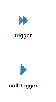
Вложения
On Mon, Sep 11, 2017 at 1:15 PM, Murtuza Zabuawala <murtuza.zabuawala@enterprisedb.com> wrote: Hello,I also observed few issues,1) In my opinion, New icons looks dull in main header menu due to dark background, attaching screenshot for your reference.Icons for the dialog boxes area will go in white.
Right now, If you see fontawesome icons are black in general but when we hover them then they turns white rest icons are still in black colour which looks good and easy on eyes, we will require similar kind of behaviour with our pgAdmin4 icons to make context menu icons consistent.
2) Spacing issue between icons and label are inconsistent, attaching screenshot for your reference.Working on it3) Icons with blue colour in them are not properly visible in context menu. For example "Trigger" icon is not visible when we hover over it because of same colour, attaching screenshot for your reference.Same as 1st one4) Are we considering different icons for Event triggers & Triggers? (They were same in pgAdmin3)Yes we are keeping them different so that user can easily differentiate them5) Icons for Casts modules are same, I mean collection icon and node icon, I think we need different icons to differentiate.Its agreed and done the updates, attached the new icon6) The width of bad-server-icon is more when compare with other icons, that makes it looks like a text document icon.if you check the measurement both are same, well I have done some tweaking to it now. Attached them for review.--Regards,On Mon, Sep 11, 2017 at 12:58 PM, Neel Patel <neel.patel@enterprisedb.com> wrote:Hi Dave,As far as I know, we replaced png icons with svg icons because - it should work with all types of resolutions. The svg icon should not blur.Here in my Linux system, I am using 1440*900(16:10) resolution and most of the svg icons are blurred. Please find attach screenshot.Thoughts ?Thanks,Neel PatelOn Fri, Aug 25, 2017 at 5:14 PM, Dave Page <dpage@pgadmin.org> wrote:HiYes, that's my expectation. Hopefully they'll go in in the next week or so.--On Fri, Aug 25, 2017 at 12:40 PM, Anthony DeBarros <adebarros@gmail.com> wrote:Dave and all,Out of curiosity (because I’m writing a book that includes pgAdmin screen grabs), do you expect these icons to make it into your September release?Thanks,AnthonyOn August 23, 2017 at 4:03:42 AM, Murtuza Zabuawala (murtuza.zabuawala@enterprised
b.com) wrote: Hi Chethana,On Wed, Aug 23, 2017 at 12:51 PM, Chethana Kumar <chethana.kumar@enterprisedb.com> wrote: Hi Murtuza,Please see my reply inline along with the updated .svg file for tree view icons.On Tue, Aug 22, 2017 at 11:17 AM, Murtuza Zabuawala <murtuza.zabuawala@enterprisedb.com> wrote: Hi Chethana,- The icons for Server node is missing, we will need given set of icons for server.1) Basic Server icon (Disconnect state)2) PG (Connected state)3) EPAS (Connected state)4) GreenPlum (Connected state)[Attaching current icons for PG & EPAS, I'm not sure about GreenPlum server icon.]- I'm not sure where we will use serverbad icon from 'tree_view_Icons.svg' file as it looks like server-group icon and not individual server.The icon is there in the pgAdmin's icon folder and it is needed for the applicationYes, we need serverbad icon which indicates the server in disconnect state but what we have on svg is same icon as server-group icon, we need icon for individual server.Something like this below which will differentiate individual server icon from server-group icon,
- Icon set for Schema & Catalog (both collection and individual) looks very similar to each other with minor colour difference, we have to look very carefully to identify them each.Agree with this point and come up with some updations on it. This time I have made it pretty differentiable between Schema and Catalog.- Why do we require two different set of icons for Tables & Columns, I mean one for Schema and one for Catalog?Agreed, I have kept single icon for tables and columns.- Icons for Partition node is same for collection and individual.Working on it- Icons for Event trigger node and Trigger node are very different from each other despite both are triggers.Agreed, done the changes accordingly.This is still different.Current Event trigger icon:NewEvent triggerIcon:
Current Trigger icon:New Trigger Icon:If you see both icons are same.[Suggestion: Can we do similar to what we have done with View & Materialized view icons, we have added M in the icon for materialized view, Same way we can have Trigger icon and for Event trigger we can add E in the icon]I know this is out of context but in my own opinion these icons have resemblance with Flat design where as rest of our application is in 2d design, for example buttons, dialogs etc.Yes, the icons look and feel are more towards flat and stylish now as it represents the current trend. You treat this as a first step towards making the whole application flat design from the current design. But this will happen in a long run, not on a quick basis.--Regards,On Tue, Aug 22, 2017 at 9:37 AM, Chethana Kumar <chethana.kumar@enterprisedb.com> wrote: Yes Shirley, I have already thought through on it.Basically, we need to have one more set of icons in white color mode so that we can use it on dialog headers as well.As the blue theme icons won't fit there.Please share your thoughts.Regards,Chethana kumarOn Tue, Aug 22, 2017 at 4:32 AM, Shirley Wang <swang@pivotal.io> wrote:Hi Chethana,I just thought of something with these icons. What happens with the ones that appear in dialog headers? In the blue bar?On Mon, Aug 21, 2017 at 8:31 AM Chethana Kumar <chethana.kumar@enterprisedb.com> wrote: Hello Team,I have applied labels for each icon for identification purpose. So please consider this copy for your feedback.Note: The "icon_demo.png" is attached to show case the view on webpage.Regards,Chethana kumarOn Mon, Aug 21, 2017 at 3:57 PM, Chethana Kumar <chethana.kumar@enterprisedb.com> wrote: Hello Team,Here are the revised and final icons for tree view control.I have attached in .svg file format as well so that you can do zoom in view at any level.Please share your feedback on the same.Thanks and regards,Chethana KumarPrincipal UI/UX DesignerEnterpriseDB Corporation--Chethana KumarPrincipal UI/UX DesignerEnterpriseDB Corporation--Chethana KumarPrincipal UI/UX DesignerEnterpriseDB Corporation--Chethana KumarPrincipal UI/UX DesignerEnterpriseDB CorporationDave Page
Blog: http://pgsnake.blogspot.com
Twitter: @pgsnake
EnterpriseDB UK: http://www.enterprisedb.com
The Enterprise PostgreSQL Company--Chethana KumarPrincipal UI/UX DesignerEnterpriseDB CorporationThe Postgres Database CompanyP: +91 86981 57146
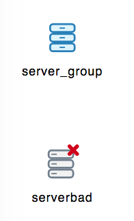

Вложения
Hi Chethana,On Mon, Sep 11, 2017 at 3:04 PM, Chethana Kumar <chethana.kumar@enterprisedb.com> wrote: On Mon, Sep 11, 2017 at 1:15 PM, Murtuza Zabuawala <murtuza.zabuawala@enterprisedb.com> wrote: Hello,I also observed few issues,1) In my opinion, New icons looks dull in main header menu due to dark background, attaching screenshot for your reference.Icons for the dialog boxes area will go in white.This will work in header menu but do you think all white colour icons will work with context menu?
Right now, If you see fontawesome icons are black in general but when we hover them then they turns white rest icons are still in black colour which looks good and easy on eyes, we will require similar kind of behaviour with our pgAdmin4 icons to make context menu icons consistent.You thoughts?2) Spacing issue between icons and label are inconsistent, attaching screenshot for your reference.Working on it3) Icons with blue colour in them are not properly visible in context menu. For example "Trigger" icon is not visible when we hover over it because of same colour, attaching screenshot for your reference.Same as 1st one4) Are we considering different icons for Event triggers & Triggers? (They were same in pgAdmin3)Yes we are keeping them different so that user can easily differentiate them5) Icons for Casts modules are same, I mean collection icon and node icon, I think we need different icons to differentiate.Its agreed and done the updates, attached the new icon6) The width of bad-server-icon is more when compare with other icons, that makes it looks like a text document icon.if you check the measurement both are same, well I have done some tweaking to it now. Attached them for review.--Regards,On Mon, Sep 11, 2017 at 12:58 PM, Neel Patel <neel.patel@enterprisedb.com> wrote:Hi Dave,As far as I know, we replaced png icons with svg icons because - it should work with all types of resolutions. The svg icon should not blur.Here in my Linux system, I am using 1440*900(16:10) resolution and most of the svg icons are blurred. Please find attach screenshot.Thoughts ?Thanks,Neel PatelOn Fri, Aug 25, 2017 at 5:14 PM, Dave Page <dpage@pgadmin.org> wrote:HiYes, that's my expectation. Hopefully they'll go in in the next week or so.--On Fri, Aug 25, 2017 at 12:40 PM, Anthony DeBarros <adebarros@gmail.com> wrote:Dave and all,Out of curiosity (because I’m writing a book that includes pgAdmin screen grabs), do you expect these icons to make it into your September release?Thanks,AnthonyOn August 23, 2017 at 4:03:42 AM, Murtuza Zabuawala (murtuza.zabuawala@enterprised
b.com) wrote: Hi Chethana,On Wed, Aug 23, 2017 at 12:51 PM, Chethana Kumar <chethana.kumar@enterprisedb.com> wrote: Hi Murtuza,Please see my reply inline along with the updated .svg file for tree view icons.On Tue, Aug 22, 2017 at 11:17 AM, Murtuza Zabuawala <murtuza.zabuawala@enterprisedb.com> wrote: Hi Chethana,- The icons for Server node is missing, we will need given set of icons for server.1) Basic Server icon (Disconnect state)2) PG (Connected state)3) EPAS (Connected state)4) GreenPlum (Connected state)[Attaching current icons for PG & EPAS, I'm not sure about GreenPlum server icon.]- I'm not sure where we will use serverbad icon from 'tree_view_Icons.svg' file as it looks like server-group icon and not individual server.The icon is there in the pgAdmin's icon folder and it is needed for the applicationYes, we need serverbad icon which indicates the server in disconnect state but what we have on svg is same icon as server-group icon, we need icon for individual server.Something like this below which will differentiate individual server icon from server-group icon,- Icon set for Schema & Catalog (both collection and individual) looks very similar to each other with minor colour difference, we have to look very carefully to identify them each.Agree with this point and come up with some updations on it. This time I have made it pretty differentiable between Schema and Catalog.- Why do we require two different set of icons for Tables & Columns, I mean one for Schema and one for Catalog?Agreed, I have kept single icon for tables and columns.- Icons for Partition node is same for collection and individual.Working on it- Icons for Event trigger node and Trigger node are very different from each other despite both are triggers.Agreed, done the changes accordingly.This is still different.Current Event trigger icon:NewEvent triggerIcon:Current Trigger icon:New Trigger Icon:If you see both icons are same.[Suggestion: Can we do similar to what we have done with View & Materialized view icons, we have added M in the icon for materialized view, Same way we can have Trigger icon and for Event trigger we can add E in the icon]I know this is out of context but in my own opinion these icons have resemblance with Flat design where as rest of our application is in 2d design, for example buttons, dialogs etc.Yes, the icons look and feel are more towards flat and stylish now as it represents the current trend. You treat this as a first step towards making the whole application flat design from the current design. But this will happen in a long run, not on a quick basis.--Regards,On Tue, Aug 22, 2017 at 9:37 AM, Chethana Kumar <chethana.kumar@enterprisedb.com> wrote: Yes Shirley, I have already thought through on it.Basically, we need to have one more set of icons in white color mode so that we can use it on dialog headers as well.As the blue theme icons won't fit there.Please share your thoughts.Regards,Chethana kumarOn Tue, Aug 22, 2017 at 4:32 AM, Shirley Wang <swang@pivotal.io> wrote:Hi Chethana,I just thought of something with these icons. What happens with the ones that appear in dialog headers? In the blue bar?On Mon, Aug 21, 2017 at 8:31 AM Chethana Kumar <chethana.kumar@enterprisedb.com> wrote: Hello Team,I have applied labels for each icon for identification purpose. So please consider this copy for your feedback.Note: The "icon_demo.png" is attached to show case the view on webpage.Regards,Chethana kumarOn Mon, Aug 21, 2017 at 3:57 PM, Chethana Kumar <chethana.kumar@enterprisedb.com> wrote: Hello Team,Here are the revised and final icons for tree view control.I have attached in .svg file format as well so that you can do zoom in view at any level.Please share your feedback on the same.Thanks and regards,Chethana KumarPrincipal UI/UX DesignerEnterpriseDB Corporation--Chethana KumarPrincipal UI/UX DesignerEnterpriseDB Corporation--Chethana KumarPrincipal UI/UX DesignerEnterpriseDB Corporation--Chethana KumarPrincipal UI/UX DesignerEnterpriseDB CorporationDave Page
Blog: http://pgsnake.blogspot.com
Twitter: @pgsnake
EnterpriseDB UK: http://www.enterprisedb.com
The Enterprise PostgreSQL Company--Chethana KumarPrincipal UI/UX DesignerEnterpriseDB CorporationThe Postgres Database CompanyP: +91 86981 57146
it is acceptable only if we are able to edit the icons through css otherwise we will have to have 3 sets of icons and it is nor recommended.So I am trying do a quick RnD on it so please hold on will come up with a solution.Thanks,Chethana kumarOn Mon, Sep 11, 2017 at 3:54 PM, Murtuza Zabuawala <murtuza.zabuawala@enterprisedb.com> wrote: Hi Chethana,On Mon, Sep 11, 2017 at 3:04 PM, Chethana Kumar <chethana.kumar@enterprisedb.com> wrote: On Mon, Sep 11, 2017 at 1:15 PM, Murtuza Zabuawala <murtuza.zabuawala@enterprisedb.com> wrote: Hello,I also observed few issues,1) In my opinion, New icons looks dull in main header menu due to dark background, attaching screenshot for your reference.Icons for the dialog boxes area will go in white.This will work in header menu but do you think all white colour icons will work with context menu?
Right now, If you see fontawesome icons are black in general but when we hover them then they turns white rest icons are still in black colour which looks good and easy on eyes, we will require similar kind of behaviour with our pgAdmin4 icons to make context menu icons consistent.You thoughts?2) Spacing issue between icons and label are inconsistent, attaching screenshot for your reference.Working on it3) Icons with blue colour in them are not properly visible in context menu. For example "Trigger" icon is not visible when we hover over it because of same colour, attaching screenshot for your reference.Same as 1st one4) Are we considering different icons for Event triggers & Triggers? (They were same in pgAdmin3)Yes we are keeping them different so that user can easily differentiate them5) Icons for Casts modules are same, I mean collection icon and node icon, I think we need different icons to differentiate.Its agreed and done the updates, attached the new icon6) The width of bad-server-icon is more when compare with other icons, that makes it looks like a text document icon.if you check the measurement both are same, well I have done some tweaking to it now. Attached them for review.--Regards,On Mon, Sep 11, 2017 at 12:58 PM, Neel Patel <neel.patel@enterprisedb.com> wrote:Hi Dave,As far as I know, we replaced png icons with svg icons because - it should work with all types of resolutions. The svg icon should not blur.Here in my Linux system, I am using 1440*900(16:10) resolution and most of the svg icons are blurred. Please find attach screenshot.Thoughts ?Thanks,Neel PatelOn Fri, Aug 25, 2017 at 5:14 PM, Dave Page <dpage@pgadmin.org> wrote:HiYes, that's my expectation. Hopefully they'll go in in the next week or so.--On Fri, Aug 25, 2017 at 12:40 PM, Anthony DeBarros <adebarros@gmail.com> wrote:Dave and all,Out of curiosity (because I’m writing a book that includes pgAdmin screen grabs), do you expect these icons to make it into your September release?Thanks,AnthonyOn August 23, 2017 at 4:03:42 AM, Murtuza Zabuawala (murtuza.zabuawala@enterprised
b.com) wrote: Hi Chethana,On Wed, Aug 23, 2017 at 12:51 PM, Chethana Kumar <chethana.kumar@enterprisedb.com> wrote: Hi Murtuza,Please see my reply inline along with the updated .svg file for tree view icons.On Tue, Aug 22, 2017 at 11:17 AM, Murtuza Zabuawala <murtuza.zabuawala@enterprisedb.com> wrote: Hi Chethana,- The icons for Server node is missing, we will need given set of icons for server.1) Basic Server icon (Disconnect state)2) PG (Connected state)3) EPAS (Connected state)4) GreenPlum (Connected state)[Attaching current icons for PG & EPAS, I'm not sure about GreenPlum server icon.]- I'm not sure where we will use serverbad icon from 'tree_view_Icons.svg' file as it looks like server-group icon and not individual server.The icon is there in the pgAdmin's icon folder and it is needed for the applicationYes, we need serverbad icon which indicates the server in disconnect state but what we have on svg is same icon as server-group icon, we need icon for individual server.Something like this below which will differentiate individual server icon from server-group icon,
- Icon set for Schema & Catalog (both collection and individual) looks very similar to each other with minor colour difference, we have to look very carefully to identify them each.Agree with this point and come up with some updations on it. This time I have made it pretty differentiable between Schema and Catalog.- Why do we require two different set of icons for Tables & Columns, I mean one for Schema and one for Catalog?Agreed, I have kept single icon for tables and columns.- Icons for Partition node is same for collection and individual.Working on it- Icons for Event trigger node and Trigger node are very different from each other despite both are triggers.Agreed, done the changes accordingly.This is still different.Current Event trigger icon:NewEvent triggerIcon:
Current Trigger icon:New Trigger Icon:If you see both icons are same.[Suggestion: Can we do similar to what we have done with View & Materialized view icons, we have added M in the icon for materialized view, Same way we can have Trigger icon and for Event trigger we can add E in the icon]I know this is out of context but in my own opinion these icons have resemblance with Flat design where as rest of our application is in 2d design, for example buttons, dialogs etc.Yes, the icons look and feel are more towards flat and stylish now as it represents the current trend. You treat this as a first step towards making the whole application flat design from the current design. But this will happen in a long run, not on a quick basis.--Regards,On Tue, Aug 22, 2017 at 9:37 AM, Chethana Kumar <chethana.kumar@enterprisedb.com> wrote: Yes Shirley, I have already thought through on it.Basically, we need to have one more set of icons in white color mode so that we can use it on dialog headers as well.As the blue theme icons won't fit there.Please share your thoughts.Regards,Chethana kumarOn Tue, Aug 22, 2017 at 4:32 AM, Shirley Wang <swang@pivotal.io> wrote:Hi Chethana,I just thought of something with these icons. What happens with the ones that appear in dialog headers? In the blue bar?On Mon, Aug 21, 2017 at 8:31 AM Chethana Kumar <chethana.kumar@enterprisedb.com> wrote: Hello Team,I have applied labels for each icon for identification purpose. So please consider this copy for your feedback.Note: The "icon_demo.png" is attached to show case the view on webpage.Regards,Chethana kumarOn Mon, Aug 21, 2017 at 3:57 PM, Chethana Kumar <chethana.kumar@enterprisedb.com> wrote: Hello Team,Here are the revised and final icons for tree view control.I have attached in .svg file format as well so that you can do zoom in view at any level.Please share your feedback on the same.Thanks and regards,Chethana KumarPrincipal UI/UX DesignerEnterpriseDB Corporation--Chethana KumarPrincipal UI/UX DesignerEnterpriseDB Corporation--Chethana KumarPrincipal UI/UX DesignerEnterpriseDB Corporation--Chethana KumarPrincipal UI/UX DesignerEnterpriseDB CorporationDave Page
Blog: http://pgsnake.blogspot.com
Twitter: @pgsnake
EnterpriseDB UK: http://www.enterprisedb.com
The Enterprise PostgreSQL Company--Chethana KumarPrincipal UI/UX DesignerEnterpriseDB CorporationThe Postgres Database CompanyP: +91 86981 57146--Chethana KumarPrincipal UI/UX DesignerEnterpriseDB CorporationThe Postgres Database CompanyP: +91 86981 57146


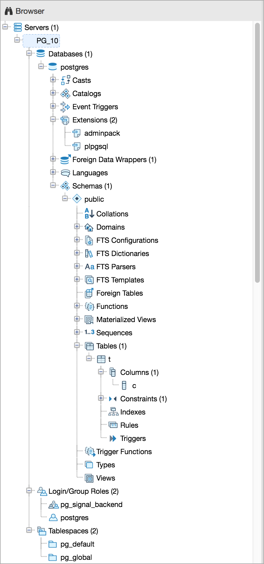
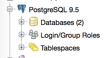
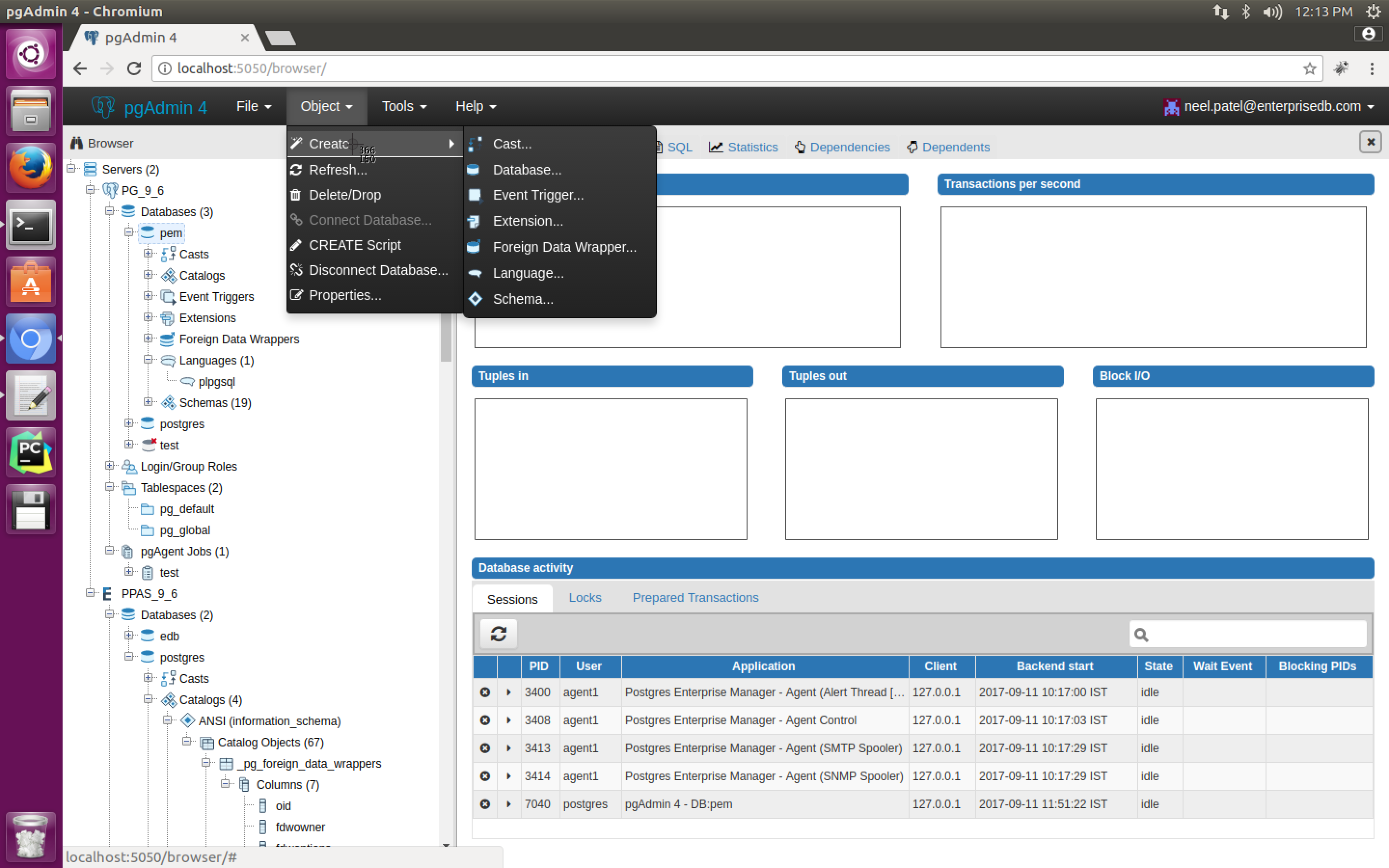
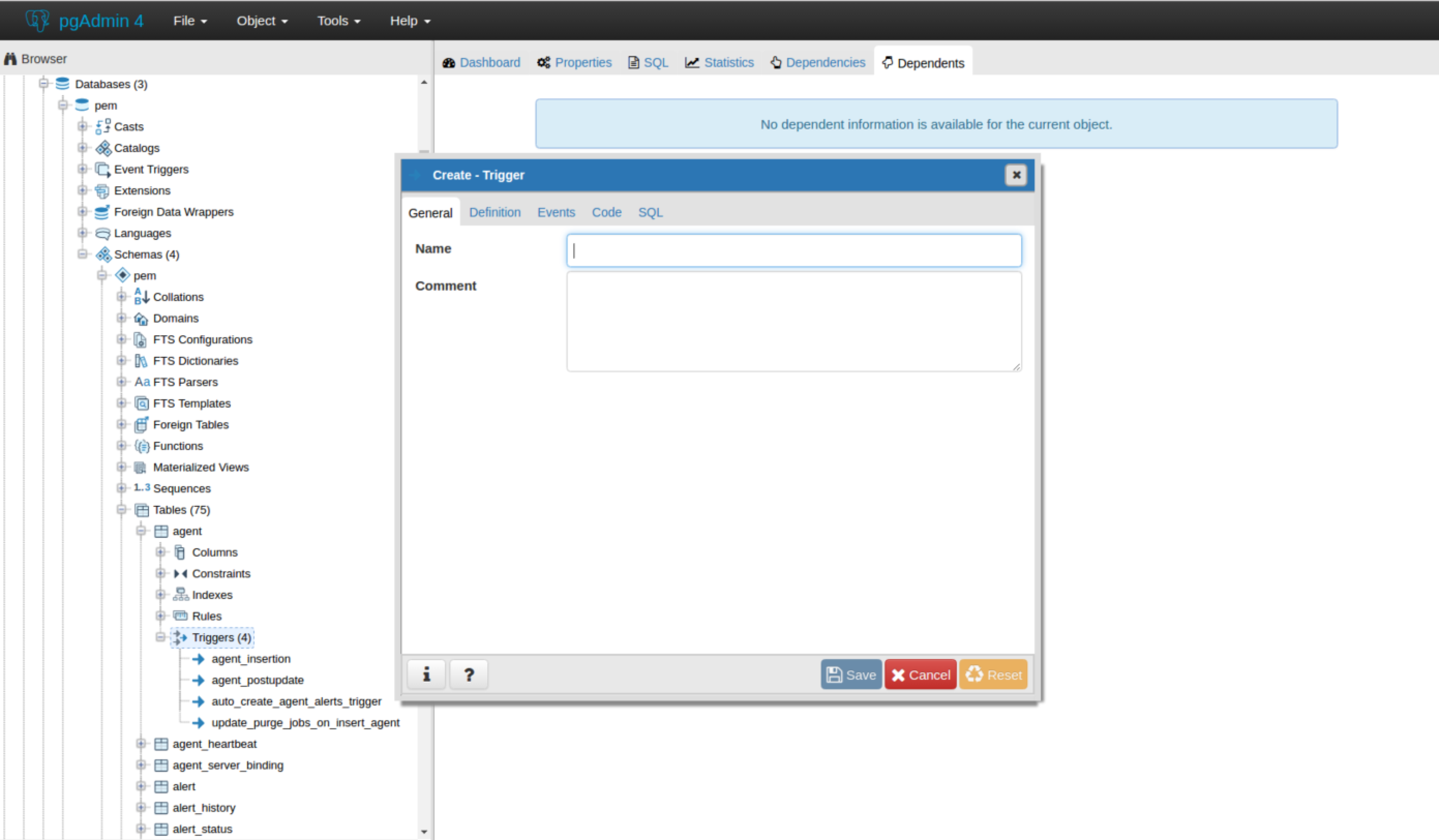
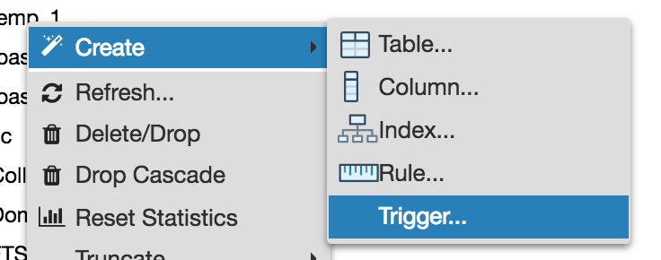
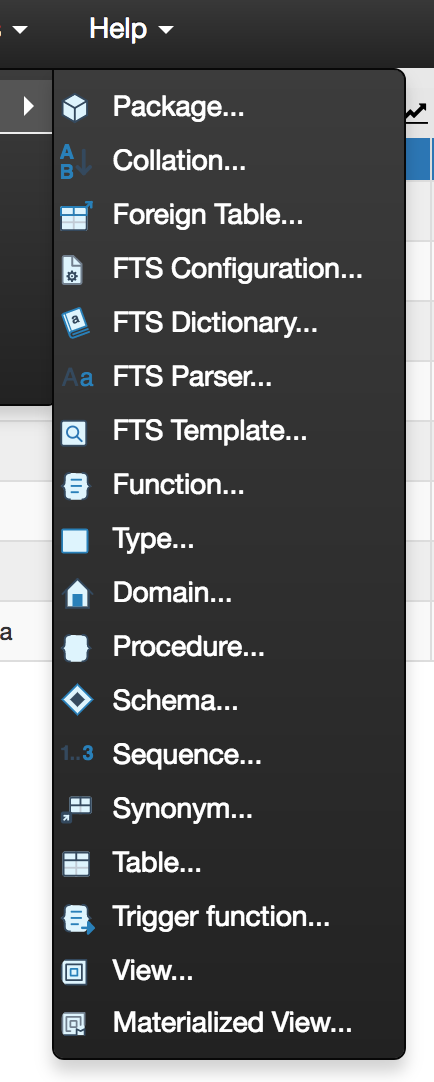
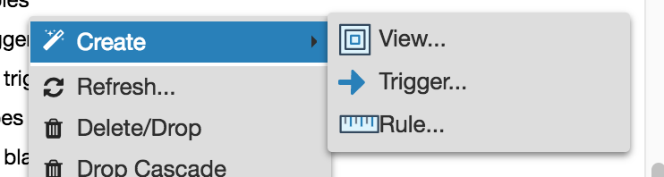
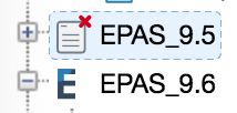
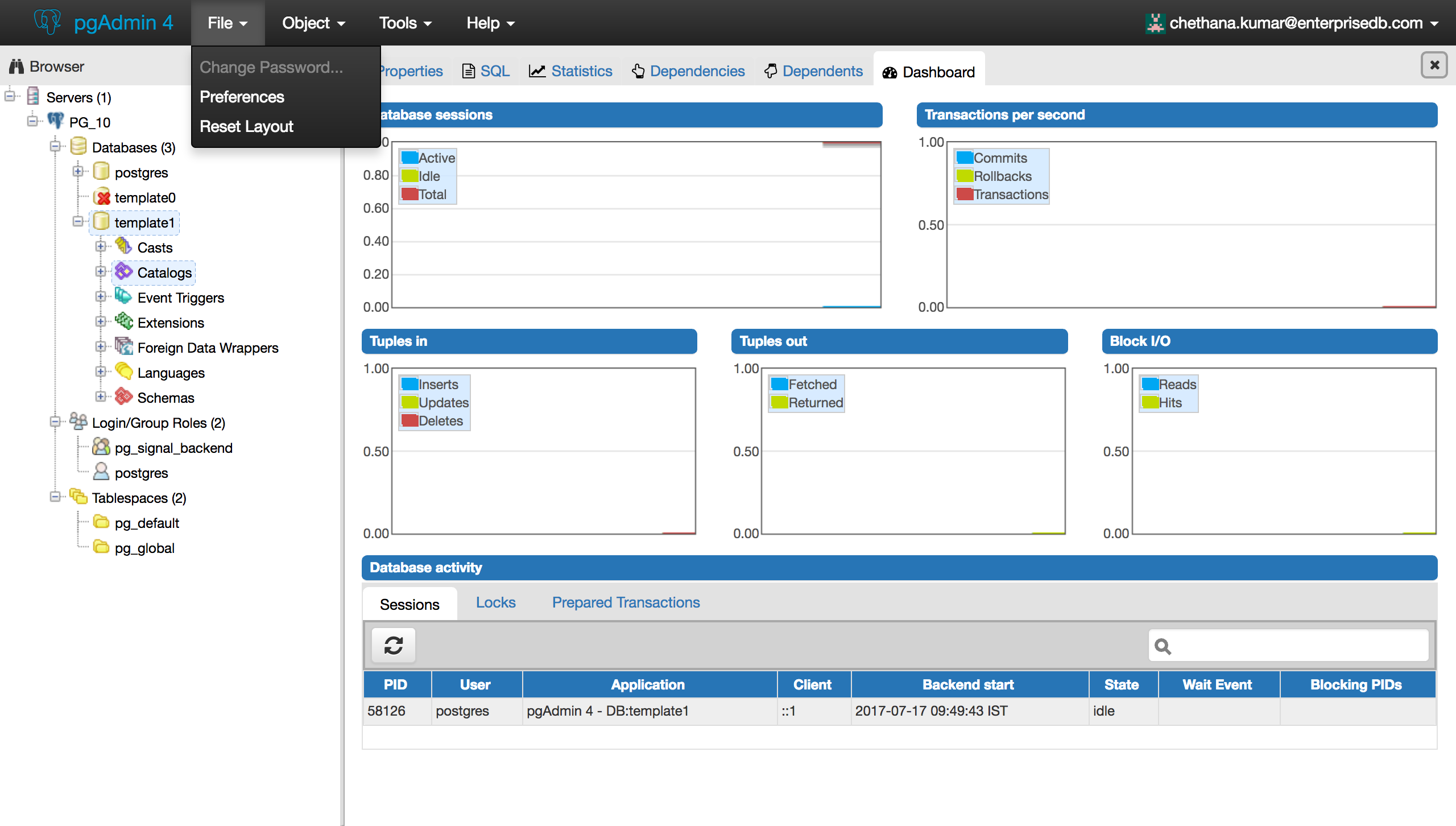
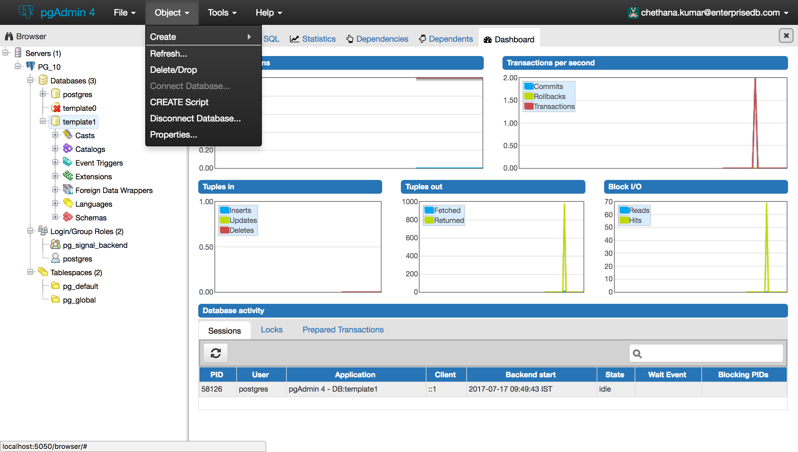
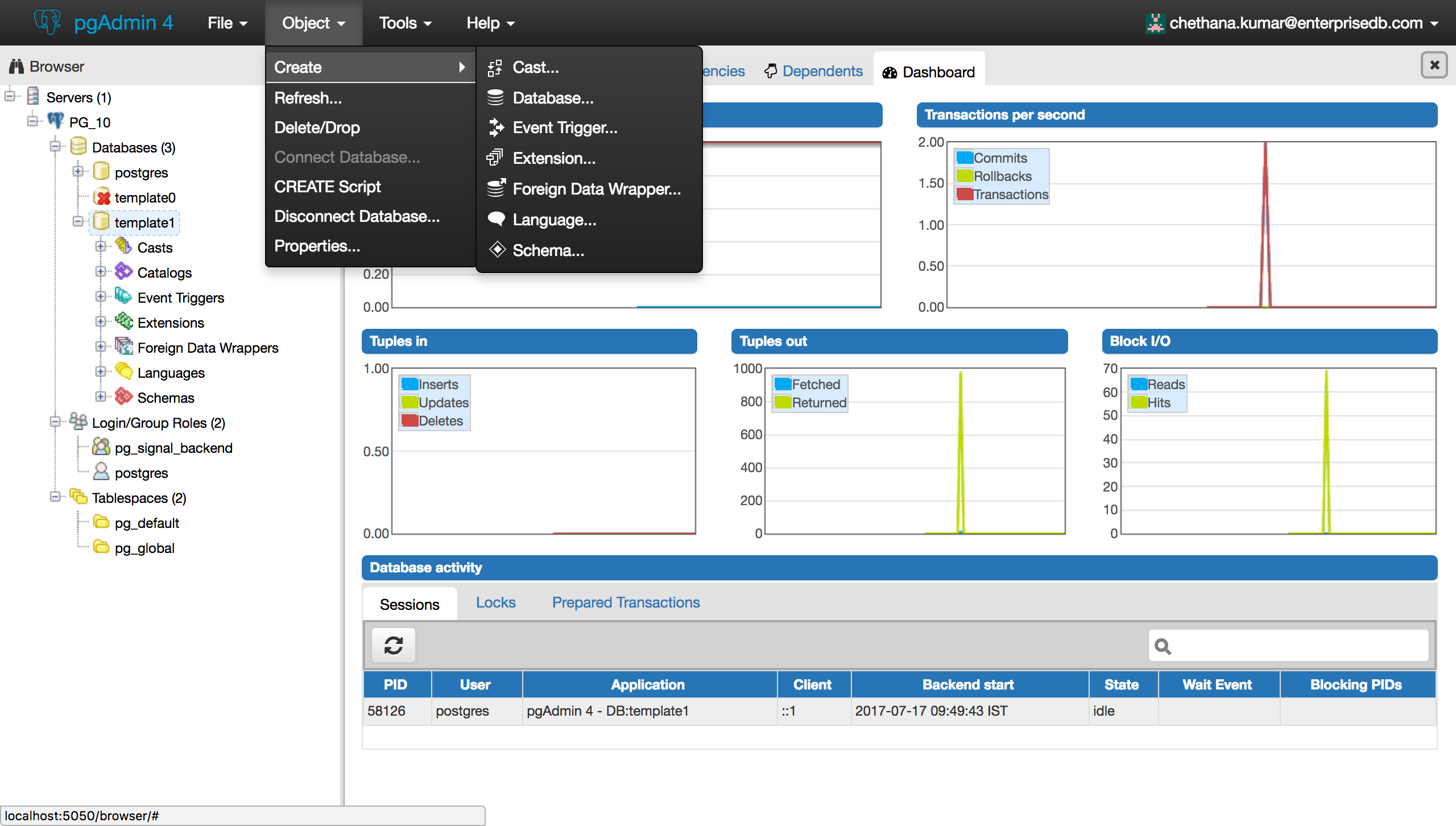
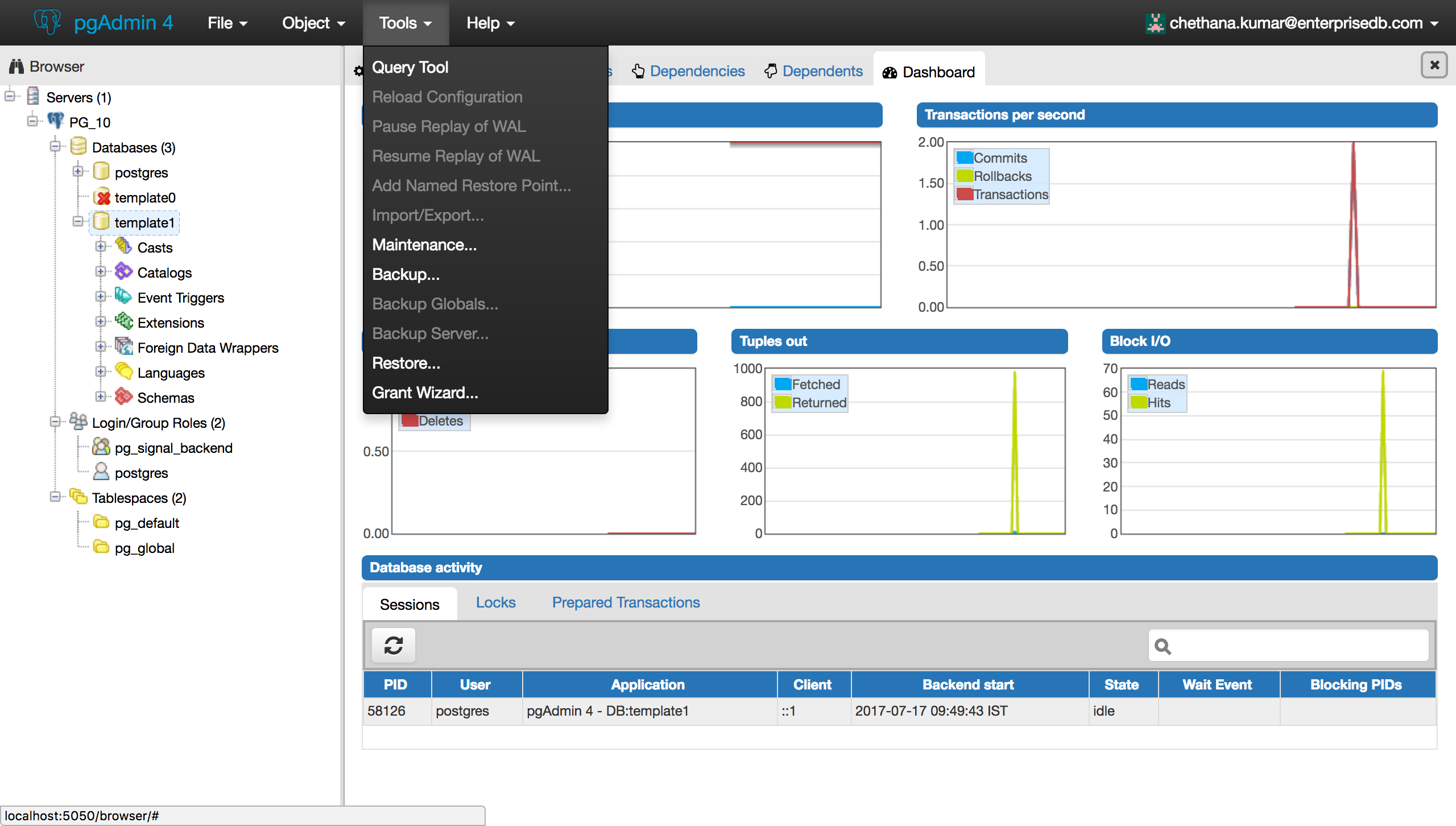
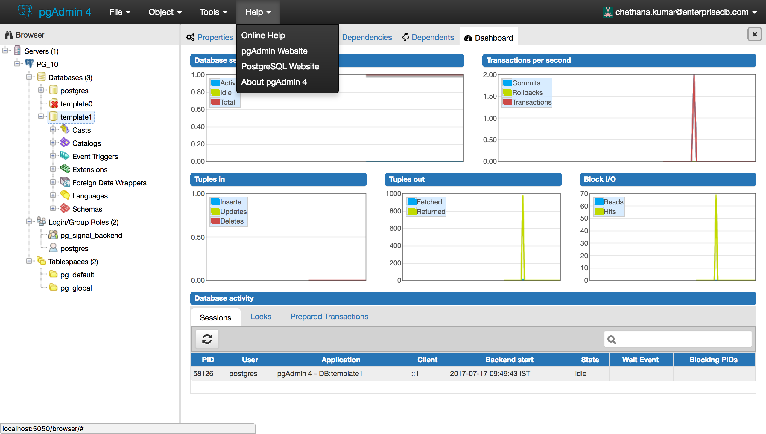
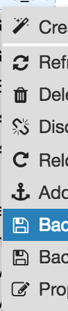
Mobile: +91 976-788-8246
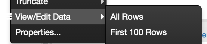
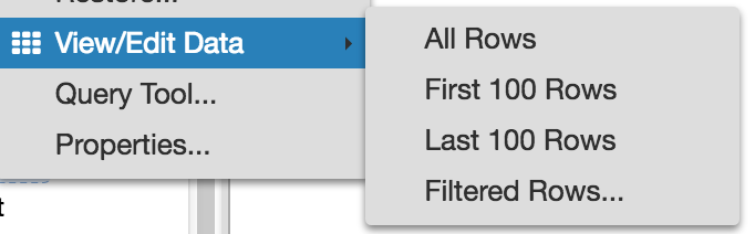