Обсуждение: [pgAdmin4][Patch]: Improvise the treeview element selection
Hi All,
Changes:
1. Highlight the full selected tree item instead of highlighting only label.
2. Set selected item background color to dark blue that is more visible to eyes.[same as in pgAdmin3]
Please find attached patch and review.
Thanks,
Surinder
Вложения
Hi Surinder,
This change seems to be different from the other patterns for selected / highlighted options. Is there a reason why this needs to be more visible than it already is? In terms of feedback on the tree, we have not heard any pains from users that this is not visible enough.
Shirley
On Mon, Jul 24, 2017 at 12:47 PM Surinder Kumar <surinder.kumar@enterprisedb.com> wrote:
Hi All,Changes:1. Highlight the full selected tree item instead of highlighting only label.2. Set selected item background color to dark blue that is more visible to eyes.[same as in pgAdmin3]Please find attached patch and review.Thanks,Surinder
On Mon, Jul 24, 2017 at 8:51 AM, Shirley Wang <swang@pivotal.io> wrote:
Hi Surinder,This change seems to be different from the other patterns for selected / highlighted options. Is there a reason why this needs to be more visible than it already is? In terms of feedback on the tree, we have not heard any pains from users that this is not visible enough.
Yeah, I'm inclined to agree. What's your motivation for this change? I've also never heard of any complaints about this.
ShirleyOn Mon, Jul 24, 2017 at 12:47 PM Surinder Kumar <surinder.kumar@enterprisedb.com> wrote: Hi All,Changes:1. Highlight the full selected tree item instead of highlighting only label.2. Set selected item background color to dark blue that is more visible to eyes.[same as in pgAdmin3]Please find attached patch and review.Thanks,Surinder
Dave Page
Blog: http://pgsnake.blogspot.com
Twitter: @pgsnake
EnterpriseDB UK: http://www.enterprisedb.com
The Enterprise PostgreSQL Company
Blog: http://pgsnake.blogspot.com
Twitter: @pgsnake
EnterpriseDB UK: http://www.enterprisedb.com
The Enterprise PostgreSQL Company
Hi
On Mon, Jul 24, 2017 at 1:24 PM, Dave Page <dpage@pgadmin.org> wrote:
On Mon, Jul 24, 2017 at 8:51 AM, Shirley Wang <swang@pivotal.io> wrote:Hi Surinder,This change seems to be different from the other patterns for selected / highlighted options. Is there a reason why this needs to be more visible than it already is? In terms of feedback on the tree, we have not heard any pains from users that this is not visible enough.
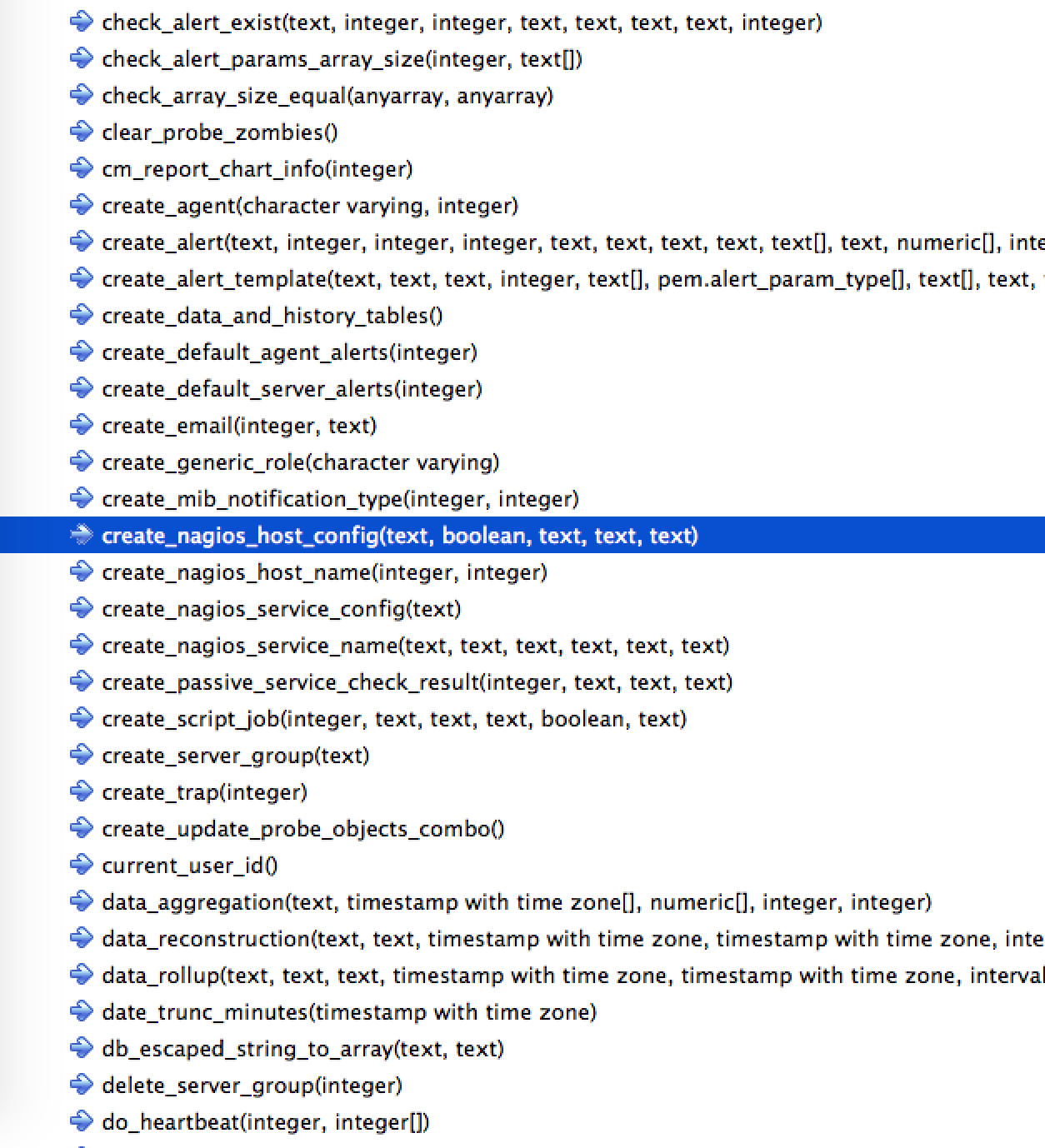
I agree it is visible enough but only with tree with 8 to 10 levels. If we think broader considering the case where function node may contain thousands of functions and then scrolling to previously selected function will become tougher.
Also, If we implement search by typing on selected node in future as in pgAdmin3, the selected node will be highlighted but finding selected node among other nodes will be painful due to lighter blue background..
Yeah, I'm inclined to agree. What's your motivation for this change? I've also never heard of any complaints about this.
Two reasons:
1. If i select a function having long name from a list of 150 functions and then switch to query tool and then again i look for selected function, being light blue background it gets difficult to find selected function among 150 functions.
If background would be dark blue, it is easier to spot.
2. I liked the node selection in pgAdmin3 where selected node is highlighted with dark blue background. In pgAdmin4, only label of selected node is highlighted with light blue.
If this patch seems unreasonable, please ignore the patch.
ShirleyOn Mon, Jul 24, 2017 at 12:47 PM Surinder Kumar <surinder.kumar@enterprisedb.com> wrote: Hi All,Changes:1. Highlight the full selected tree item instead of highlighting only label.2. Set selected item background color to dark blue that is more visible to eyes.[same as in pgAdmin3]Please find attached patch and review.Thanks,Surinder--Dave Page
Blog: http://pgsnake.blogspot.com
Twitter: @pgsnake
EnterpriseDB UK: http://www.enterprisedb.com
The Enterprise PostgreSQL Company
Вложения
Hi
--
On Mon, Jul 24, 2017 at 10:30 AM, Surinder Kumar <surinder.kumar@enterprisedb.com> wrote:
HiOn Mon, Jul 24, 2017 at 1:24 PM, Dave Page <dpage@pgadmin.org> wrote:On Mon, Jul 24, 2017 at 8:51 AM, Shirley Wang <swang@pivotal.io> wrote:Hi Surinder,This change seems to be different from the other patterns for selected / highlighted options. Is there a reason why this needs to be more visible than it already is? In terms of feedback on the tree, we have not heard any pains from users that this is not visible enough.I agree it is visible enough but only with tree with 8 to 10 levels. If we think broader considering the case where function node may contain thousands of functions and then scrolling to previously selected function will become tougher.Also, If we implement search by typing on selected node in future as in pgAdmin3, the selected node will be highlighted but finding selected node among other nodes will be painful due to lighter blue background..Yeah, I'm inclined to agree. What's your motivation for this change? I've also never heard of any complaints about this.Two reasons:1. If i select a function having long name from a list of 150 functions and then switch to query tool and then again i look for selected function, being light blue background it gets difficult to find selected function among 150 functions.If background would be dark blue, it is easier to spot.2. I liked the node selection in pgAdmin3 where selected node is highlighted with dark blue background. In pgAdmin4, only label of selected node is highlighted with light blue.If this patch seems unreasonable, please ignore the patch.
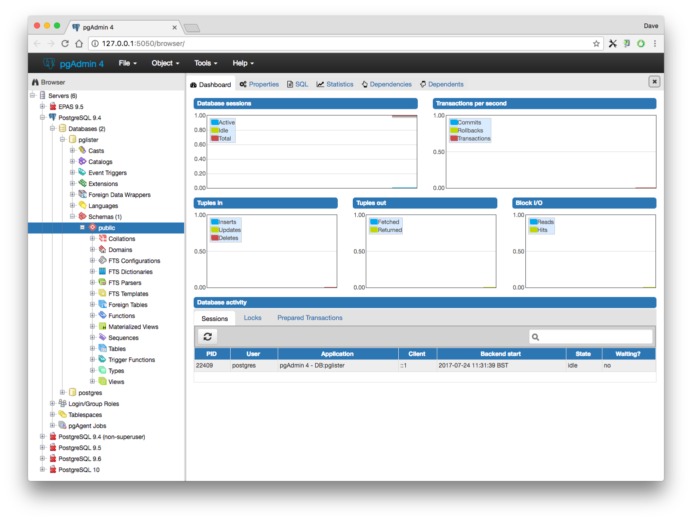
I don't think anyone is saying it's unreasonable, just whether it's needed. I just tried it out and I can see how it makes the selected item more visible, but it's also a lot less aesthetically pleasing, so I would definitely want to see some real-world users making a solid case for it before making such a change. Here's a more complete screenshot.
Dave Page
Blog: http://pgsnake.blogspot.com
Twitter: @pgsnake
EnterpriseDB UK: http://www.enterprisedb.com
The Enterprise PostgreSQL Company
Blog: http://pgsnake.blogspot.com
Twitter: @pgsnake
EnterpriseDB UK: http://www.enterprisedb.com
The Enterprise PostgreSQL Company