Обсуждение: [pgadmin-hackers] [Design Update][History]
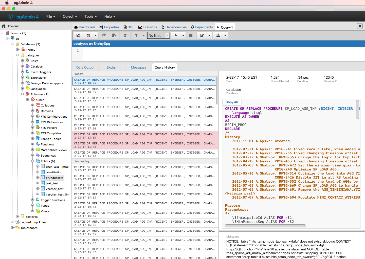
‘History’ is difficult to find in the lower panel. Users tended to look for it at the top of the window. We believe this might be because the lower panel includes 4 tabs - ‘Data Output’, ‘Explain’, ‘Messages’, and ‘History’ - and the grouping of the four makes it difficult to see how each is related.
We also learned that once a query within the history panel is expanded, it should be easier to switch from one query to the next.
Actions
Rename ‘History’ to ‘Query History’
Provides more context on what the history will show
Removes confusion that ‘History’ might be showing ‘Data Output’ history
Remove ‘Explain’ and ‘Messages’ from bottom panel
4 tabs are not providing the same level of information even though they are visually displayed with the same significance
‘Explain’ is more relevant in other areas, like within ‘Data Output’ or perhaps another window. It should be shown when the user actively chooses to see this view rather than be shown by default.
‘Messages’ are included with data in ‘History’
‘Data Output’ and ‘History’ should be grouped together because the two tabs show results based off of what was typed in the query editor
Iterate on ‘History’ to have full query expand to side.
Enables quicker browsing through the ‘Query History’
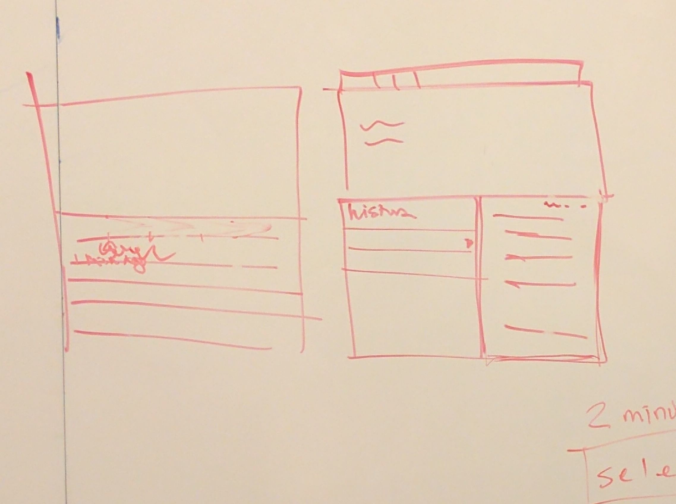
Example whiteboard sketch

Вложения
Hello Hackers,Below is an update on our findings for seeing query history in pgAdmin. You can also find all updates here: https://docs.google.com/document/d/1J_GhsL0nR4dbTI6F- XlxspvXutghzj-3UGjDWf8MtVA/ edit?usp=sharing . . .Summary‘History’ is difficult to find in the lower panel. Users tended to look for it at the top of the window. We believe this might be because the lower panel includes 4 tabs - ‘Data Output’, ‘Explain’, ‘Messages’, and ‘History’ - and the grouping of the four makes it difficult to see how each is related.
We also learned that once a query within the history panel is expanded, it should be easier to switch from one query to the next.
Actions
Rename ‘History’ to ‘Query History’
Provides more context on what the history will show
Removes confusion that ‘History’ might be showing ‘Data Output’ history
Remove ‘Explain’ and ‘Messages’ from bottom panel
4 tabs are not providing the same level of information even though they are visually displayed with the same significance
‘Explain’ is more relevant in other areas, like within ‘Data Output’ or perhaps another window. It should be shown when the user actively chooses to see this view rather than be shown by default.
‘Messages’ are included with data in ‘History’
‘Data Output’ and ‘History’ should be grouped together because the two tabs show results based off of what was typed in the query editor
Iterate on ‘History’ to have full query expand to side.
Enables quicker browsing through the ‘Query History’
Example whiteboard sketch

Blog: http://pgsnake.blogspot.com
Twitter: @pgsnake
EnterpriseDB UK: http://www.enterprisedb.com
The Enterprise PostgreSQL Company
Вложения
I disagree. I use both the Explain and Messages tabs all the time, and rarely the History tab. You cannot easily merge the data output and EXPLAIN tabs because they show complementary information.
The Messages tab is used to quickly show the full set of messages from the last executed query. Having that info only on the results tab is less useful for a number of reasons:- It shows the results from all queries, thus making the display more cluttered when you're only interested in the results of the last query (which is probably the majority of the time).
- It shows information above and beyond the messages, again, cluttering the display and detracting from the message info.
- It shows only 1 line at a time, where messages are typically multi-line. This would mean that either the user has to expand the row to see the results, or we'd have to do it programmatically which could interfere with rows the user has intentionally expanded.
‘Data Output’ and ‘History’ should be grouped together because the two tabs show results based off of what was typed in the query editor
Iterate on ‘History’ to have full query expand to side.
Enables quicker browsing through the ‘Query History’
Example whiteboard sketch
If the user wants that, they can do it already. I would argue in most cases users likely want to have the entire width available for query results, which often need more space than is available at present as it is.
Please ensure you're talking not just to users that query data, but to those developing stored procedures as well - they likely have different needs (quite probably for which the Messages tab is even more important).
Вложения
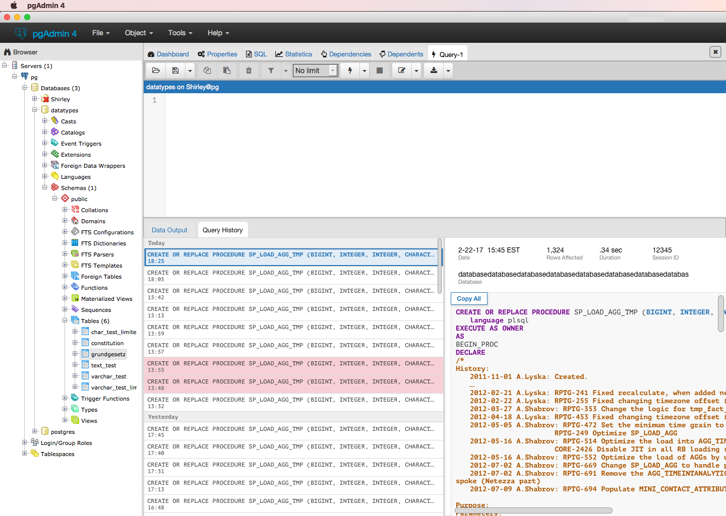
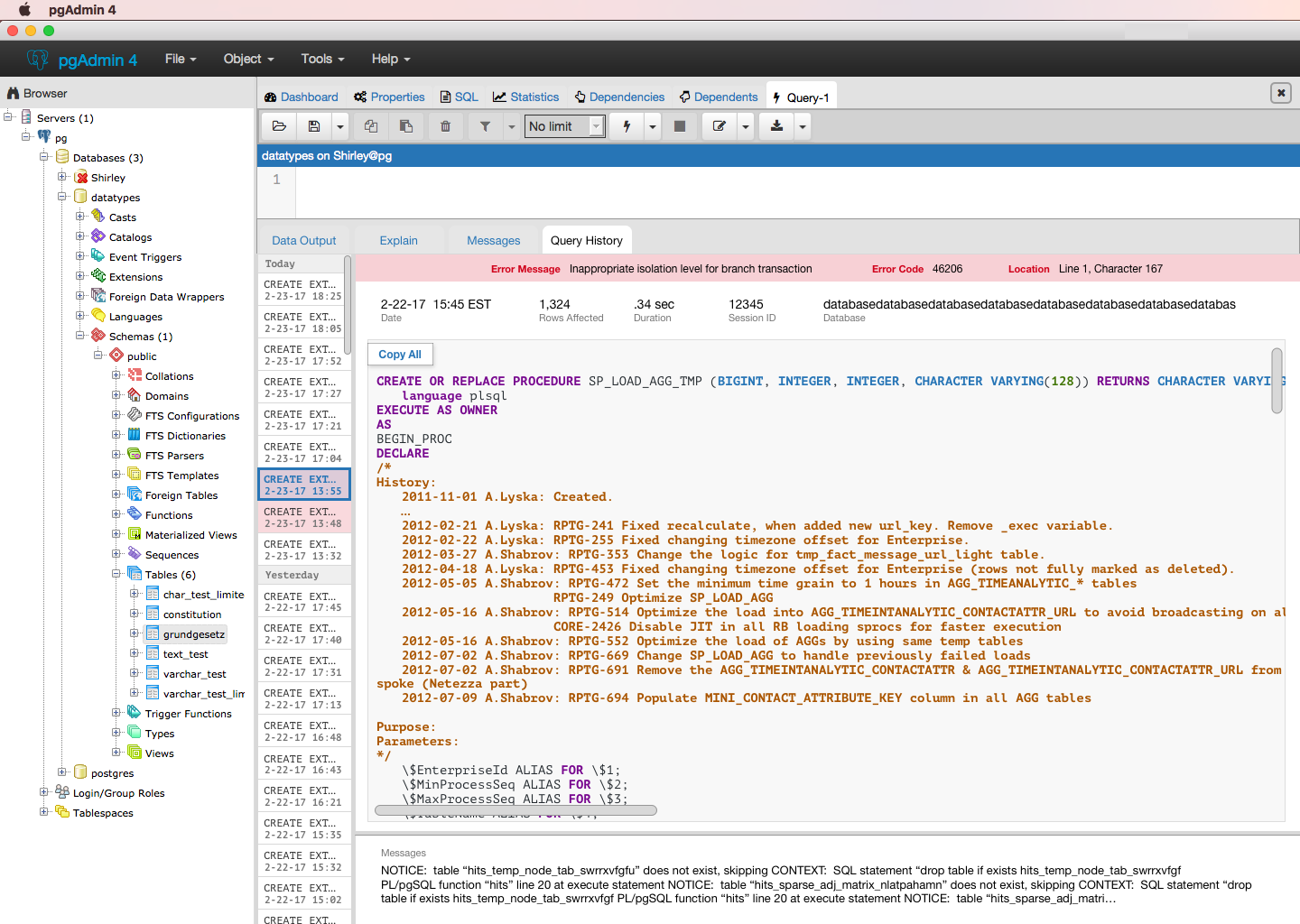
Thanks, DaveI disagree. I use both the Explain and Messages tabs all the time, and rarely the History tab. You cannot easily merge the data output and EXPLAIN tabs because they show complementary information.I see. It may be that we haven't heard about the full value of the Explain tab (it also doesn't seem to be working on my version of pgAdmin (w/Postgres, not Greenplum)). I see no problem with keeping it as is until we learn more.Here are the updated versions of History (Explain isn't included because we were working with the assumption that the tab could be combined with results, we can add it again unless we learn something new).- Users are able to click or use the arrow keys on their keyboard to navigate through the queries on the left.- List of queries is expandable- Copy all is fixed to the top right corner so it'll be present as users vertically/horizontally scroll
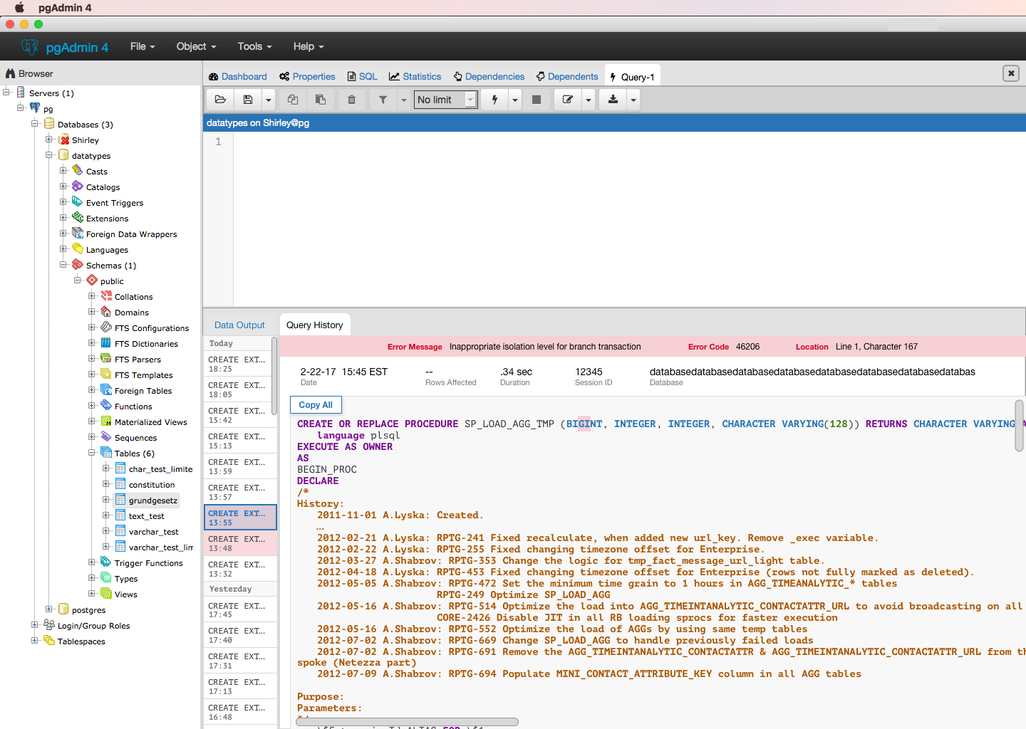
To your points,The Messages tab is used to quickly show the full set of messages from the last executed query. Having that info only on the results tab is less useful for a number of reasons:- It shows the results from all queries, thus making the display more cluttered when you're only interested in the results of the last query (which is probably the majority of the time).In the messages tab, it seems like when the query ran successfully, the message shows number of rows affected and total time, both which are shown with your query history. It also seems like when there is an error message, it duplicates the description and splits out line and character. We can condense that into 3 groups of info : error code, a description, and location within the query where the error was detected.
Immediate feedback on any errors should be displayed right after you run the query. It appears there's already a pattern for feedback w/ the green box that appears in the bottom right corner when you run a successful query. Any sort of feedback on the query run (success/fail messages) should be treated consistently. Persistent messages can live within the history.- It shows information above and beyond the messages, again, cluttering the display and detracting from the message info.You're right that the error messages displays information at a higher level than query history, which can be solved by establishing hierarchy - error messages go at the top.
- It shows only 1 line at a time, where messages are typically multi-line. This would mean that either the user has to expand the row to see the results, or we'd have to do it programmatically which could interfere with rows the user has intentionally expanded.Because we learned that people generally remember what queries they ran based on time, seeing one line of your previous query isn't incredibly helpful, and having the ability to view the full query is valuable, we moved to having side panels with an easy way to switch between which query you want to view.
‘Data Output’ and ‘History’ should be grouped together because the two tabs show results based off of what was typed in the query editor
Iterate on ‘History’ to have full query expand to side.
Enables quicker browsing through the ‘Query History’
Example whiteboard sketch
If the user wants that, they can do it already. I would argue in most cases users likely want to have the entire width available for query results, which often need more space than is available at present as it is.Totally, results should be shown under a separate tab. Data results would remain unchanged.Please ensure you're talking not just to users that query data, but to those developing stored procedures as well - they likely have different needs (quite probably for which the Messages tab is even more important).Yes! We've been having difficulty finding people like that. Do you have any leads?
Blog: http://pgsnake.blogspot.com
Twitter: @pgsnake
EnterpriseDB UK: http://www.enterprisedb.com
The Enterprise PostgreSQL Company
On Mon, Mar 6, 2017 at 9:19 PM, Shirley Wang <swang@pivotal.io> wrote:Thanks, DaveI disagree. I use both the Explain and Messages tabs all the time, and rarely the History tab. You cannot easily merge the data output and EXPLAIN tabs because they show complementary information.I see. It may be that we haven't heard about the full value of the Explain tab (it also doesn't seem to be working on my version of pgAdmin (w/Postgres, not Greenplum)). I see no problem with keeping it as is until we learn more.Here are the updated versions of History (Explain isn't included because we were working with the assumption that the tab could be combined with results, we can add it again unless we learn something new).- Users are able to click or use the arrow keys on their keyboard to navigate through the queries on the left.- List of queries is expandable- Copy all is fixed to the top right corner so it'll be present as users vertically/horizontally scrollThat makes it impossible any details from the initial grid view.
To your points,The Messages tab is used to quickly show the full set of messages from the last executed query. Having that info only on the results tab is less useful for a number of reasons:- It shows the results from all queries, thus making the display more cluttered when you're only interested in the results of the last query (which is probably the majority of the time).In the messages tab, it seems like when the query ran successfully, the message shows number of rows affected and total time, both which are shown with your query history. It also seems like when there is an error message, it duplicates the description and splits out line and character. We can condense that into 3 groups of info : error code, a description, and location within the query where the error was detected.It'll also show (in the correct order) any notices or other messages raised by stored functions. It's critical that these remain easy to read as they're used for debugging as well as conveying non-result info to the user.Immediate feedback on any errors should be displayed right after you run the query. It appears there's already a pattern for feedback w/ the green box that appears in the bottom right corner when you run a successful query. Any sort of feedback on the query run (success/fail messages) should be treated consistently. Persistent messages can live within the history.- It shows information above and beyond the messages, again, cluttering the display and detracting from the message info.You're right that the error messages displays information at a higher level than query history, which can be solved by establishing hierarchy - error messages go at the top.No, error messages need to be shown properly ordered amongst any other messages. The output is intentionally sequential - if it weren't, it would be useless for debugging.
- It shows only 1 line at a time, where messages are typically multi-line. This would mean that either the user has to expand the row to see the results, or we'd have to do it programmatically which could interfere with rows the user has intentionally expanded.Because we learned that people generally remember what queries they ran based on time, seeing one line of your previous query isn't incredibly helpful, and having the ability to view the full query is valuable, we moved to having side panels with an easy way to switch between which query you want to view.Sure, but you're missing the point. The query text isn't the only thing we want to see in the history; there is additional meta data that will help the user locate the query they want that is no longer visible unless they select each row individually.
‘Data Output’ and ‘History’ should be grouped together because the two tabs show results based off of what was typed in the query editor
Iterate on ‘History’ to have full query expand to side.
Enables quicker browsing through the ‘Query History’
Example whiteboard sketch
If the user wants that, they can do it already. I would argue in most cases users likely want to have the entire width available for query results, which often need more space than is available at present as it is.Totally, results should be shown under a separate tab. Data results would remain unchanged.Please ensure you're talking not just to users that query data, but to those developing stored procedures as well - they likely have different needs (quite probably for which the Messages tab is even more important).Yes! We've been having difficulty finding people like that. Do you have any leads?You'd need to ask for volunteers on the mailing list.--Dave Page
Blog: http://pgsnake.blogspot.com
Twitter: @pgsnake
EnterpriseDB UK: http://www.enterprisedb.com
The Enterprise PostgreSQL Company
On Tue, Mar 7, 2017 at 8:07 PM, Shirley Wang <swang@pivotal.io> wrote:
>
>
> On Tue, Mar 7, 2017 at 4:01 AM Dave Page <dpage@pgadmin.org> wrote:
>>
>> On Mon, Mar 6, 2017 at 9:19 PM, Shirley Wang <swang@pivotal.io> wrote:
>>>
>>> Thanks, Dave
>>>
>>>>
>>>> I disagree. I use both the Explain and Messages tabs all the time, and
>>>> rarely the History tab. You cannot easily merge the data output and EXPLAIN
>>>> tabs because they show complementary information.
>>>
>>>
>>> I see. It may be that we haven't heard about the full value of the
>>> Explain tab (it also doesn't seem to be working on my version of pgAdmin
>>> (w/Postgres, not Greenplum)). I see no problem with keeping it as is until
>>> we learn more.
>>>
>>> Here are the updated versions of History (Explain isn't included because
>>> we were working with the assumption that the tab could be combined with
>>> results, we can add it again unless we learn something new).
>>>
>>> - Users are able to click or use the arrow keys on their keyboard to
>>> navigate through the queries on the left.
>>> - List of queries is expandable
>>> - Copy all is fixed to the top right corner so it'll be present as users
>>> vertically/horizontally scroll
>>
>>
>> That makes it impossible any details from the initial grid view.
>>
>>
>>>
>>>
>>>
>>> To your points,
>>>
>>>>
>>>> The Messages tab is used to quickly show the full set of messages from
>>>> the last executed query. Having that info only on the results tab is less
>>>> useful for a number of reasons:
>>>>
>>>> - It shows the results from all queries, thus making the display more
>>>> cluttered when you're only interested in the results of the last query
>>>> (which is probably the majority of the time).
>>>>
>>> In the messages tab, it seems like when the query ran successfully, the
>>> message shows number of rows affected and total time, both which are shown
>>> with your query history. It also seems like when there is an error message,
>>> it duplicates the description and splits out line and character. We can
>>> condense that into 3 groups of info : error code, a description, and
>>> location within the query where the error was detected.
>>
>>
>> It'll also show (in the correct order) any notices or other messages
>> raised by stored functions. It's critical that these remain easy to read as
>> they're used for debugging as well as conveying non-result info to the user.
>>
>>>
>>>
>>> Immediate feedback on any errors should be displayed right after you run
>>> the query. It appears there's already a pattern for feedback w/ the green
>>> box that appears in the bottom right corner when you run a successful query.
>>> Any sort of feedback on the query run (success/fail messages) should be
>>> treated consistently. Persistent messages can live within the history.
>>>
>>>>
>>>> - It shows information above and beyond the messages, again, cluttering
>>>> the display and detracting from the message info.
>>>
>>>
>>> You're right that the error messages displays information at a higher
>>> level than query history, which can be solved by establishing hierarchy -
>>> error messages go at the top.
>>
>>
>> No, error messages need to be shown properly ordered amongst any other
>> messages. The output is intentionally sequential - if it weren't, it would
>> be useless for debugging.
>
>
> I see. We're looking into messages for storage procedures now and how that
> should be solved. Are there other types of messages we should be aware of?

No, I don't think so. They come through the standard postgres elog
mechanism which should cover other sources as well.


--
Dave Page
Blog: http://pgsnake.blogspot.com
Twitter: @pgsnake

EnterpriseDB UK: http://www.enterprisedb.com
The Enterprise PostgreSQL Company


On Tue, Mar 7, 2017 at 8:07 PM, Shirley Wang <swang@pivotal.io> wrote:
>
>
> On Tue, Mar 7, 2017 at 4:01 AM Dave Page <dpage@pgadmin.org> wrote:
>>
>> On Mon, Mar 6, 2017 at 9:19 PM, Shirley Wang <swang@pivotal.io> wrote:
>>>
>>> Thanks, Dave
>>>
>>>>
>>>> I disagree. I use both the Explain and Messages tabs all the time, and
>>>> rarely the History tab. You cannot easily merge the data output and EXPLAIN
>>>> tabs because they show complementary information.
>>>
>>>
>>> I see. It may be that we haven't heard about the full value of the
>>> Explain tab (it also doesn't seem to be working on my version of pgAdmin
>>> (w/Postgres, not Greenplum)). I see no problem with keeping it as is until
>>> we learn more.
>>>
>>> Here are the updated versions of History (Explain isn't included because
>>> we were working with the assumption that the tab could be combined with
>>> results, we can add it again unless we learn something new).
>>>
>>> - Users are able to click or use the arrow keys on their keyboard to
>>> navigate through the queries on the left.
>>> - List of queries is expandable
>>> - Copy all is fixed to the top right corner so it'll be present as users
>>> vertically/horizontally scroll
>>
>>
>> That makes it impossible any details from the initial grid view.
>>
>>
>>>
>>>
>>>
>>> To your points,
>>>
>>>>
>>>> The Messages tab is used to quickly show the full set of messages from
>>>> the last executed query. Having that info only on the results tab is less
>>>> useful for a number of reasons:
>>>>
>>>> - It shows the results from all queries, thus making the display more
>>>> cluttered when you're only interested in the results of the last query
>>>> (which is probably the majority of the time).
>>>>
>>> In the messages tab, it seems like when the query ran successfully, the
>>> message shows number of rows affected and total time, both which are shown
>>> with your query history. It also seems like when there is an error message,
>>> it duplicates the description and splits out line and character. We can
>>> condense that into 3 groups of info : error code, a description, and
>>> location within the query where the error was detected.
>>
>>
>> It'll also show (in the correct order) any notices or other messages
>> raised by stored functions. It's critical that these remain easy to read as
>> they're used for debugging as well as conveying non-result info to the user.
>>
>>>
>>>
>>> Immediate feedback on any errors should be displayed right after you run
>>> the query. It appears there's already a pattern for feedback w/ the green
>>> box that appears in the bottom right corner when you run a successful query.
>>> Any sort of feedback on the query run (success/fail messages) should be
>>> treated consistently. Persistent messages can live within the history.
>>>
>>>>
>>>> - It shows information above and beyond the messages, again, cluttering
>>>> the display and detracting from the message info.
>>>
>>>
>>> You're right that the error messages displays information at a higher
>>> level than query history, which can be solved by establishing hierarchy -
>>> error messages go at the top.
>>
>>
>> No, error messages need to be shown properly ordered amongst any other
>> messages. The output is intentionally sequential - if it weren't, it would
>> be useless for debugging.
>
>
> I see. We're looking into messages for storage procedures now and how that
> should be solved. Are there other types of messages we should be aware of?
No, I don't think so. They come through the standard postgres elog
mechanism which should cover other sources as well.
--
Dave Page
Blog: http://pgsnake.blogspot.com
Twitter: @pgsnake
EnterpriseDB UK: http://www.enterprisedb.com
The Enterprise PostgreSQL Company
Вложения
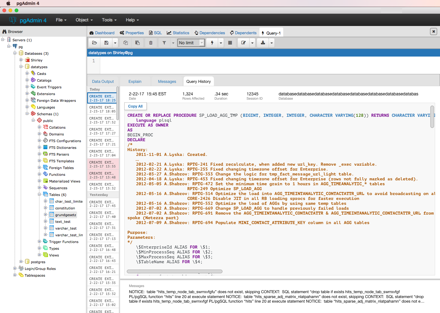
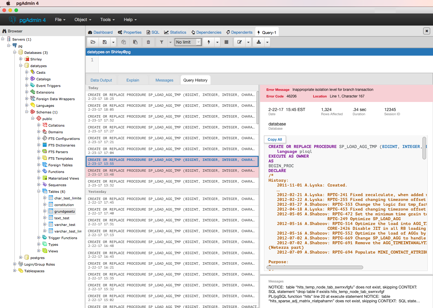
Hello all,Here are the updated designs for history. Goal is to display the same information currently in pgAdmin, just rearranged to enable people to view the full query. We found that when using pgAdmin, people use the query editor as a place to store their queries, and use history to view previous iterations of that query.Change from previous iteration is the addition of a vertically draggable messages box, which would display a truncated version of the original message displayed in the messages tab. This does not impact messages from queries currently run, info/functionality from those tabs will remain the same.As always, feedback appreciated :)ShirleyOn Tue, Mar 7, 2017 at 8:07 PM, Shirley Wang <swang@pivotal.io> wrote:
>
>
> On Tue, Mar 7, 2017 at 4:01 AM Dave Page <dpage@pgadmin.org> wrote:
>>
>> On Mon, Mar 6, 2017 at 9:19 PM, Shirley Wang <swang@pivotal.io> wrote:
>>>
>>> Thanks, Dave
>>>
>>>>
>>>> I disagree. I use both the Explain and Messages tabs all the time, and
>>>> rarely the History tab. You cannot easily merge the data output and EXPLAIN
>>>> tabs because they show complementary information.
>>>
>>>
>>> I see. It may be that we haven't heard about the full value of the
>>> Explain tab (it also doesn't seem to be working on my version of pgAdmin
>>> (w/Postgres, not Greenplum)). I see no problem with keeping it as is until
>>> we learn more.
>>>
>>> Here are the updated versions of History (Explain isn't included because
>>> we were working with the assumption that the tab could be combined with
>>> results, we can add it again unless we learn something new).
>>>
>>> - Users are able to click or use the arrow keys on their keyboard to
>>> navigate through the queries on the left.
>>> - List of queries is expandable
>>> - Copy all is fixed to the top right corner so it'll be present as users
>>> vertically/horizontally scroll
>>
>>
>> That makes it impossible any details from the initial grid view.
>>
>>
>>>
>>>
>>>
>>> To your points,
>>>
>>>>
>>>> The Messages tab is used to quickly show the full set of messages from
>>>> the last executed query. Having that info only on the results tab is less
>>>> useful for a number of reasons:
>>>>
>>>> - It shows the results from all queries, thus making the display more
>>>> cluttered when you're only interested in the results of the last query
>>>> (which is probably the majority of the time).
>>>>
>>> In the messages tab, it seems like when the query ran successfully, the
>>> message shows number of rows affected and total time, both which are shown
>>> with your query history. It also seems like when there is an error message,
>>> it duplicates the description and splits out line and character. We can
>>> condense that into 3 groups of info : error code, a description, and
>>> location within the query where the error was detected.
>>
>>
>> It'll also show (in the correct order) any notices or other messages
>> raised by stored functions. It's critical that these remain easy to read as
>> they're used for debugging as well as conveying non-result info to the user.
>>
>>>
>>>
>>> Immediate feedback on any errors should be displayed right after you run
>>> the query. It appears there's already a pattern for feedback w/ the green
>>> box that appears in the bottom right corner when you run a successful query.
>>> Any sort of feedback on the query run (success/fail messages) should be
>>> treated consistently. Persistent messages can live within the history.
>>>
>>>>
>>>> - It shows information above and beyond the messages, again, cluttering
>>>> the display and detracting from the message info.
>>>
>>>
>>> You're right that the error messages displays information at a higher
>>> level than query history, which can be solved by establishing hierarchy -
>>> error messages go at the top.
>>
>>
>> No, error messages need to be shown properly ordered amongst any other
>> messages. The output is intentionally sequential - if it weren't, it would
>> be useless for debugging.
>
>
> I see. We're looking into messages for storage procedures now and how that
> should be solved. Are there other types of messages we should be aware of?
No, I don't think so. They come through the standard postgres elog
mechanism which should cover other sources as well.
--
Dave Page
Blog: http://pgsnake.blogspot.com
Twitter: @pgsnake
EnterpriseDB UK: http://www.enterprisedb.com
The Enterprise PostgreSQL Company


Blog: http://pgsnake.blogspot.com
Twitter: @pgsnake
EnterpriseDB UK: http://www.enterprisedb.com
The Enterprise PostgreSQL Company
Вложения
I like it. My only comment is that the the messages section should honour line breaks, and should use a fixed-width font as it may include error indicators or output from loops which may (effectively) be tabulated.On Wed, Mar 15, 2017 at 8:48 PM, Shirley Wang <swang@pivotal.io> wrote:Hello all,Here are the updated designs for history. Goal is to display the same information currently in pgAdmin, just rearranged to enable people to view the full query. We found that when using pgAdmin, people use the query editor as a place to store their queries, and use history to view previous iterations of that query.Change from previous iteration is the addition of a vertically draggable messages box, which would display a truncated version of the original message displayed in the messages tab. This does not impact messages from queries currently run, info/functionality from those tabs will remain the same.As always, feedback appreciated :)ShirleyOn Tue, Mar 7, 2017 at 8:07 PM, Shirley Wang <swang@pivotal.io> wrote:
>
>
> On Tue, Mar 7, 2017 at 4:01 AM Dave Page <dpage@pgadmin.org> wrote:
>>
>> On Mon, Mar 6, 2017 at 9:19 PM, Shirley Wang <swang@pivotal.io> wrote:
>>>
>>> Thanks, Dave
>>>
>>>>
>>>> I disagree. I use both the Explain and Messages tabs all the time, and
>>>> rarely the History tab. You cannot easily merge the data output and EXPLAIN
>>>> tabs because they show complementary information.
>>>
>>>
>>> I see. It may be that we haven't heard about the full value of the
>>> Explain tab (it also doesn't seem to be working on my version of pgAdmin
>>> (w/Postgres, not Greenplum)). I see no problem with keeping it as is until
>>> we learn more.
>>>
>>> Here are the updated versions of History (Explain isn't included because
>>> we were working with the assumption that the tab could be combined with
>>> results, we can add it again unless we learn something new).
>>>
>>> - Users are able to click or use the arrow keys on their keyboard to
>>> navigate through the queries on the left.
>>> - List of queries is expandable
>>> - Copy all is fixed to the top right corner so it'll be present as users
>>> vertically/horizontally scroll
>>
>>
>> That makes it impossible any details from the initial grid view.
>>
>>
>>>
>>>
>>>
>>> To your points,
>>>
>>>>
>>>> The Messages tab is used to quickly show the full set of messages from
>>>> the last executed query. Having that info only on the results tab is less
>>>> useful for a number of reasons:
>>>>
>>>> - It shows the results from all queries, thus making the display more
>>>> cluttered when you're only interested in the results of the last query
>>>> (which is probably the majority of the time).
>>>>
>>> In the messages tab, it seems like when the query ran successfully, the
>>> message shows number of rows affected and total time, both which are shown
>>> with your query history. It also seems like when there is an error message,
>>> it duplicates the description and splits out line and character. We can
>>> condense that into 3 groups of info : error code, a description, and
>>> location within the query where the error was detected.
>>
>>
>> It'll also show (in the correct order) any notices or other messages
>> raised by stored functions. It's critical that these remain easy to read as
>> they're used for debugging as well as conveying non-result info to the user.
>>
>>>
>>>
>>> Immediate feedback on any errors should be displayed right after you run
>>> the query. It appears there's already a pattern for feedback w/ the green
>>> box that appears in the bottom right corner when you run a successful query.
>>> Any sort of feedback on the query run (success/fail messages) should be
>>> treated consistently. Persistent messages can live within the history.
>>>
>>>>
>>>> - It shows information above and beyond the messages, again, cluttering
>>>> the display and detracting from the message info.
>>>
>>>
>>> You're right that the error messages displays information at a higher
>>> level than query history, which can be solved by establishing hierarchy -
>>> error messages go at the top.
>>
>>
>> No, error messages need to be shown properly ordered amongst any other
>> messages. The output is intentionally sequential - if it weren't, it would
>> be useless for debugging.
>
>
> I see. We're looking into messages for storage procedures now and how that
> should be solved. Are there other types of messages we should be aware of?
No, I don't think so. They come through the standard postgres elog
mechanism which should cover other sources as well.
--
Dave Page
Blog: http://pgsnake.blogspot.com
Twitter: @pgsnake
EnterpriseDB UK: http://www.enterprisedb.com
The Enterprise PostgreSQL Company--Dave Page
Blog: http://pgsnake.blogspot.com
Twitter: @pgsnake
EnterpriseDB UK: http://www.enterprisedb.com
The Enterprise PostgreSQL Company


Karen Blatchley Engineering Project Manager | |||||
| Unit 6 The Quadrangle, Grove Technology Park Wantage Oxfordshire OX12 9FA UK | |||||
T: +44 7976 463762 | |||||
| www.enterprisedb.com | |||||
Website: www.enterprisedb.com
EnterpriseDB Blog: http://blogs.enterprisedb.com/
Follow us on Twitter: http://www.twitter.com/enterprisedb
Вложения
On 16 March 2017 at 09:51, Dave Page <dpage@pgadmin.org> wrote:I like it. My only comment is that the the messages section should honour line breaks, and should use a fixed-width font as it may include error indicators or output from loops which may (effectively) be tabulated.