Обсуждение: Old revised version, and a new one
Hello all!

I've uploaded a revised version of the page Andreas hosted for me
before at
http://www.grzm.com/postgresql_org/html/index.htm

Within the limitations of the table format it used, I think most of the
CSS problems have been corrected. I've tested it on Safari, and the Mac
versions of MSIE5.2, Opera 6.03, Mozilla Firebird, and Camino. They're
pretty much the same, though the fonts appear bigger in Opera. I'm not
sure why, though it might be because the default font size in Opera is
bigger than in other browsers. I don't think this particular design
(with fixed sidebar widths) has much of a future, but I wanted to try
to eliminate the previous CSS mistakes.

I've also loaded an alternative version without fixed sidebar widths.

http://localhost/pgweb/html/index3.htm

I've tested this one as well (same browsers), and feedback in browsers
on other
platforms as well as page design are of course appreciated. I organized
it a bit differently, though I think pretty much everything's still
there. Again, font sizes are appear bigger in Opera on my machine. How
big of a problem is this? Another thing I'm concerned about is the tag
line in the banner: when the window is narrow, the line breaks causing
some height problems.

WIthout resorting to an image or making the font really really small,
the line will break when the window narrows, though we could probably
choose the mode of failure. And there's of course the option to just
cut it. I replaced the links with the tag line because I thought there
was quite a bit of duplication in this design, with the reworked
sidebar.

Thanks again, Andreas, for hosting the previous version!

Michael
The path for the alternative is incorrect ;)

http://www.grzm.com/postgresql_org/html/index3.htm

That one has some really nice elements, there are others I don't like. I think I will play with this a bit later :)

Mit freundlichen Grüßen
Andreas Grabmüller

----- Original-Nachricht -----
Von: "Michael Glaesemann" <grzm@myrealbox.com>
An: pgsql-www@postgresql.org
Datum: Thursday, November 13, 2003 09:03 PM
Betreff: [pgsql-www] Old revised version, and a new one

> Hello all!
>
> I've uploaded a revised version of the page Andreas hosted for me
> before at
> http://www.grzm.com/postgresql_org/html/index.htm
>
> Within the limitations of the table format it used, I think most of the
> CSS problems have been corrected. I've tested it on Safari, and the Mac
> versions of MSIE5.2, Opera 6.03, Mozilla Firebird, and Camino. They're
> pretty much the same, though the fonts appear bigger in Opera. I'm not
> sure why, though it might be because the default font size in Opera is
> bigger than in other browsers. I don't think this particular design
> (with fixed sidebar widths) has much of a future, but I wanted to try
> to eliminate the previous CSS mistakes.
>
> I've also loaded an alternative version without fixed sidebar widths.
>
> http://localhost/pgweb/html/index3.htm
>
> I've tested this one as well (same browsers), and feedback in browsers
> on other
> platforms as well as page design are of course appreciated. I organized
> it a bit differently, though I think pretty much everything's still
> there. Again, font sizes are appear bigger in Opera on my machine. How
> big of a problem is this? Another thing I'm concerned about is the tag
> line in the banner: when the window is narrow, the line breaks causing
> some height problems.
>
> WIthout resorting to an image or making the font really really small,
> the line will break when the window narrows, though we could probably
> choose the mode of failure. And there's of course the option to just
> cut it. I replaced the links with the tag line because I thought there
> was quite a bit of duplication in this design, with the reworked
> sidebar.
>
> Thanks again, Andreas, for hosting the previous version!
>
> Michael
>
>
> ---------------------------(end of broadcast)---------------------------
> TIP 5: Have you checked our extensive FAQ?
>
>                http://www.postgresql.org/docs/faqs/FAQ.html

--
LetzPlay.de
| Freemail:       http://www.letzplay.de/mail
| Forenhosting: http://www.letzplay.de/foren
> -----Original Message-----
> From: Michael Glaesemann [mailto:grzm@myrealbox.com]
> Sent: 13 November 2003 20:00
> To: pgsql-www@postgresql.org
> Subject: [pgsql-www] Old revised version, and a new one
>
> Hello all!
>
> I've uploaded a revised version of the page Andreas hosted
> for me before at http://www.grzm.com/postgresql_org/html/index.htm

Hi Michael,

Unfortunately I have a number of problems with this design:

1) The fonts have all shrunk. We purposefully increaed the sizes on the
current site to what they are now.

2) The "Welcome To..." text is very close to both the menu bar and event
boxes etc.

3) The sidebars touch the bottom of the ads, yet they have left/right
borders.

4) The colour of the text in the event/news boxes is too light against
the grey background.

5) Resizing a little below 800 wide causes odd wrapping in the header.

Don't take that as harsh criticism though - we just need to iron out
these issues :-)

Regards, Dave.
> -----Original Message-----
> From: Andreas Grabmüller [mailto:webmaster@letzplay.de]
> Sent: 13 November 2003 20:35
> To: pgsql-www@postgresql.org; grzm@myrealbox.com
> Subject: Re: [pgsql-www] Old revised version, and a new one
>
> The path for the alternative is incorrect ;)
>
> http://www.grzm.com/postgresql_org/html/index3.htm
>
> That one has some really nice elements, there are others I
> don't like. I think I will play with this a bit later :)

TO be honest the only bit I like is the headings in the right bar. The left bar and center sections just look wrong
(asidefrom the fact that some of the text doesn't even display in IE6). I also think the sidebars need to line up with
thenatural columns created by the ads, otherwise the whole layout looks off-balance.

Sorry Michael :-(, I would concentrate on the other one :-)

Regard,s Dave.
On Friday, November 14, 2003, at 05:44 AM, Dave Page wrote:
>> I've uploaded a revised version of the page Andreas hosted
>> for me before at http://www.grzm.com/postgresql_org/html/index.htm
>
> Hi Michael,
>
> Unfortunately I have a number of problems with this design:
>
> 1) The fonts have all shrunk. We purposefully increaed the sizes on the
> current site to what they are now.
>
> 2) The "Welcome To..." text is very close to both the menu bar and
> event
> boxes etc.
>
> 3) The sidebars touch the bottom of the ads, yet they have left/right
> borders.
>
> 4) The colour of the text in the event/news boxes is too light against
> the grey background.
>
> 5) Resizing a little below 800 wide causes odd wrapping in the header.
>
> Don't take that as harsh criticism though - we just need to iron out
> these issues :-)

No problem. Feedback is a good thing. Those are all things that can be
easily handled. And I agree with you on 2, 3 and 5. Good to know about
1, and will try increasing the sizes. As for 4, the two options that
spring to mind are changing the color of the text or making the text
bold, and this might be solved anyway when the font size is increased.
I'll try all of them, but any preferences?

The two things I'm happiest about is I haven't yet heard about
*mistakes* causing huge problems in browsers (though those may yet
come) and I was actually able to get the host thing worked out in less
than 30 hours (thanks to those five folks at hub.org)—my 5am URI slip
notwithstanding! ;)

Thanks for the quick feedback!

Michael
On Friday, November 14, 2003, at 05:34 AM, Andreas Grabmüller wrote:

> The path for the alternative is incorrect ;)
>
> http://www.grzm.com/postgresql_org/html/index3.htm

Thanks, Andreas! Glad you figured it out. I'll get the hang of this
yet, I swear it ; ) For your added viewing pleasure, you might want to
check out
http://www.grzm.com/postgresql_org/html/indexc.htm
I added some background colors to see how things were lining up when I
was debuggin g. (Not intended for production use!)

> That one has some really nice elements, there are others I don't like.

Thanks! I wanted to try some things to provide some design contrast and
explore some options. There are things I'm definitely not happy with:
the right sidebar is kind of plain, the survey should be set off more
visually, the GBorg section on the left is heinous, need more
distinction in the news/events articles themselves, to name a few.

Michael
On Friday, November 14, 2003, at 05:48 AM, Dave Page wrote:
>
> The left bar and center sections just look wrong (aside from the fact
> that some of the text doesn't even display in IE6).

Could you be more specific? I don't have access to IE6, so I don't know
what you're (not) seeing. Even if this particular design doesn't work
for you, I definitely want to know about potential problems in IE6 so I
can learn to work around them in others. (I did forget to add the words
"Submit News" in the News heading—it's just an empty <a> tag right now.)

>  I also think the sidebars need to line up with the natural columns
> created by the ads, otherwise the whole layout looks off-balance.

I agree. It's one of the things I used as a design constraint on the
other design. On the other hand, in another thread,

On Thursday, November 13, 2003, at 01:09 PM, Bruce Momjian wrote:

> Andreas Grabm?ller wrote:
>> Well, I like the boxes on the sides, however I'm not happy with
>> making it fixed-width again...
>
> Agreed.

And I was running into problems with column width with words not
fitting into the 120px columns defined by the ads. I do think 120px is
a little narrow, making it harder to read longer descriptions (due to
line breaks) or even using longer words in some cases. What are your
thoughts on increasing the left and right borders on the ads to make
the columns wider?

Michael
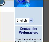
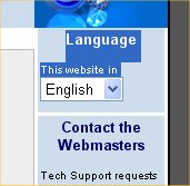
> -----Original Message-----
> From: Michael Glaesemann [mailto:grzm@myrealbox.com]
> Sent: 14 November 2003 00:58
> To: Dave Page
> Cc: pgsql-www@postgresql.org
> Subject: Re: [pgsql-www] Old revised version, and a new one
>
>
> No problem. Feedback is a good thing. Those are all things
> that can be easily handled. And I agree with you on 2, 3 and
> 5. Good to know about 1, and will try increasing the sizes.
> As for 4, the two options that spring to mind are changing
> the color of the text or making the text bold, and this might
> be solved anyway when the font size is increased.
> I'll try all of them, but any preferences?

Make the colour navy blue or something similar.

> The two things I'm happiest about is I haven't yet heard about
> *mistakes* causing huge problems in browsers (though those may yet
> come) and I was actually able to get the host thing worked
> out in less than 30 hours (thanks to those five folks at
> hub.org)-my 5am URI slip notwithstanding! ;)

There was one thing - the text around the language box is invisible
unless you select it, but even then it seems to flash somewhat
bizarrely. Screenshots attached.

Regards, Dave

PS, ie6 on XP, fully patched and plugged.
Вложения
> -----Original Message-----
> From: Michael Glaesemann [mailto:grzm@myrealbox.com]
> Sent: 14 November 2003 01:28
> To: Dave Page
> Cc: webmaster@letzplay.de; pgsql-www@postgresql.org
> Subject: Re: [pgsql-www] Old revised version, and a new one
>
> And I was running into problems with column width with words
> not fitting into the 120px columns defined by the ads. I do
> think 120px is a little narrow, making it harder to read
> longer descriptions (due to line breaks) or even using longer
> words in some cases. What are your thoughts on increasing the
> left and right borders on the ads to make the columns wider?

Ahh, a sense of déjà vu!!

The problem with increasing the left/right ad borders is that you then need to do the top/bottom as well or it just
lookswrong.

One this I did try previously that I seem to recall I liked but Marc wasn't so keen on (though maybe not for this
reason)was including a solid title bar just below the header, right the way across. It also had a thin white border all
roundso it looked like a completely standalone entity. It gives just enough of a break that the columns no longer need
toline up with the ads (though they should still look even).

Regards, Dave.
On Friday, November 14, 2003, at 05:29 PM, Dave Page wrote:
>> From: Michael Glaesemann [mailto:grzm@myrealbox.com]
>> And I was running into problems with column width with words
>> not fitting into the 120px columns defined by the ads. I do
>> think 120px is a little narrow, making it harder to read
>> longer descriptions (due to line breaks) or even using longer
>> words in some cases. What are your thoughts on increasing the
>> left and right borders on the ads to make the columns wider?
>
> Ahh, a sense of déjà vu!!

Well-worn road, eh?

> The problem with increasing the left/right ad borders is that you then
> need to do the top/bottom as well or it just looks wrong.
>
> One this I did try previously that I seem to recall I liked but Marc
> wasn't so keen on (though maybe not for this reason) was including a
> solid title bar just below the header, right the way across.

I was thinking something very similar. You could take the links that
are currently banner and make something like a menu bar running beneath
the ads, the logotype, and the logo. This would also give us a lot more
space for varying length menu terms. I'm probably not the first person
to suggest this. Was there a reason why it wasn't implemented? I'll try
something like this as well.

Speaking of which, are there originals of the logotype and logo
floating around somewhere? I've been keen to clean up some of the
pixelation (from jpg compression?), but it might be easier just to
recreate them from the originals than spend the time pushing pixels.

Michael
On Friday, November 14, 2003, at 05:24 PM, Dave Page wrote:
>> From: Michael Glaesemann [mailto:grzm@myrealbox.com]
>> As for 4, the two options that spring to mind are changing
>> the color of the text or making the text bold
>
> Make the colour navy blue or something similar.

I'll give it a shot.

> There was one thing - the text around the language box is invisible
> unless you select it, but even then it seems to flash somewhat
> bizarrely. Screenshots attached.

Talk about service! Thanks for the pics. This is what you were talking
about before,

>  (aside from the fact that some of the text doesn't even display in
> IE6).

Right? I'll look into it. A brief google on "css ie6 hidden text"
brought up a couple different mailing list threads. It seems IE6 has
issues with padding and divs, so hopefully I'll be able to find a good
workaround.

Michael
> -----Original Message-----
> From: Michael Glaesemann [mailto:grzm@myrealbox.com]
> Sent: 14 November 2003 09:24
> To: Dave Page
> Cc: webmaster@letzplay.de; pgsql-www@postgresql.org
> Subject: Re: [pgsql-www] Old revised version, and a new one
>
>
> On Friday, November 14, 2003, at 05:29 PM, Dave Page wrote:
> >> From: Michael Glaesemann [mailto:grzm@myrealbox.com] And I was
> >> running into problems with column width with words not
> fitting into
> >> the 120px columns defined by the ads. I do think 120px is a little
> >> narrow, making it harder to read longer descriptions (due to line
> >> breaks) or even using longer words in some cases. What are your
> >> thoughts on increasing the left and right borders on the
> ads to make
> >> the columns wider?
> >
> > Ahh, a sense of déjà vu!!
>
> Well-worn road, eh?

Yup.

> > The problem with increasing the left/right ad borders is
> that you then
> > need to do the top/bottom as well or it just looks wrong.
> >
> > One this I did try previously that I seem to recall I liked
> but Marc
> > wasn't so keen on (though maybe not for this reason) was
> including a
> > solid title bar just below the header, right the way across.
>
> I was thinking something very similar. You could take the
> links that are currently banner and make something like a
> menu bar running beneath the ads, the logotype, and the logo.
> This would also give us a lot more space for varying length
> menu terms. I'm probably not the first person to suggest
> this. Was there a reason why it wasn't implemented? I'll try
> something like this as well.

I was designing the current site around this time last year and we got through about 15 versions of the site before we
allagreed on this one. I forget the exact reasons why any of them were rejected to be honest (not that I can even
rememberwhat most of them looked like anyway!).

> Speaking of which, are there originals of the logotype and
> logo floating around somewhere? I've been keen to clean up
> some of the pixelation (from jpg compression?), but it might
> be easier just to recreate them from the originals than spend
> the time pushing pixels.

Sorry, I did them from the logo on techdocs. I never had any vector images for them. However, I have a funny feeling
oneof the pgAdmin team worked up a vector version of Slonik (the elephant - betcha didn't know it had a name!). I'll
emailhim.

Cheers, Dave.
> -----Original Message-----
> From: Michael Glaesemann [mailto:grzm@myrealbox.com]
> Sent: 14 November 2003 09:41
> To: Dave Page
> Cc: pgsql-www@postgresql.org
> Subject: Re: [pgsql-www] Old revised version, and a new one
>
>
> On Friday, November 14, 2003, at 05:24 PM, Dave Page wrote:
> >> From: Michael Glaesemann [mailto:grzm@myrealbox.com] As for 4, the
> >> two options that spring to mind are changing the color of
> the text or
> >> making the text bold
> >
> > Make the colour navy blue or something similar.
>
> I'll give it a shot.
>
> > There was one thing - the text around the language box is invisible
> > unless you select it, but even then it seems to flash somewhat
> > bizarrely. Screenshots attached.
>
> Talk about service! Thanks for the pics. This is what you
> were talking about before,

We aim to please :-)

> >  (aside from the fact that some of the text doesn't even display in
> > IE6).
>
> Right?

Yup.

> I'll look into it. A brief google on "css ie6 hidden text"
> brought up a couple different mailing list threads. It seems
> IE6 has issues with padding and divs, so hopefully I'll be
> able to find a good workaround.

:-)

Regards, Dave.
On Friday, November 14, 2003, at 06:50 PM, Dave Page wrote:
> Sorry, I did them from the logo on techdocs. I never had any vector
> images for them.

No problem. jpeg, as you know, uses lossy compression. Any time you
resave it, you're going to lose something. png would be nice, but so
far few browsers read it. Wanna lead the bleeding edge? (Of course, gif
doesn't have this problem, but I try to stay away from people who throw
their licensing weight around. :)

When svg becomes more of widely implemented...

> However, I have a funny feeling one of the pgAdmin team worked up a
> vector version of Slonik (the elephant - betcha didn't know it had a
> name!).

Thanks for the trivia. I'll be sure to pull it out at my next cocktail
party!

What's sad is that I wasn't sure if it was an elephant—not because it
doesn't look like one, but being in Japan for nearly 5 years has taken
it's toll on my vocabulary. I wasn't sure there wasn't a more accurate
word for it. I was thinking mammoth or mastodon were possible
alternatives, but refrained from saying anything more specific than
"logo".  I've since checked the dictionary. I'm relieved to find out
that both are related to elephants, though Slonik appears to be neither.