Re: [pgadmin-hackers] [Design update] Style guide for pgAdmin4
| От | Shirley Wang |
|---|---|
| Тема | Re: [pgadmin-hackers] [Design update] Style guide for pgAdmin4 |
| Дата | |
| Msg-id | CAPG3WN7W=+sc9zk0BsFrEejWg1PFL1PR4xvQw6BSWuX4d3oDfw@mail.gmail.com обсуждение исходный текст |
| Ответ на | Re: [pgadmin-hackers] [Design update] Style guide for pgAdmin4 (Dave Page <dpage@pgadmin.org>) |
| Ответы |
Re: [pgadmin-hackers] [Design update] Style guide for pgAdmin4
|
| Список | pgadmin-hackers |
Hello!
Update on style guide location
We're going to move the agreed upon styles from Figma onto a webpage that will be accessible by everyone. We've decided to have a static site, with the html and css available to copy and paste. We'll add components to the style guide after we update the current UI with new styles.
Dropdown styles
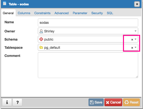
I noticed that some drop downs include a 'x' next to the current option in the text field:
The 'x' and the down arrow functionally do the same thing, and it seems redundant to have both. I would suggest removing the 'x' since selecting another option from the dropdown will automatically replace the current option.
Button toggles vs checkboxes
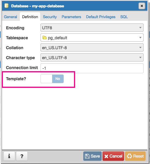
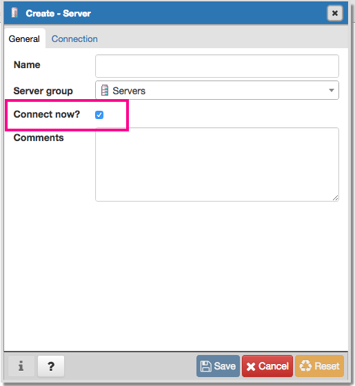
In some cases within dialogs, a toggle is used to define yes or no, while in other cases a radio button is used to define yes or no:
It does seem like 'Connect now?' and 'Save password' (in 'Connection' tab within 'Create - Server') are the only places where checkboxes are used, is there a reason why these are different? I think we should just choose one, unless there was a specific reason as to why both check boxes and toggles are used.
On Thu, May 4, 2017 at 4:09 AM Dave Page <dpage@pgadmin.org> wrote:
On Wed, May 3, 2017 at 11:06 PM, Shirley Wang <swang@pivotal.io> wrote:So to summarise:- I'm happy to see the number of grays reduced as proposed.- I don't like the dark gray column headers.- I think the column and row headers should be the same colour.- I think we should review the bluish-gray used for the codemirror gutter (though, it looks fine for the alternate rows)- We should use a light-gray for the disabled codemirror, with slightly faded text.What do you think?Gotcha. Here's the query tool with the same grey as the row header.I quite like this grey as a header.Yes, me too.And in the 'View all Data'I made the codemirror and codemirror gutter the same color with a 50% opacity on the text. It looks like its lighter in the 'View all data' mockup, but that's because the codemirror being grey makes the gutter lose contrast.Works for me :-)I'm not sure why it looks bluish grey for you, it's a neutral grey both times (#f9f9f9). Perhaps try editing the color in Chrome Inspector to see if it makes a difference?Likely just my ageing eyes.--Dave Page
Blog: http://pgsnake.blogspot.com
Twitter: @pgsnake
EnterpriseDB UK: http://www.enterprisedb.com
The Enterprise PostgreSQL Company
Вложения
В списке pgadmin-hackers по дате отправления: