Re: Rework of the frmOptions window
| От | Guillaume Lelarge |
|---|---|
| Тема | Re: Rework of the frmOptions window |
| Дата | |
| Msg-id | 4BAE5116.8090009@lelarge.info обсуждение |
| Ответ на | Re: Rework of the frmOptions window (Guillaume Lelarge <guillaume@lelarge.info>) |
| Ответы |
Re: Rework of the frmOptions window
|
| Список | pgadmin-hackers |
Le 27/03/2010 16:05, Guillaume Lelarge a écrit :
> Le 27/03/2010 15:05, Dave Page a écrit :
>> On Wed, Mar 24, 2010 at 7:05 PM, Guillaume Lelarge
>> <guillaume@lelarge.info> wrote:
>>> Hi,
>>>
>>> Since our frmOptions is so badly displayed, I've put some work on it:
>>>
>>>  * Sizers everywhere!
>>>  * Replace widgets with a wxDirPickerCtrl.
>>>  * Replace widgets with a wxFilePickerCtrl.
>>>  * Replace widgets with a wxFontPickerCtrl.
>>>  * Minimize the dialog size.
>>>
>>> Dave, if you have Snow Leopard, can you check this patch? if
>>> wxFontDialog is still broken on Mac OS X, I'll need to revert this git
>>> commit. Thanks.
>>
>> Sure. There's an issue on the first tab, where the text at the bottom
>> is truncated.
>
> Was already fixed in my local git branch. But thanks :)
>
>> Other than that, it looks OK technically speaking, but
>> the controls (and form) are getting so wide they're starting to look
>> very 'in your face'. FWIW, Magnus was of a similar opinion when I
>> showed him the dialogue.
>>
>
> Yeah, I agree too. Mainly with the colour buttons.
>
> One way we can fix this is lowering the width of the dialog. If we do
> that, we need to lessen the number of tabs. One way would be to put all
> colours options in the same tab. IIRC, you already mentionned it.
>
> Another way would be to have four columns, instead of two right now. Not
> sure it will be better displayed this way.
>
>>> Apart from this, seems good enough for me.
>>
>> I think it's good enough to use. It certainly does need a rethink in
>> the longer term though.
>>
>
> We can still think of it now. We still have time.
>
> I'll try the first way (lower the width of the dialog).
>
>

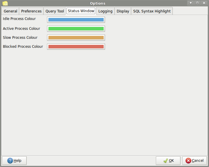
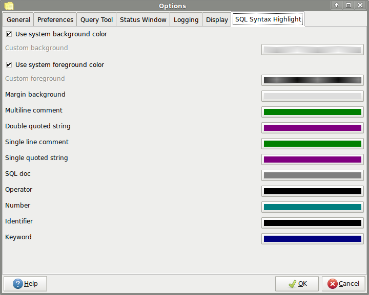
Two screenshots, with two different methods. First one, I added a spacer
as a third column (this column is growable). Second one, the growable
columns is the first, which explains why the ctlColourPickerCtrl is
aligned on the right.

Not sure I really like one or the other.


--
Guillaume.
 http://www.postgresqlfr.org
 http://dalibo.com
Вложения
В списке pgadmin-hackers по дате отправления:

