Re: pgarchives new design review
| От | Alvaro Herrera |
|---|---|
| Тема | Re: pgarchives new design review |
| Дата | |
| Msg-id | 20220805102553.wbifj2ye4tkszhqq@alvherre.pgsql обсуждение исходный текст |
| Ответ на | Re: pgarchives new design review (Sahil Harpal <sahilharpal1234@gmail.com>) |
| Ответы |
Re: pgarchives new design review
|
| Список | pgsql-www |
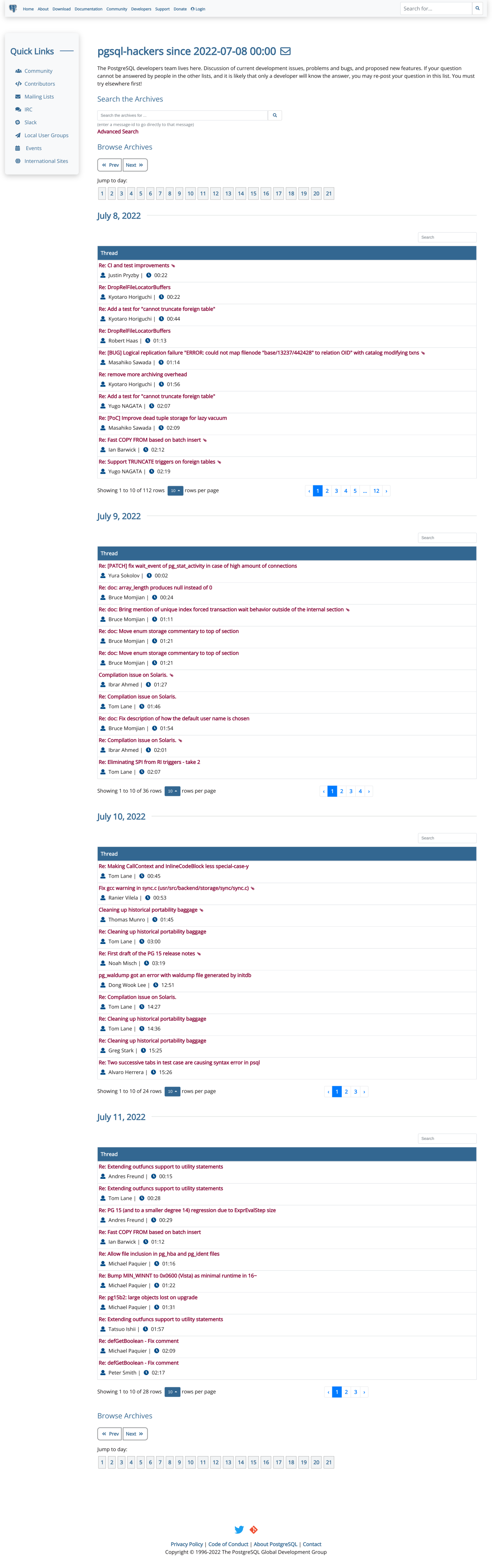
On 2022-Jul-29, Sahil Harpal wrote:

> On Fri, 29 Jul 2022 at 15:49, Dave Page <dpage@pgadmin.org> wrote:

> > - The lists of messages are (intentionally) a lot more compact in the
> > current design. The new design looks nice, but would require a *lot* more
> > scrolling as each row is now at least two lines of text. I wonder if
> > there's a way to keep at least some of the compact-ness, whilst still
> > making it look nicer.
>
> I think users would not require to scroll much. Like in the new design we
> have an option to set max entries to be displayed. So we can set max
> entries to lets say 10 and then just jump/switch to different pages one by
> one.

As a heavy user of the archives, I am completely against the idea of
having only 10 entries per page and forced to jump to different pages.

Looking at the site just now
http://140.211.168.145:88/list/pgsql-hackers/2022-07/
I see that you now have 10 entries for July 1st, with buttons for
further pages of more posts that day; then 10 entries for July 2nd; and
so on.  Screenshot attached.  This doesn't seem a good idea to me; an
arbitrary date change line means nothing in the flow of mailing list
messages, and the result of this paging is unusable.

In my opinion, the list of messages shown for a period of time has to be
a continuum of *all* messages in that period, without these paging breaks.

I prefer to scroll.

--
Álvaro Herrera         PostgreSQL Developer  —  https://www.EnterpriseDB.com/
Вложения
В списке pgsql-www по дате отправления: