Re: Remove stickiness from navigation bar in docs
| От | Andres Freund |
|---|---|
| Тема | Re: Remove stickiness from navigation bar in docs |
| Дата | |
| Msg-id | 20181019215053.us6arlkyutx3e4ft@alap3.anarazel.de обсуждение исходный текст |
| Ответ на | Re: Remove stickiness from navigation bar in docs ("Jonathan S. Katz" <jkatz@postgresql.org>) |
| Ответы |
Re: Remove stickiness from navigation bar in docs
|
| Список | pgsql-www |
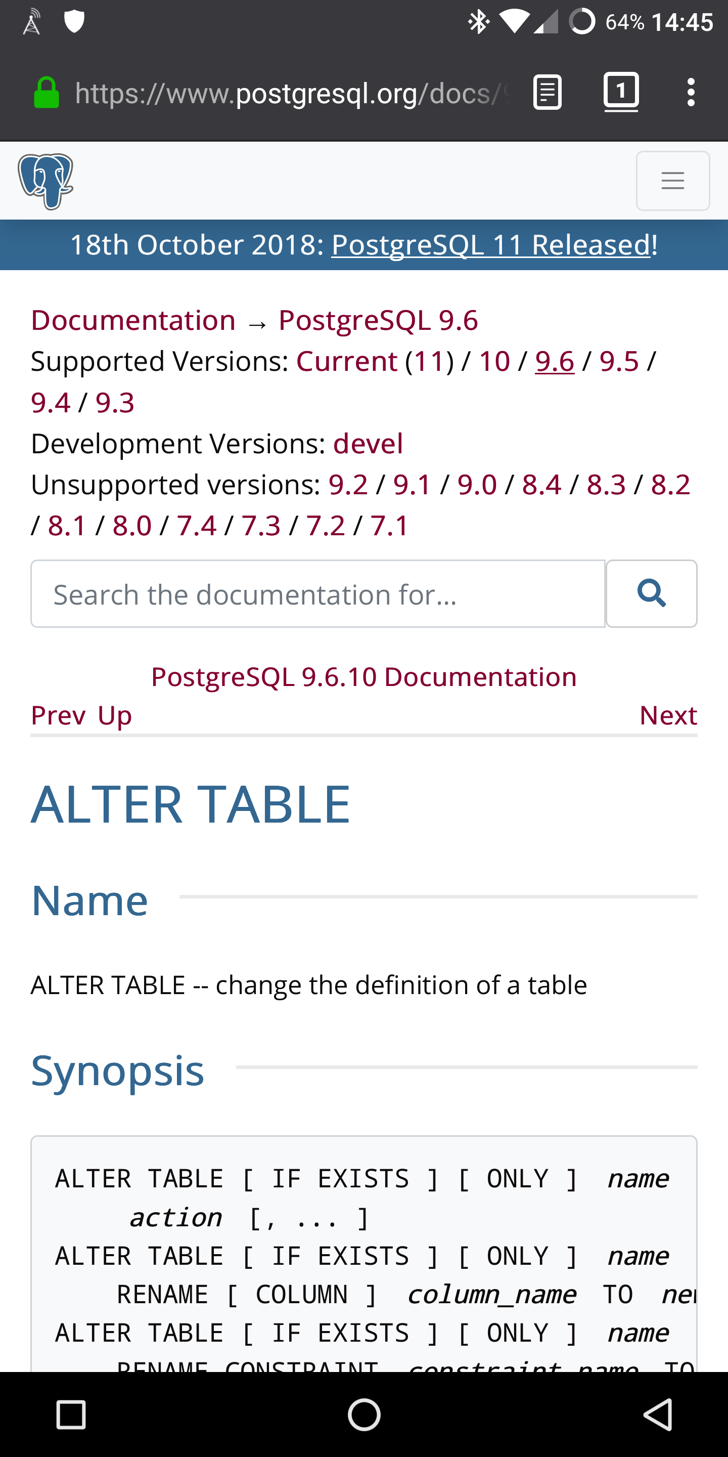
Hi,

On 2018-10-19 17:37:07 -0400, Jonathan S. Katz wrote:
> > I don't like the shout box in the docs, FWIW. For me that's reference
> > material, and I don't want to waste the space. Currently content starts
> > like half a screen down when at the top. That's a *lot*.

You're quoting me saying things about the shout box - but I think you're
talking about the fixed navbar?


> Well, the things up top are the core doc navigation (versions, search,
> TOCs on the page). Those are fairly important, particularly on large
> pages. And also on large pages, it can be a pain to scroll all the way
> back up if you need to get to another part of the site, or search.

It's like one swipe to scroll back up even on big pages, I don't quite
buy that. But I find the mobile header much less intrusive / distracting
than the non-mobile one (Doesn't change size. Only a small symbol, not
multiple links), so I don't care as much.


FWIW, the mobile docs view looks kinda bad when you start out. I've
attached a screenshot from my phone.  The amount of space taken by the
header, by the shoutbox, by the version selectors (man, that's like 5
lines), the search box, the docs header, is more than a bit
disproportional.

Greetings,

Andres Freund
Вложения
В списке pgsql-www по дате отправления: